
Cleaning Company Logo Design
A cleaning identity beyond the familiar sparkle icon
Read articleBOCW — DESIGN NOTES
Design decisions, practical guides and useful questions for your brand. Choose a category or search the whole library.
Explore articles ↘769–792 / 1029 articles
A cleaning identity beyond the familiar sparkle icon
Read article
An identity for management rather than a single building
Read article
A call centre identity beyond the speech bubble
Read article
An agency signature that gives client work room
Read article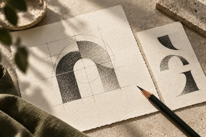
A digital identity distinct from the performance chart
Read article
A studio signature that respects the photograph
Read article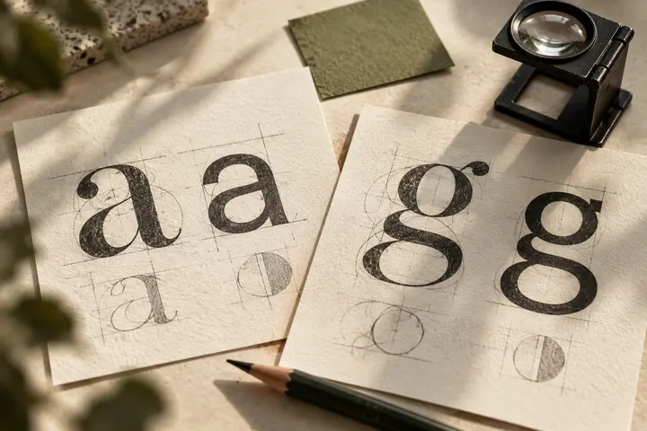
An identity that holds across screen and production paperwork
Read article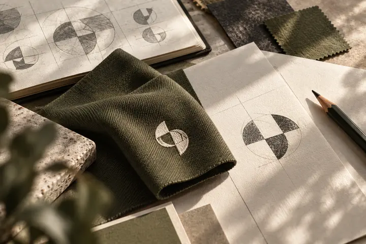
A school identity with room for every age group
Read article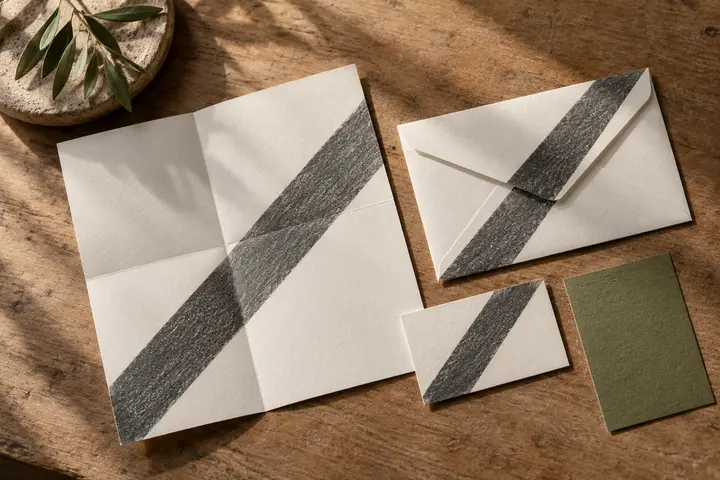
A welcoming nursery mark with clear adult communication
Read article
Readable naming with room for different languages
Read article
Clear direction and learning without a racing identity
Read article
A shared visual language across different practical skills
Read article
An imprint that survives spines, covers and catalogue entries
Read article
A bookshop signature that holds together shelves and streets
Read article
A reproducible signature across samples and production surfaces
Read articleKeep the maker visible among the signs it produces
Read articleRepresent rhythm without reducing the school to one discipline
Read articleA distinctive gallery identity that leaves artwork room
Read articleAn emblem that holds together shirts and score displays
Read articleA clear fitness identity among busy training surfaces
Read articleBuild the studio name through spacing and clear letterforms
Read articleA measured institutional mark around a shared purpose
Read article
A recognisable shop signature among changing floral colours
Read articleOne shop identity across different animal product categories
Read articleNo matching articles. Try another term.