

Wind Energy Company Logo Design
Balancing rotational movement within a stationary mark
Read articleBOCW — DESIGN NOTES
Design decisions, practical guides and useful questions for your brand. Choose a category or search the whole library.
Explore articles ↘745–768 / 1029 articles
Balancing rotational movement within a stationary mark
Read article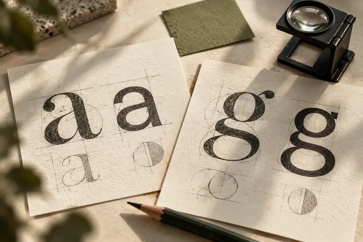
Connecting the charging point with its digital signature
Read article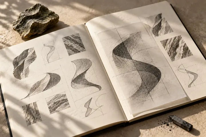
Turning modular structure into a lasting brand shape
Read article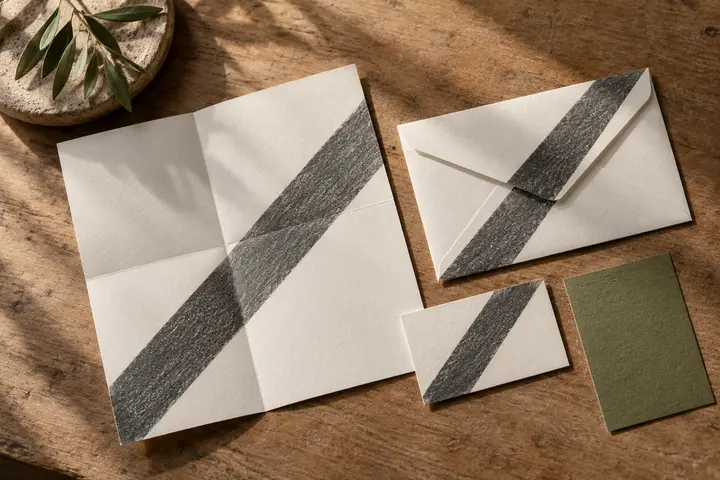
A readable identity from roadside sign to receipt
Read article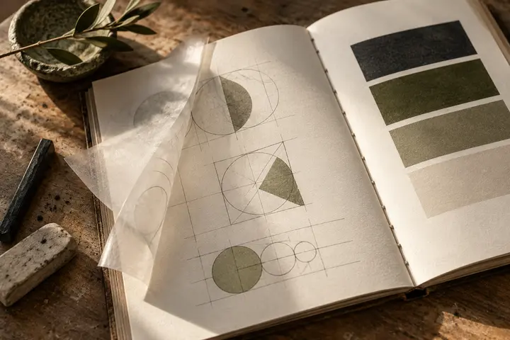
Readable service branding beyond a familiar flame symbol
Read article
Simple forms for devices, labels and service cards
Read article
Turn material circulation into a distinctive business mark
Read article
A calm report signature with a clear field presence
Read article
Keep one recognisable direction across the fleet
Read article
A clear identity beside boxes, addresses and vehicles
Read article
A compact identity that survives a busy parcel label
Read article
A compact identity from phone header to delivery bag
Read article
An orderly business signature distinct from rack information
Read article
One consistent name across languages and product groups
Read article
A clear business identity within document heavy communication
Read articleA distinct agency name beside product and provider marks
Read articleBank identities across branch signs and mobile screens
Read articleA compact identity for the moment of payment
Read articleMeasured typography for information-rich investment communications
Read articleCalm accounting identities for frequently repeated documents
Read articleA measured signature for complex consulting presentations
Read articleAn approachable identity between candidates and employers
Read article
A clear field identity with a calm document presence
Read articleA restrained security identity for uniforms and facilities
Read articleNo matching articles. Try another term.