In this article
A publishing house logo lives beside artwork made for many different books. A novel, an academic volume and a picture book may share almost no visual language. The imprint should identify their publisher without forcing every cover into one mood. That makes restraint useful: the small device on a spine and the full name in a catalogue need to feel related. A growing list of series should still leave the parent signature recognisable and give each individual book room to establish its own character.
Quick answer
Start a publishing house identity with a simple spine device and a clearly spaced name. Develop controlled light and dark versions for different covers. Let the cover system express the range of genres rather than asking the logo to illustrate them all. A narrow printed spine and a small digital catalogue entry provide practical tests for the final drawing.
Move beyond the open book
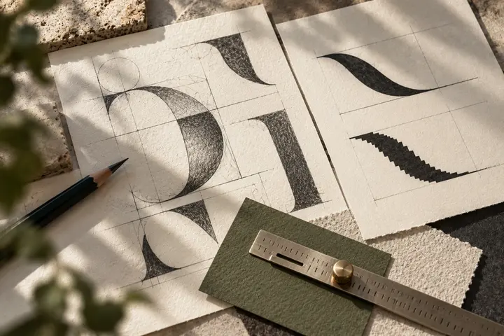
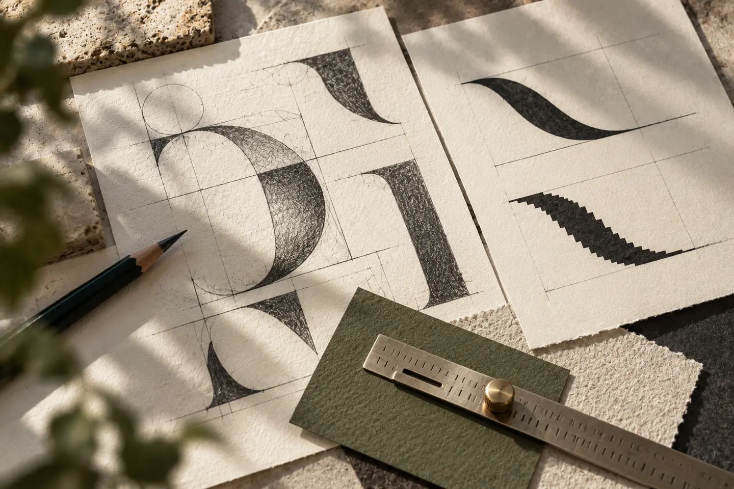
An open book is an accessible starting point, but many similar drawings may limit distinction. Explore a cut in the publisher’s initial, a compact printed block or an arrangement of two voids. The device need not depict a pen, bird and page at once. A clear silhouette can hold its character in a tiny cover corner. When a specific figure comes from one literary genre, consider whether it still represents the rest of the publishing programme. An emblem for poetry may feel oddly restrictive on a technical title.
Choose the rhythm of the name
Serif lettering is not compulsory for literature, and geometric lettering does not automatically signify contemporary publishing. Judge the actual name: its internal rhythm, open spaces and relationship with book title typography. A long name may place a publishing descriptor on another line. That solution fails if the descriptor becomes an unreadable hairline. Inspect Turkish dotted and dotless letters where relevant. A distinctive feature can live in a single letter while the remaining forms stay quiet. This gives the imprint character without making each word compete with a cover headline.
Let covers determine contrast
One coloured signature will not remain equally clear across every cover. Black and white versions can give designers more freedom while preserving the same geometry. A signature colour may take a larger role in catalogues, shipping labels and publisher announcements. Check the internal gaps of a reversed device over a dark photograph. Write a limited rule for colour selection instead of inventing a new logo treatment for each book. If foil is considered, compare it with flat ink so reflected light does not disguise weaknesses in the drawing.
Proof the spine and catalogue
The first trial places the symbol at a height of 6 millimetres on a hypothetical book spine. Review thin strokes and vertical spacing on an actual printed sample. The second shows the full signature at 120 pixels wide in a digital catalogue. Open that entry at normal display size. Rearrange the descriptor if the name is hard to read. These trials reveal different problems. The simplified spine device should not automatically replace the full name in every public context, where new readers may need a more explicit introduction.
Assess a hypothetical mixed list
Imagine an independent publisher producing essays, translated fiction and design books. A device derived from a cut rectangle could accompany restrained lettering. Series identities would vary across covers while the publisher mark stayed fixed. Bring three light and dark covers, a narrow spine, a catalogue entry and a monochrome shipping label to the review. The publisher should be identifiable in every example, with the book title retaining priority. This is an invented brief for visual discussion, not an account of an actual publisher or completed project.
Key takeaways
- Design a spine device rather than a miniature cover illustration.
- Resolve black and white versions before relying on a signature colour.
- Keep the publisher signature distinct from individual series identities.
Frequently asked questions
Must a publisher logo show a book?
No. A letter based or abstract device can work. Judge its distinction and clarity in the narrow spine application rather than by literal subject matter alone.
Can each series have a different logo?
A series can have its own identity, provided the main publisher signature retains a stable appearance and role across the catalogue.
Can foil be the primary version?
Foil is an application choice. Establish a drawing that works in flat single colour first; reflection cannot repair cramped letters or closed gaps.