In this article
Pilates studio logos often begin with a fine body outline, leaf or infinity symbol. Those choices may work, but they can disappear among familiar images when the studio name lacks a clear voice. The main question is not how accurately the logo depicts a movement. It is whether the same name stays readable on an entrance and a small booking screen. A calm interior does not require fragile lettering. These suggestions concern visual identity, rather than exercise technique or claims about health benefits.
Quick answer
Explore a logotype with open spaces and, where useful, a simple supporting device. A human figure or equipment illustration is optional. Trial fine strokes on real materials and inspect pale colours against glass and screens. Separate actual-size tests for entrance film and a mobile booking heading will show whether both applications preserve a recognisable name.
Question the body outline
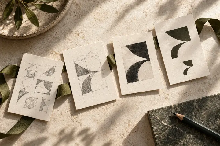
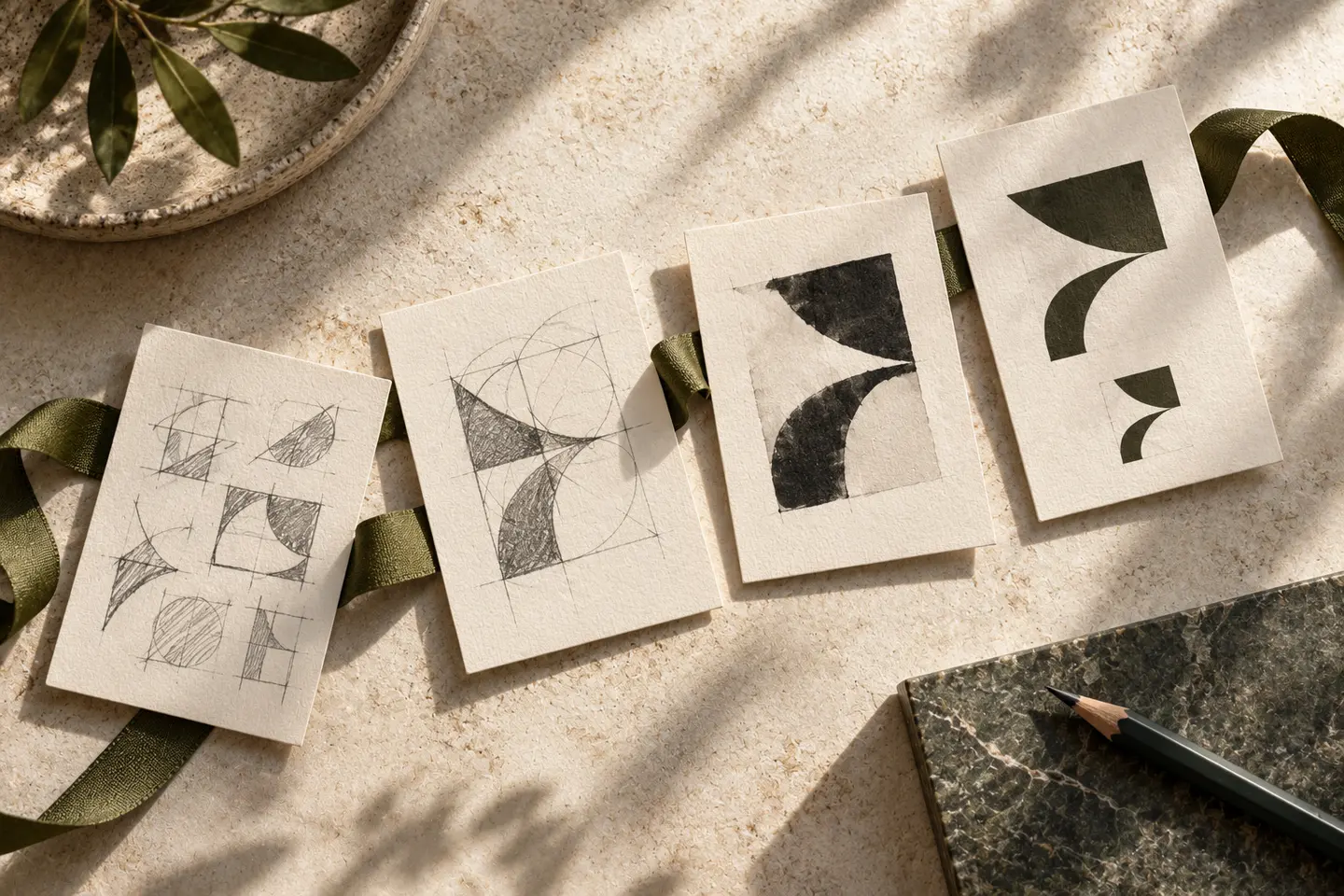
If a silhouette is proposed, consider whether it presents one body shape as an ideal. A single exercise position cannot describe every activity in the studio. An open space between two curves or a balanced cut in an initial may provide another direction. Abstraction alone does not make a mark distinctive; establish its relationship with the name. Explore different space proportions instead of adding a small leaf to a familiar infinity shape. Compare the alternatives without photography, in one colour and at small size before judging decorated presentations.
Distinguish lightness from clarity
A light type weight may set a quiet tone. If its strokes disappear in a physical sample, it is no longer doing that job effectively. Wide tracking can scatter a long studio name into individual letters. Develop several spacing options around the actual word rhythm. Give a Pilates descriptor enough room if it needs to sit below the name. Preserve Turkish dots and accents in customised lettering. A dotless letter should not become an anonymous dash, and a cedilla should not be clipped by the artwork boundary.
Choose colour beyond the interior
Beige and sage are possibilities rather than compulsory sector colours. A similarly pale logo may fade against a light studio wall. Compare a darker brown or deep navy version where appropriate. Colour on glass changes with the scene behind it, viewed from inside and outside. Prepare light and dark alternatives with those conditions in mind. A warm interior photograph does not oblige the whole identity to use pastels. Review daylight and evening examples so the decision reflects the entrance people actually encounter rather than one controlled image.
Test glass and the booking screen
For the first hypothetical trial, position a 240 millimetre wide paper template on the entrance glass. Examine the handle, sight lines and surrounding information, then inspect a small sample of the selected film. For the second, show the name at 112 pixels wide in a booking interface. If a delicate device disappears, consider simplification or a logotype only version. Preserve the same reading order in both settings. Check whether decorative dots or curves are mistaken for letters when the complete signature is viewed at normal size.
Imagine two working rooms
Consider a hypothetical studio with separate rooms for group classes and individual sessions. An open monogram and balanced lettering could be compared beside photographs of each space. Room names would belong in wayfinding headings rather than inside the logo. Approval would depend on a clear entrance name, a readable mobile heading and a consistent monochrome form. The identity should not promise pain relief or a particular physical transformation. All premises in this example are invented; the scenario illustrates visual decisions rather than describing an actual studio project.
Key takeaways
- Consider whom a body silhouette represents and whom it may exclude.
- Judge a light type weight through actual reading rather than delicacy alone.
- Test changing glass backgrounds separately from mobile screen contrast.
Frequently asked questions
Must the logo show a reformer?
No. Equipment imagery may narrow a broader studio identity. A clear letter device and approved service description offer another option.
Are pastel colours more suitable?
Not necessarily. Light walls and glass backgrounds may reduce contrast. Compare a darker version on the actual surface.
Can the mobile version omit the symbol?
A controlled logotype only version can work. Preserve letter shapes and proportions so readers still recognise the same studio name.