In this article
A fitness centre logo must remain visible among equipment, mirrors, directions and training photographs. Adding a muscular figure or lightning bolt does not solve that problem on its own. A single body type may narrow the identity of a centre serving people with different goals. Begin with the name and the places where the shared device appears. A small towel signature and a mobile booking heading reveal different weaknesses in the drawing. The subject here is visual communication, rather than exercise advice or promised physical results.
Quick answer
Explore readable lettering whose energy comes from controlled proportions. Equipment illustrations and body silhouettes are optional. A clear single colour device can adapt to varied surfaces. Preserve internal spaces in towel and small screen trials. Distinguish class types with secondary headings and colour panels rather than changing the main centre signature for every programme.
Translate strength into structure
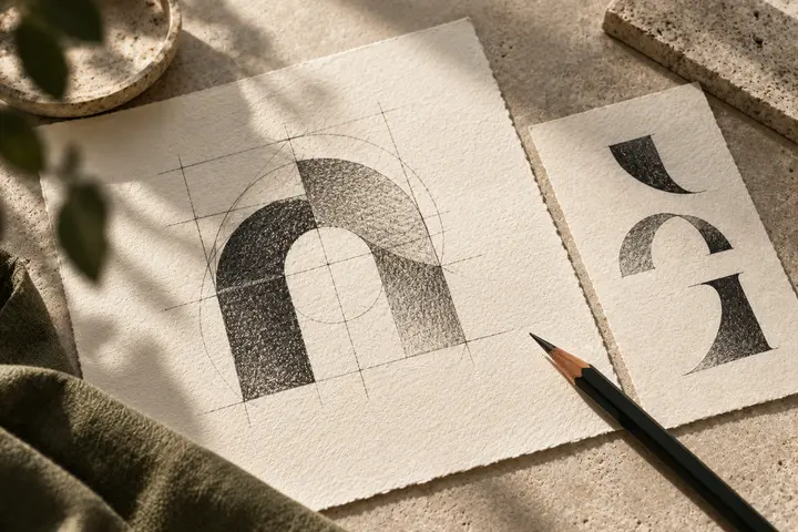
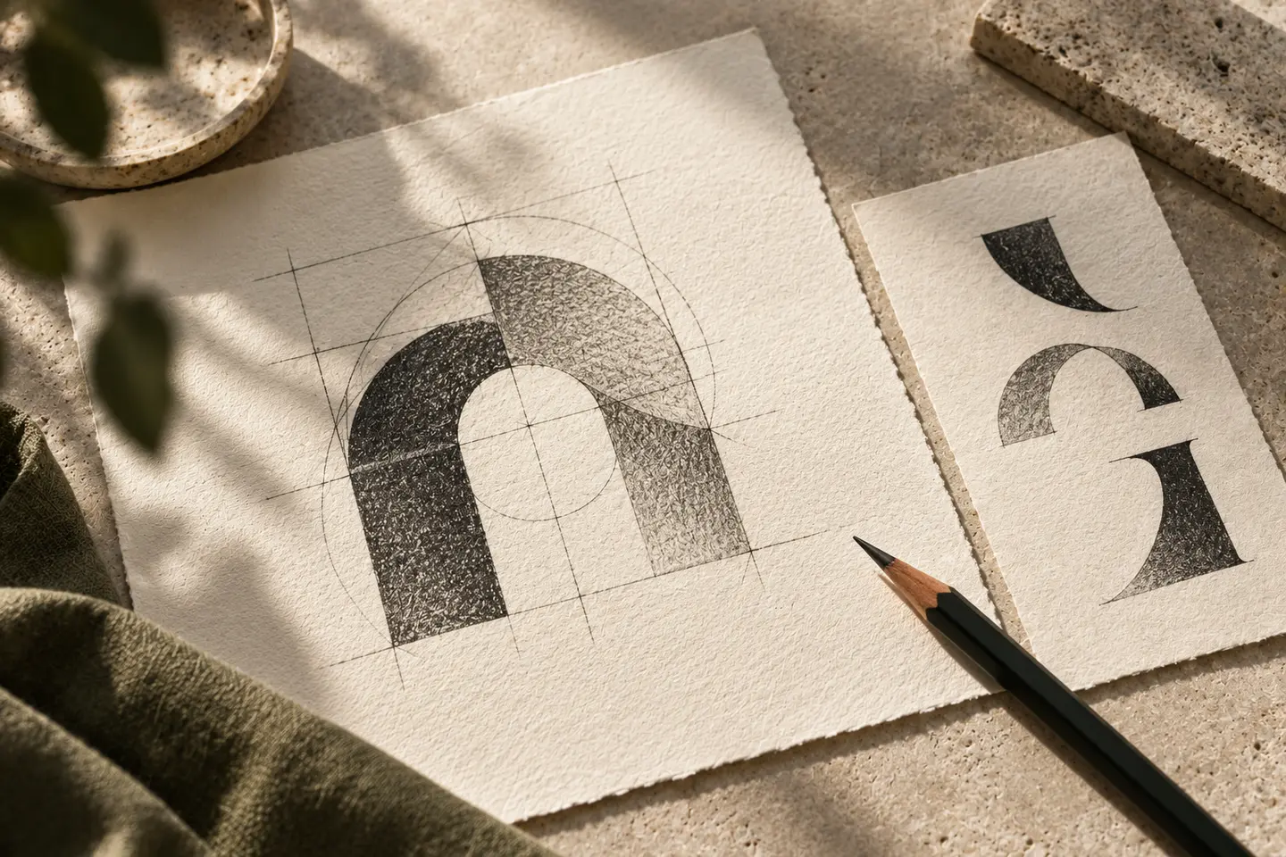
Heavy italic lettering offers one direction, but every centre need not resemble the same sports poster. Explore an open initial, two offset components or a balanced cut. Sharp tips may disappear in small applications. If a dumbbell is used, ask whether the centre now appears to offer only weight training. Compare the device beside several class posters. Strength can come from stable proportions and a firm outline without an aggressive figure. Remove decorative speed marks when they contribute little to recognising the actual name.
Read letters over mirrors
Lettering on a mirror competes with moving reflections. Hairline strokes and tiny interruptions can disappear there. Examine the most difficult letter pairs within the centre’s actual name. For a long name, try a stacked arrangement before shrinking the fitness descriptor further. A short mobile name should retain a clear relationship with the complete signature. Keep the slant of letters consistent, and preserve Turkish accents and dots where relevant. They should remain legible parts of the name rather than being absorbed into decorative motion streaks.
Contain the bright accent
Acid yellow, orange or red may provide an accent without creating the same response in every viewer. A darker primary colour and limited highlight can be more controlled beside busy training imagery. Filling every class poster with one bright colour may make different information difficult to distinguish. Compare light and dark signatures on photography, painted surfaces and fabric. An intense screen colour needs a physical sample before it becomes a production decision. Colour can support recognition, but cannot replace a readable name or repair a weak silhouette.
Proof a towel and booking header
For the first hypothetical trial, produce a woven or embroidered towel sample at 80 millimetres wide, according to the intended method. Examine how the pile affects internal gaps. For the second, show a 128 pixel wide signature beside menu and account controls in a mobile booking header. These dimensions belong to the exercise, not a universal production standard. If strokes that work on the towel look crude on screen, reconsider their shared geometry and weight. Approval based only on a large wall mockup leaves both everyday uses unresolved.
Imagine a mixed training centre
Consider a hypothetical centre with strength areas, group classes and individual training spaces. A letter formed from two open components could accompany balanced lettering. Programme titles would occupy separate information blocks at equal emphasis. Require a readable towel name, a contained mobile heading and a clear outline over a mirror. The identity should not promise a particular body shape or physical outcome. The operator should supply photographs and approved service descriptions. This invented scenario provides a design setting, not a claim about an actual client or training result.
Key takeaways
- Avoid reducing the centre to one piece of equipment or body type.
- Inspect counters and cuts against moving mirror imagery.
- Treat towel samples and mobile headers as separate reading conditions.
Frequently asked questions
Should the symbol include a dumbbell?
It can if the scope supports it. Where classes and other activities matter, compare a shared letter device as well.
Will bright colour make the logo stronger?
Not by itself. Review the monochrome name and silhouette with equal care before relying on a vivid accent.
Does a towel need another logo?
A controlled single colour version may be enough. Simplify disappearing details while preserving the main geometry and relationship with the full signature.