
Pharmacy Logo Design
A pharmacy name that stands apart from busy shelves
Read articleBOCW — DESIGN NOTES
Design decisions, practical guides and useful questions for your brand. Choose a category or search the whole library.
Explore articles ↘601–624 / 1029 articles
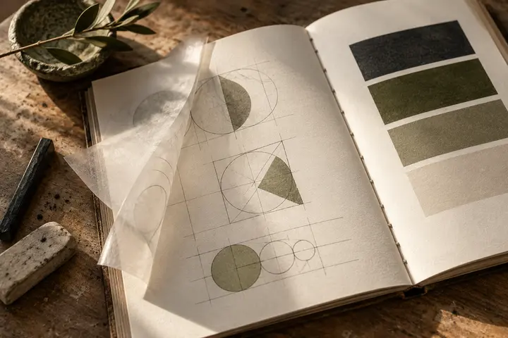
A pharmacy name that stands apart from busy shelves
Read article
Space and visual restraint in psychology practice identities
Read article
Nutrition identities beyond scales and tape measures
Read article
Expressing movement without a generic running figure
Read article
A corporate mark that accommodates varied medical products
Read article
Precise visual rhythm for medical laboratory identities
Read article
Frames, gaze and lettering in optical store identity
Read article
Waves, rhythm and readable names for hearing centres
Read article
Measured elegance and clear names for aesthetic clinics
Read article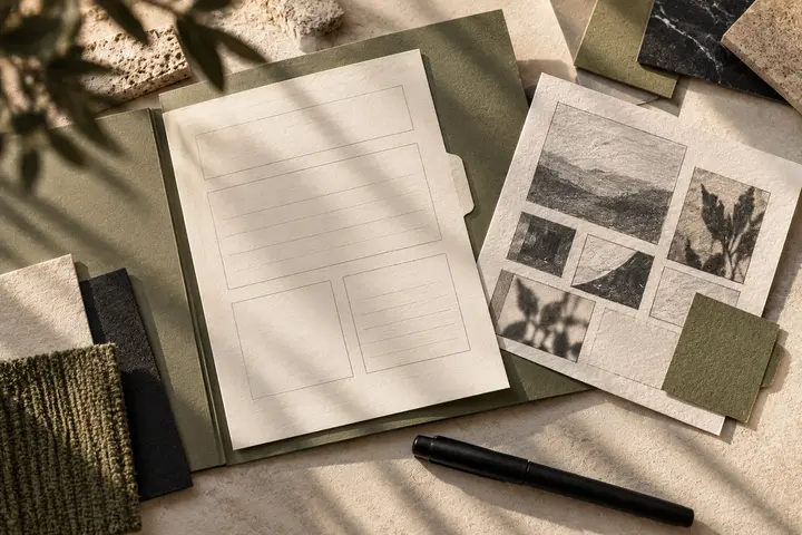
Expressing a beauty space through considered visual restraint
Read article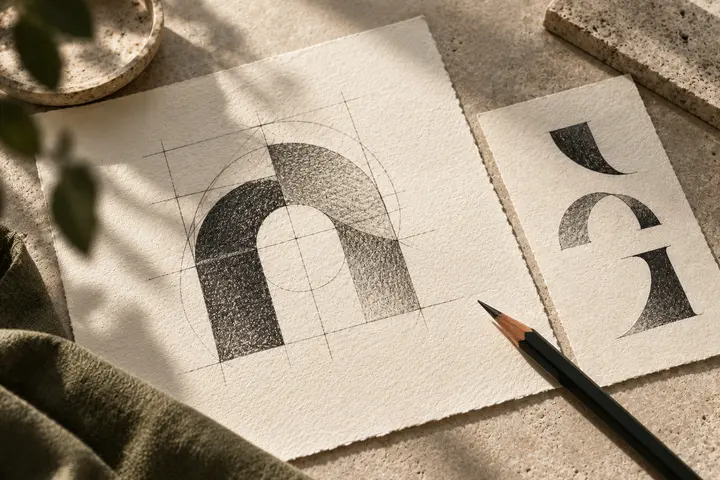
Turning hair movement into a readable salon identity
Read article
Balancing barbershop heritage with clear contemporary lettering
Read article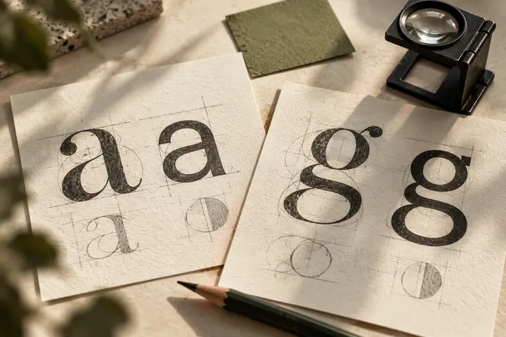
A cosmetics signature that holds different products together
Read article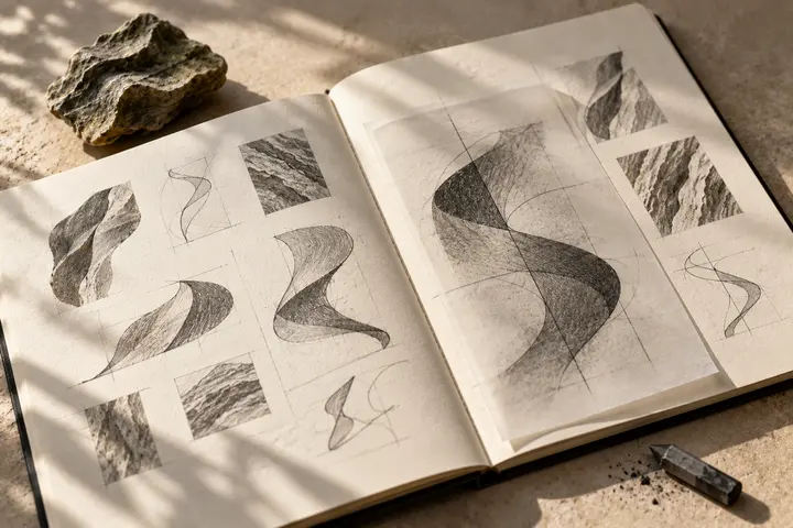
Giving fragrance a visual character without illustrating scent
Read article
A calm spatial identity that remains easy to read
Read articleBuilding a restaurant signature across menus and frontage
Read article
Taking a cafe’s daily rhythm from cup to window
Read articleA steady signature beside changing coffee information
Read articleBalancing patisserie elegance with dependable printed detail
Read articleOpen lettering and paper texture in bakery identity
Read articleOne recognisable signature across a varied dessert counter
Read articleA small chocolate signature with room for expression
Read articleA recognizable signature for lids, cones and counters
Read articlePreparing a doner shop mark for quick glances
Read articleNo matching articles. Try another term.