In this article
A physiotherapy centre does not have to illustrate movement with a running person. That motif can bring a sports club or racing event to mind more strongly than intended. Explore how direction, balance and controlled rhythm might establish the identity instead. The centre’s name and approved descriptor provide the stable information layer. A symbol can create a particular sense of movement without presenting one athletic body as a universal representation of the people who use the service. Its character should also survive practical changes of surface.
Quick answer
Investigate movement through line direction, balanced forms and the spaces between them. If using a human figure, favour an understandable silhouette over detail. Evaluate the name independently from slanted sports lettering. Trials on a wall, staff clothing and an exercise sheet should demonstrate a consistent character. The logo’s visual energy should not imply a guaranteed treatment result or improvement in mobility.
Locate movement within the line itself
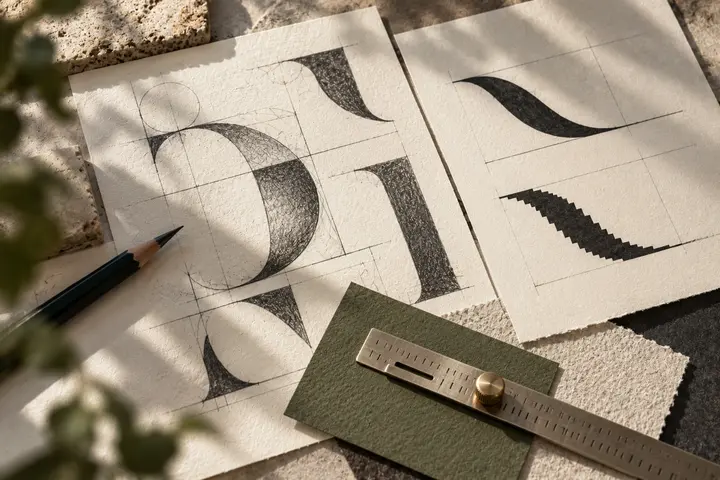
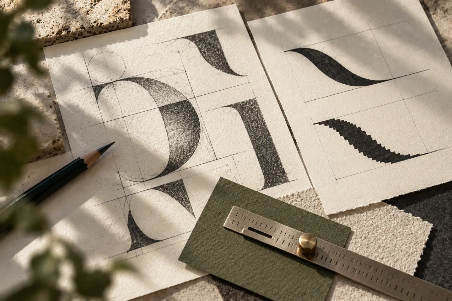
Two rising lines can suggest energy, but their meaning is not identical for everyone. Inspect where a stroke begins and ends. Does a sharp turn or a gradual change in direction better suit the intended tone? A segmented spine like motif may lose its gaps at small sizes. Simplification is not merely deleting components: clarifying the flow and outer contour can also make a drawing more resilient. Judge the form as an intentional whole before attaching an explanation to every component.
Choose the posture deliberately
A figure with open arms is recognisable and also widely familiar. Proportions, head size and the relationship to the ground can give it a more individual character. An extreme running lean may overemphasise performance. A balanced stance or a relationship between two abstract components can establish a different tone. Do not present the depicted body as a medical explanation. Its posture is a compositional choice within the institution’s identity, and its usefulness depends on how clearly it supports that identity.
Slanted lettering is only one kind of energy
Italic capitals can suggest speed, although a movement related service need not appear fast. Upright lettering with open shapes can support a dynamic emblem effectively. Tight spacing is particularly troublesome in a long centre name. Keep the physiotherapy descriptor connected to the name without merging them. If the symbol already moves strongly to the right, leaning the lettering in the same direction may create excessive momentum. Holding one component steady can make the other component’s movement easier to appreciate.
Compare clothing, sheets and walls
A large emblem on a staff shirt does not establish whether a small chest arrangement will work. Test both. On an exercise sheet, reserve a signature area so that diagrams and numbered instructions do not compete with the logo. Include nearby equipment in an interior wall simulation instead of showing only an empty surface. A bright accent can contribute energy but should not overpower the sheet’s explanatory text. Monochrome trials reveal how much character the line itself carries independently of colour.
A hypothetical direction built around controlled flow
Compare an open symbol drawn from one continuous line with an initial formed from two balanced components. If one looks stronger on the wall and the other on clothing, revisit both across all three surfaces. Increase line weight if the first disappears on the sheet. Adjust the direction between components if the second feels excessively static. Prefer a coherent identity that stays recognisable and considered in use, rather than the sketch that depicts the most dramatic movement at a large presentation scale.
Key takeaways
- Explore movement beyond a running silhouette.
- Assess the combined momentum of slanted lettering and symbols.
- Give explanatory information its own space on exercise sheets.
Frequently asked questions
Can a spine motif work?
Yes, while considering whether small segments merge and whether the image narrows the perceived scope of the centre.
Must the logo look athletic?
No. More restrained lines and balanced abstract forms can also communicate a considered sense of movement.
Are fine lines more elegant?
They may appear so at large sizes. Their visibility on small printed sheets and clothing still needs separate assessment.