In this article
A patisserie logo carries the same name on an unopened gift box and a small display label. If refinement becomes a reason to make every line fragile, the identity may disappear on everyday surfaces. Choosing heavy lettering alone does not establish a particular character either. Consider the curves of the letters, the empty area on the box and the supporting palette together. The aim is to create a recognisable signature that can accommodate different products, rather than turn every pastry into a decorative symbol.
Quick answer
Elegance in a patisserie logo comes from the balance of line and space, rather than the number of details. Begin with a readable name, selective ornament and a mark that works in one colour. Compare the generous box lid layout with small printing on a cake board. Script or a monogram should also make sense to someone encountering the name for the first time.
Look beyond a swirl of icing
Piping bags, crowns and cake silhouettes are familiar starting points, but none is required. A particular letter pair in the name, the meeting of sharp and soft strokes or an opening in a frame may offer a more individual direction. Give either the symbol or the lettering priority instead of decorating both equally. An elaborate symbol may need a quieter name. A restrained wordmark can leave room for a livelier packaging pattern. The logo does not have to generate every part of the decoration by itself.
Preserve reading within flowing lettering
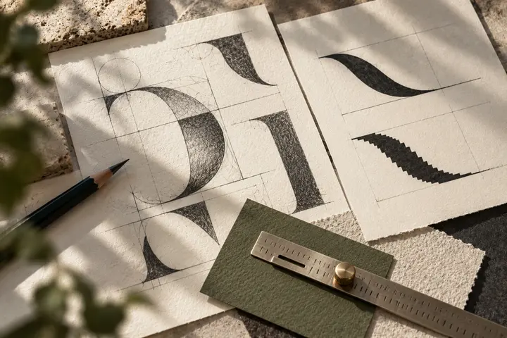
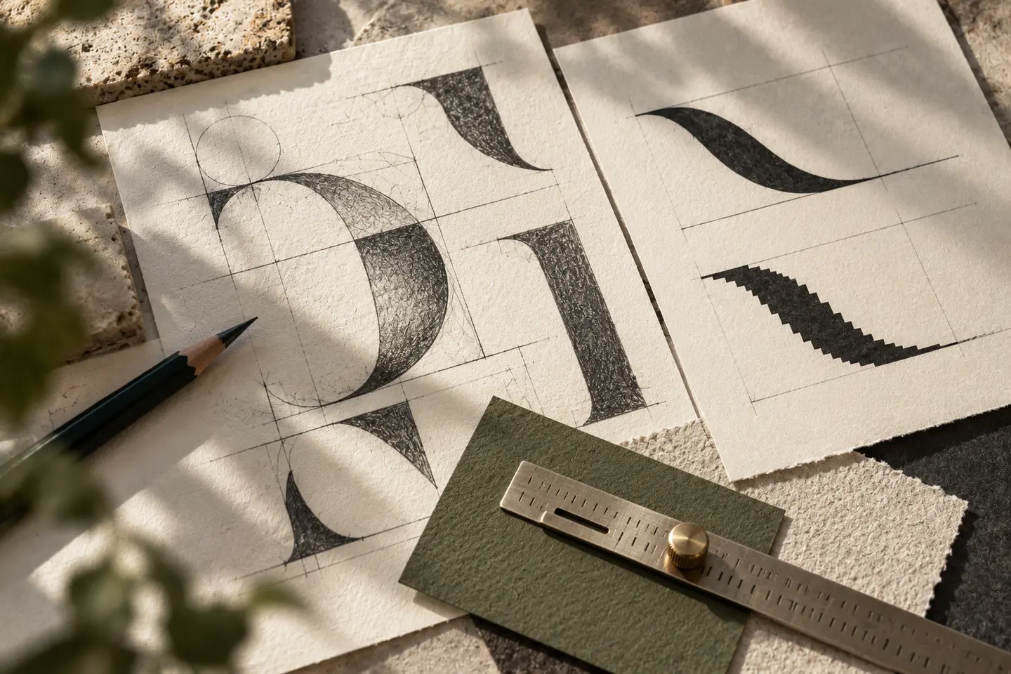
A flowing script can lend ceremony to a box. Long joins and sweeping descenders can also touch neighbouring letters until the name becomes uncertain. Show it briefly and ask how it reads. Draw a second version with fewer flourishes and compare recognition as well as appearance. Review every character used in the real name, including dotted and undotted Turkish letters where needed. A supporting descriptor need not repeat the movement of the signature. Plain secondary type can reveal the main lettering’s personality more clearly.
Make the name visible among soft colours
Cream lettering on pale pink may appear gentle while proving difficult to distinguish on a small label. Try pairing pastel surfaces with a darker ink. Where product photography is already colourful, a quieter pack can provide balance. Instead of recolouring the logo for chocolate and fruit products, vary the surrounding graphics. Prepare full colour, dark single colour and light single colour versions together. Even when embossing or glossy finishes are being considered, an initial review in flat printing helps reveal whether the underlying form is sufficiently clear.
Test a box lid and a small cake board
For the first prototype, place a logo 65 millimetres wide on a box lid measuring 180 millimetres across. Consider the empty centre area as well as the size of the name. For the second, print a signature 24 millimetres wide on a small cake board. Develop a simpler version if fine strokes vanish or connected letters turn into a single patch. These are comparison sizes for the draft. Review physical samples without screen enlargement, and account for the area that the cake itself will cover.
A hypothetical everyday and celebration range
This hypothetical brief concerns a patisserie offering small daily treats and celebration cakes under one name. The identity should suit a plain shopping bag and a special presentation box. Compare widely spaced serif lettering with a controlled script route. Show both on the same box colour so that attractive materials do not decide the review by themselves. Acceptance should include reading the full name, distinguishing the monogram from the box pattern and retaining line integrity on small cake boards. Any dates or heritage statements should use information verified by the business.
Key takeaways
- Do not equate refinement with an abundance of fine lines.
- Balance expressive main lettering with calm supporting typography.
- Review the box lid and cake board as a pair.
Frequently asked questions
Must a patisserie logo be ornate?
No. Restrained lettering can feel considered through spacing and proportion. Ornament is useful when it contributes character while preserving a clear reading of the name.
Can a monogram replace the full name?
It can support small applications. First encounters still need the full name, and the identity system should define where the monogram can appear independently.
How can pastel colours remain readable?
Create a noticeable lightness difference between the lettering and background. Print a real small label and assess it beside colourful products rather than on an isolated screen.