In this article
The main challenge for a hair salon logo is distinguishing the salon’s attitude, beyond simply announcing a connection with hair. Sharp geometry, a loose brush trace and carefully drawn lettering suggest different experiences. The appropriate direction depends on the interior, photographic style and way the services are described. Scissors provide a quick category cue, yet a widely used symbol can make the name harder to remember. A considered identity keeps the salon name visible among all the decorative movement around it.
Quick answer
Begin a hair salon logo with the structure of the name, adding a symbol for hair movement or cutting only when it contributes something useful. Curves and lettering should share a compatible rhythm. Readability on the glazed frontage, clarity on an appointment card and a convincing single colour apron application provide practical grounds for choosing the design.
Alternatives to the familiar scissors
Open scissors can create a lively angle, although a heavy joint between the handles may make the emblem look congested. A lock of hair reduced to one curve offers a quieter alternative. At a small size, that curve should still appear intentional rather than like an arbitrary flourish. A lettering only logo is also a valid choice. Photography and a short descriptor can explain the category while the shape of the name supplies recognition.
Suggesting a cut through letter structure
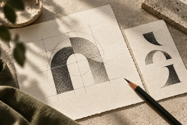
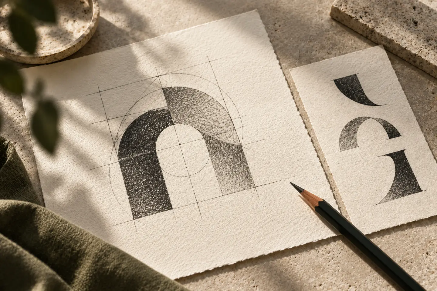
Sharpening one letter terminal can suggest cutting without depicting a tool. The same intervention does not need to appear throughout the alphabet. A single change can be stronger when the rest of the composition remains calm. Tight spacing may hinder reading on a crowded frontage, whereas excessive spacing can break a short name into isolated pieces. Compare uppercase and lowercase versions, checking that dots and accents do not collide with any added hair contours.
Colour inside a reflective interior
Mirrors and polished surfaces affect how a logo on the salon wall is perceived. Do not select colour solely against a white screen. Dark matt lettering on a pale wall may provide a calmer reading than reflective chrome. If an accent competes with the colours in hairstyle photographs, reduce the area it occupies. Black is optional: a deep blue or warm dark grey can also connect the identity to the character of the room.
Reading the salon name at two distances
For the first actual size trial, print the name 24 millimetres wide on an appointment card. Add the date and time fields to judge whether the logo has enough separation. Next, prepare a 70 centimetre frontage arrangement and view it with the posters visible behind the glass. The silhouette of the complete name matters more here than tiny holes in a scissors drawing. Test both applications in one colour so recognition does not depend on a coloured detail.
A hypothetical cutting studio direction
Consider a hypothetical cutting studio with a short name and close photographs of its work. Because those photographs already contain movement, explore steady lettering with one angled terminal. A social profile symbol could derive from the initial. Acceptance requires a name that reads immediately, a consistent method for protecting it over photographs and an apron application that retains the same drawing as the frontage. Different hairstyles belong in the imagery rather than being collected inside the logo.
Key takeaways
- Balance the category clarity of scissors against their limited distinctiveness.
- Keep lettering calmer when the hair photography already carries movement.
- Review reflective interiors and poster filled windows in their actual context.
Frequently asked questions
Must a salon logo include scissors?
No. A descriptor can explain the category, allowing distinctive lettering to place more emphasis on the salon name.
Is script lettering suitable?
It can be if the name remains clear. Check overlapping loops on an actual appointment card before approving the direction.
How should the logo sit over photographs?
Use a quiet area or a defined background treatment. Inventing a new logo colour for every photograph weakens visual continuity.