In this article
A cafe identity is often seen in motion. One customer turns a takeaway cup while another reads the name through a window from the pavement. These moments place different demands on the same drawing. Cafe logo design therefore starts beyond a pleasant picture of a cup. Consider the sound of the name, the atmosphere of the seating area and the surfaces used for takeaway service. A welcoming identity can express warmth without making every letter round or adding decorative steam.
Quick answer
The central task is to combine an approachable character with quick recognition. A distinctive wordmark may be sufficient. Examine curved cup placement, changing backgrounds behind glass and the profile avatar separately. If a bean or cup appears, it should not displace the name. Keep enough internal space for the lettering to retain its character in small, simple printing.
Draw the cafe’s behaviour
A cafe may stand for quiet work, a quick standing break or a neighbourhood gathering. Each suggests a different rhythm. A name associated with short stops might support lively, close lettering. A place for lingering may suit a more open composition. Do not let the mood override reading, though. If the word becomes too dense or disconnected, adjust it. A chair detail, window shape or particular letter relationship can provide a starting point for a symbol just as readily as a coffee cup.
Space the letters around a cup
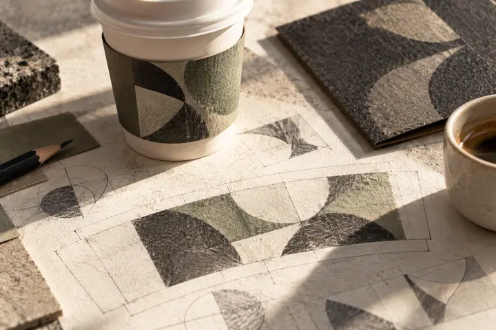
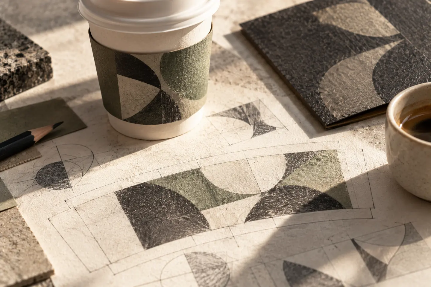
A long wordmark that looks balanced on flat paper can disappear around both sides of a cup. Decide whether the whole name must be visible in one glance. Keeping the main signature on the front and allowing a supporting pattern to wrap around is one option. For script lettering, read similar characters separately. Hurried joins may obscure the syllables of the name. A distinctive initial followed by quieter letters can create personality without requiring every character to perform a different visual trick.
Consider both sides of the window
Dark green on cream may be an attractive beginning, but not every cafe surface is cream. Seating and passing traffic change the background behind glass. Review solid white and dark versions for transparent applications. A cup lid, sleeve and stamp may also present different colour densities. Rather than expanding the palette immediately, define how one principal colour relates to light and dark surfaces. Seasonal drink graphics can vary around a steady signature without forcing the logo to change colour each month.
Try one mark in the hand and one on screen
Place a logo 50 millimetres wide on an actual takeaway cup for the first trial. Rotate the cup on the table and while holding it. Note whether its seam splits the name and which letters fingers cover. Then prepare a profile image at 40 pixels square. If the full name becomes too small, try a compact letter mark. Both should share a corner treatment or stroke character. These are exploratory trial sizes; the actual cup and interface determine final dimensions.
A hypothetical morning window
Imagine a small cafe in a narrow street with a strong morning takeaway emphasis. This is a hypothetical brief. Its identity needs visibility from outside without dominating quiet work tables. Compare broad lowercase lettering with a single line of capitals on the same window photograph and plain cup. Acceptance should include reading without tilting the cup, open letter counters in a stamp and a useful single colour symbol. Ask someone unfamiliar with the proposed name to read the first trial before explaining its intended pronunciation.
Key takeaways
- Introduce the cup curve early in the design review.
- Prepare window versions for changing backgrounds.
- Derive the compact mark from the main lettering’s character.
Frequently asked questions
Can a cafe use a handwritten logo?
Yes, when the name remains clear. Check that joins do not close in small printing, and avoid expecting handwriting alone to create a welcoming atmosphere.
Will the category be clear without a coffee bean?
The name, menu and premises provide context together. A logo does not need to explain everything by itself; distinctive lettering may be enough.
Which colour should window lettering use?
Compare white and dark versions against the actual interior furniture and bright street. A decision made against one empty background may miss the real conditions.