In this article
A customs brokerage identity often appears beside documents filled with headings, references and institutional names. Its first visual task is to identify the brokerage clearly and remain distinct from the document structure. Circular text resembling an official seal, or figures suggesting state authority, can complicate that task. Calmer lettering and an original connection shape may be enough to establish the firm’s own identity. This discussion concerns form, colour and document placement; it does not provide advice about regulations, customs procedures or the outcome of any transaction.
Quick answer
Design a clear name hierarchy, a restrained symbol and a strong single colour counterpart. Avoid making the main identity resemble a public authority seal. Give the full business description a separate line where required. Actual size prints in a document header and on a folder spine label reveal how long names and small details behave in practical layouts.
Relate the short name to the full description
When a short business name and full description share the same weight, the logo can become a block of text. Decide which name functions as the main brand first. Prepare a separate line for applications requiring the full wording. Making that line too small to read is not a solution; it needs appropriate space and length. Serif and plain type offer different characters, but both can suffer from tight spacing. Examine adjacent capital letters and Turkish marks in a physical print.
Choose an original junction rather than a seal
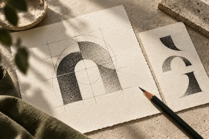
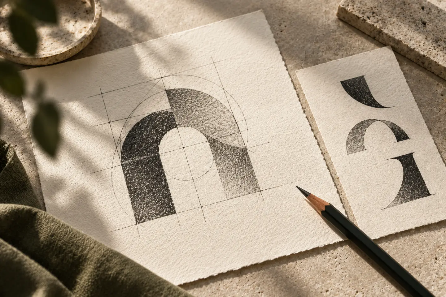
A frame, meeting planes or an open monogram from initials can provide a starting shape. A circular boundary is not inherently problematic, but stars and dense surrounding text can strengthen an official seal association. Check that the symbol remains distinct from other approval areas on the document. If a bridge or passage informs the concept, use a few broad pieces instead of a detailed architectural illustration. This helps preserve the shape on a small folder label while keeping the identity attached to its name.
Balance dark colours with clear detail
Deep green, navy and warm grey offer different visual directions; none is a mandatory professional colour. If a metallic effect accompanies a dark tone, show a flat single colour equivalent too. A glossy gold screen effect can disappear in a black document copy. The drawing should therefore work without colour shifts or shadows. Fine lettering that feels weak on white paper may need greater weight. Generous space on a folder cover can provide formality without adding decorative complexity to the mark.
Proof a document header and folder spine
For the first trial, print the logo 36 millimetres wide in black in an example document header. Include a representative reference number and title. The second trial is a compact arrangement for a 45 millimetre wide folder spine label. Show the necessary full name lines in both samples. Check merged details, descriptor reading and separation from approval areas. If the folder label feels too narrow, use a designed vertical arrangement instead of squeezing the letters until the word loses its normal proportions.
Approve a hypothetical brokerage identity
Imagine a brokerage using one identity across documents and customer presentations. Its brief asks for a clear, orderly and neutral character. Present a document header, folder label and meeting folder together. Base acceptance on clarity of the business name rather than an attempt to appear official. Do not describe the logo as a promise of authority or transaction results. The final set should contain full and short arrangements, black printing and a dark background version, with positions for variable document information shown separately.
Key takeaways
- Do not give the full description the same density as the main name.
- Assess official seal associations beside other document markings.
- Prepare a compact folder spine arrangement instead of compressing letters.
Frequently asked questions
Can a customs brokerage logo be circular?
A circular form can be considered, but assess possible confusion with public authority or approval seals. If stars and surrounding descriptions strengthen that association, explore a more open construction.
Must the full name always sit in the same place?
The primary name can stay consistent while full wording receives arrangements for different surfaces. Show the relationship between short and full versions in the guide rather than removing text arbitrarily.
Is metallic colour necessary for a professional appearance?
No. A balanced flat colour wordmark can be strong. Even when a metallic application is selected, the same underlying shape should remain effective in a black document print.