In this article
A logistics logo can suggest movement across a long vehicle, yet the same name also needs to remain recognisable on dispatch paperwork and a small tracking header. Arrows pointing in every direction or a globe illustration do not automatically solve that task. A useful direction makes the company name a stable visual centre across different transport surfaces. This discussion makes no claim about network coverage, delivery times or capacity. It addresses the relationship between large applications and the smaller screens and documents used in daily communication.
Quick answer
Develop a wordmark that feels firm on horizontal surfaces while retaining open letters in small documents. One controlled shape or a deliberate letter opening may communicate direction sufficiently. Include body divisions in the vehicle layout. An actual size trailer section and a small dispatch document print turn the visual decision into something that can be assessed directly.
Handle long names on long vehicles
A broad surface is not a reason to spread the letters indefinitely. Excess spacing can make the name appear as separate signs rather than a single word. Start with moderately wide type and examine the rhythm of repeated verticals. Put a long business description below the primary name. Supporting lines in different languages need a readable secondary hierarchy rather than an imitation of the main letter height. Keep the primary name in the same proportions across vehicles instead of stretching it to fill available space.
Suggest direction without an arrow collection
A route symbol may not need numerous stops and intersections. A starting point and a clear movement can provide enough visual information. A broad angle emerging from a letter counter offers another direction. Check the symbol on both sides of the vehicle. Mirroring it to balance a composition can split one identity into two different drawings. Preserve the artwork and adjust position or text alignment instead. The purpose is a consistent recognisable sign, not a literal illustration of every journey.
Remain recognisable across body colours
A bright accent on navy and dark lettering on a light body can suit different fleet surfaces. Producing a new palette for each vehicle would fragment the identity. Define light background, dark background and single colour versions in advance. Review examples including dirt, shadow and door lines. Strengthening a solid colour area can be cleaner than adding delicate outlines. The tracking header should retain the same colour logic while leaving operational status messages enough visual space to be understood.
Print a trailer section and dispatch sheet
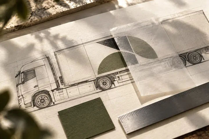
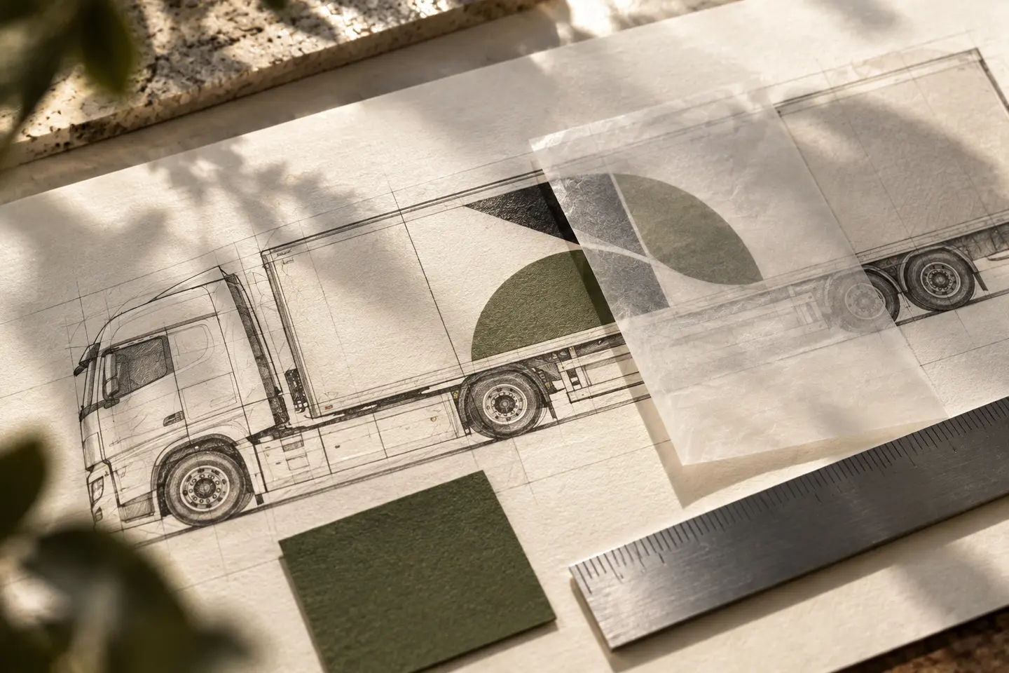
For the first trial, print a logo bearing section 900 millimetres wide and place it on an example containing a vertical trailer join. This reveals physical edge relationships that a reduced full vehicle mockup can hide. For the second trial, print the mark 30 millimetres wide on a dispatch sheet containing a table and reference number. The large proof tests continuity of the name; the small one tests letter openings. Both should retain the same character before the design is accepted.
Resolve a hypothetical fleet brief
Imagine a road transport business bringing its vehicles and documents into one visual system. A horizontal primary arrangement and a compact counterpart for narrow screens could answer the brief. Review the trailer section, driver folder and mobile tracking header together. Avoid drawing unsupported coverage onto a map to imply a service network. The mark remains a signature beside operational information. The artwork package should explain surface placement without turning unverified service claims into reasons for the visual design.
Key takeaways
- Do not expand the word unnecessarily to fill a horizontal panel.
- Preserve the original symbol direction on both vehicle sides.
- Test a trailer section and small dispatch sheet at their intended sizes.
Frequently asked questions
Does a logistics logo need a globe?
No. A globe can introduce unintended assumptions about network coverage. A letter based mark or directional geometry can establish a more specific identity with a clearer visual boundary.
Can every vehicle have a different logo colour?
A limited set of defined colour versions is more consistent for the core identity. Different body colours should use an appropriate background version rather than prompting arbitrary recolouring of the artwork.
Can the logo be mirrored on a vehicle?
If its symbol has direction, mirroring creates another mark. Left and right layouts should use the same drawing, with balance achieved through placement and text alignment instead.