In this article
A business card must fit more than a wallet. Names, contact details, languages and production methods all compete for a small surface. A useful card makes the organisation recognisable and the person easy to contact after a meeting. This guide connects format decisions with a production file and a physical paper sample, rather than judging the design only on a large screen.
Quick answer
There is no universal mandatory business card size. Agree the finished format with the printer, create the document at that trim size and confirm the required bleed. Keep important information within a safe area. Select the paper and finishing process using a physical, actual-size proof that also tests whether the smallest details remain readable.
Choose the format around the content
Do not choose orientation from the shape of the logo alone. Place the longest staff name, job title, telephone number and website into a trial layout first. A second language may deserve another face or a separate edition. Ask the printer for its standard formats before specifying a custom cut. Unusual dimensions can affect finishing, packing and cost. Removing unnecessary social accounts often improves readability more effectively than simply enlarging the card.
Separate trim, bleed and safe areas
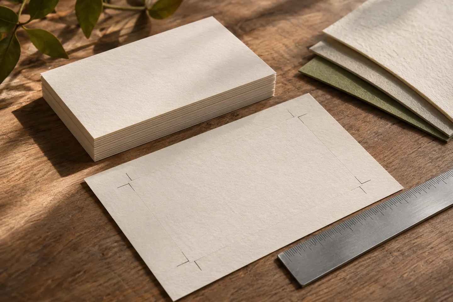
The trim line defines the finished edge. Bleed extends backgrounds beyond that edge, while the safe area keeps essential information away from cutting tolerances. Confusing these boundaries can produce white edges or cramped text. Use the printer’s template to establish the required distances rather than assuming a value. Thin decorative frames make small trimming differences more visible and deserve particular attention. Check that construction guides will not accidentally appear in the exported artwork.
Evaluate paper as a physical material
Weight does not fully describe how substantial a card feels; bulk and surface matter too. Uncoated stock may suit a tactile identity, but small type and dark areas need a physical test. Choose foil, varnish or embossing for a clear purpose rather than applying every available effect. A card intended for handwritten notes must retain a writable area. Comparing two printed paper samples can reveal more than repeatedly adjusting a colour on screen.
Match the file to the production method
Label the orientation of both faces and prepare fonts, colour definitions and finishing layers to the printer’s specification. Foil, cutting and embossing instructions should be distinguishable from normal artwork. Test any QR code at printed size with different phones and verify its destination. Include the employee, language and revision in the filename. Confirm that the approved PDF and editable source belong to the same revision, especially when multiple staff cards are produced together.
Proof a realistic staff scenario
For example, prepare cards for a salesperson with a long surname and a manager with a short one. Define acceptable line breaks instead of changing the name size arbitrarily for each person. Examine samples on a desk, in the hand and at a normal reading distance. Asking someone to read the telephone number aloud is a simple practical test. Each employee should verify their own details. Record the final revision, quantity and approving person before production.
Key takeaways
- Test the format with real names and contact information.
- Confirm bleed and safe areas with the printer’s template.
- Approve stock and readability from an actual-size proof.
Frequently asked questions
Should a card be double-sided?
It depends on the content. Another face can accommodate a language or service description, but leaving space can be intentional too. Repeating every detail on both sides is rarely necessary.
Can a QR code replace contact information?
Keeping a readable phone number and website makes the card useful without scanning or connectivity. Test the code’s clear margin and printed scan performance separately from its appearance on screen.
Will screen colours match the print?
Screens, paper and printing processes produce different appearances. For critical brand colours, agree a production target and review a physical sample instead of approving colour from a phone display alone.