In this article
Letterhead is more than a fixed image containing a logo and address. Staff add text, tables and additional pages. A design that looks attractive as an empty sheet is therefore not enough. This guide considers the different requirements of printed stationery and digital templates together. The objective is a recognisable document system that supports everyday correspondence rather than making employees work around decorative artwork.
Quick answer
Identify whether the document will use preprinted stock, a Word template or a digital PDF. Separate brand and contact areas from editable body content. Test the first and continuation pages with real text. Review printer limitations, opening on different computers and PDF export independently. A screen presentation alone does not establish that the template is ready for routine use.
Separate paper stationery from the digital template
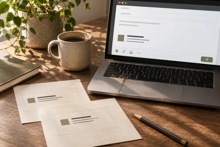
Preprinted stationery and a Word document printed in the office require different workflows. Brand elements are already on the paper in one case; in the other, the printer may output identity and body text together. Adding artwork without choosing the workflow can cause duplication or unnecessary colour use. List print artwork, editable templates and sample PDFs as distinct deliveries, each labelled for its intended purpose.
Build the body area around realistic content
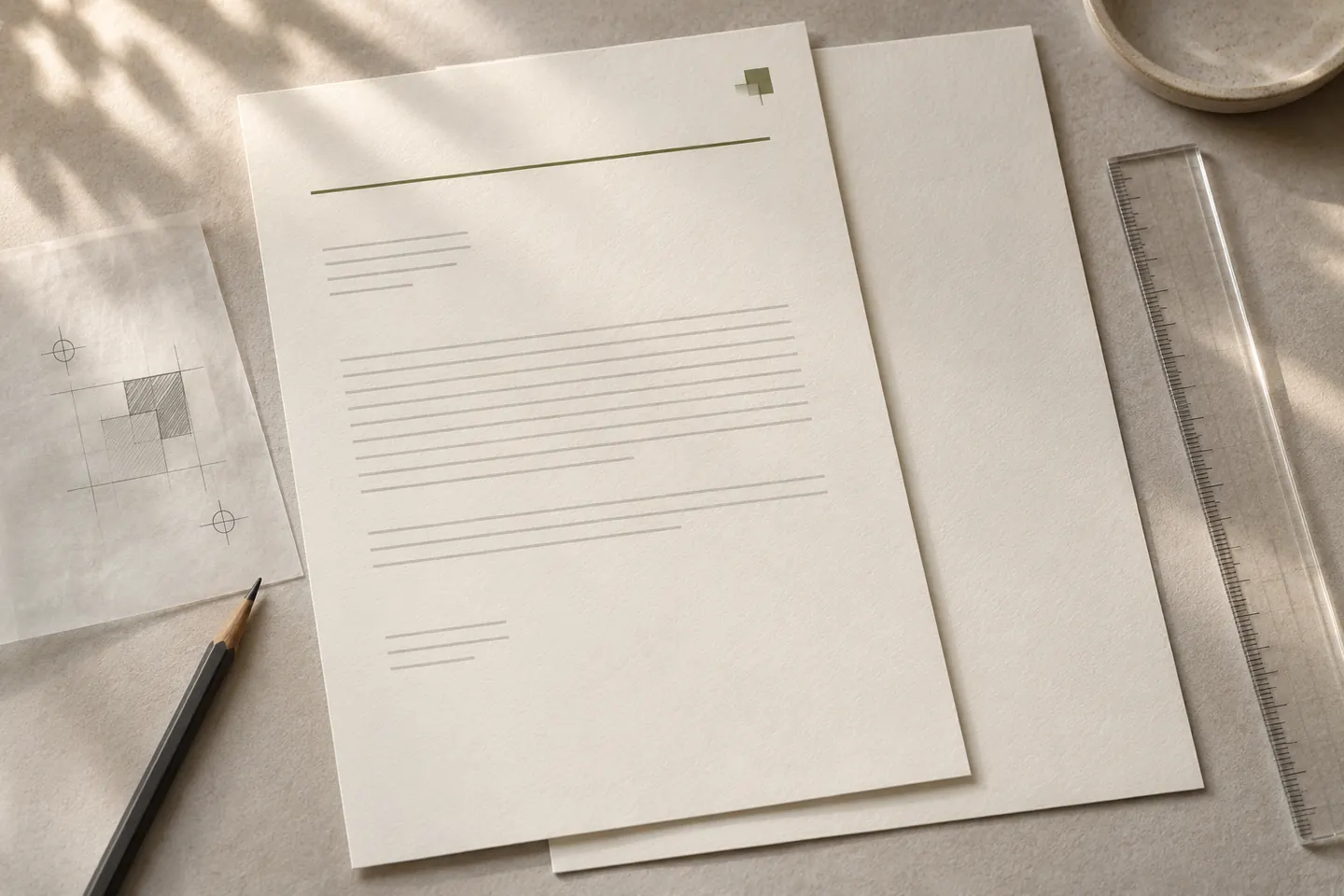
A long company letter reveals needs that a short announcement does not. Test date, subject, salutation, sign-off and any tables in one sample. Excessive logo space can force ordinary correspondence onto unnecessary pages. Consider margins alongside content density and output conditions rather than appearance alone. The approval owner should review realistic staff documents, not just the empty first page of a presentation.
Separate headers and footers from body editing
Word supports text and images in headers and footers. Placing the identity frame in that structure can make body editing easier, but first-page and section behaviour still need checking for the actual document. Pasting an image arbitrarily into the body can make its position change as text grows. Explain where fixed elements and editable information belong in a short usage note supplied with the template.
Test continuation pages separately
A prominent first-page identity area may give way to a quieter continuation layout, or the same arrangement may continue. Choose according to use. Check body text near the footer, table breaks and page numbering. Duplicating a one-page mockup does not test real document flow. A hypothetical proposal containing two pages and a table can reveal template problems that remain hidden in a short visual sample.
Finish with PDF and printer review
Save and reopen the document, test another computer and examine the exported PDF. Font availability, image clarity and links may differ. Do not assume an office printer supports edge-to-edge output; artwork intended for commercial printing can behave differently. Confirm approved company details, keep a dated master and provide both a blank template and a correctly completed example so that staff understand the intended workflow.
Key takeaways
- Separate print artwork from everyday templates.
- Test first and continuation pages with real content.
- Review PDF export and printer output separately.
Frequently asked questions
Can letterhead be delivered only as PDF?
It depends on use. Staff who add text may also need an editable template. A PDF prepared for printing and an everyday correspondence template should not be treated as identical deliverables.
Must every page have the same artwork?
Not necessarily. First and continuation pages can suit different information densities. They should still belong to one identity and work correctly throughout a multipage document.
What if the logo moves as I type?
Review the image’s placement and relevant header or positioning setup. Retest with realistic body text and tables instead of judging whether it looks correct on an empty page.