In this article
A business does not meet its customers on one surface alone. It may first be noticed through advertising, examined through a website, assessed through a proposal, experienced through packaging and remembered through the response to a question. Being a brand means these encounters support a recognisable shared idea. Design makes that continuity visible, while actual business behaviour gives substance to the promise. A distinctive logo or campaign is therefore only one part of the work. Rather than repeating the steps for founding a new brand, this comprehensive guide examines how an established or growing business can manage its touchpoints as a connected experience.
Quick answer
Being a brand means aligning identity, communication and service behaviour so customers can recognise the business, understand its offer and encounter a consistent experience. The logo supports recognition, corporate identity organises applications, campaigns communicate a particular message and the website provides information and a route to action. Lasting coherence depends on these elements working together around a promise the business can actually fulfil.
Being a brand: Recognition, understanding and a continuing promise
A person having heard your name does not establish that they know what to expect from the business. Recognition and understanding are different questions. Look beyond visibility and define which service, approach and relationship customers should associate with you. Then identify its counterpart in daily operations. If a service brand emphasises clarity while its quotations remain ambiguous, the visual message and the lived experience are working against one another.
The Brand Building guide addresses foundational decisions separately. The focus here is whether existing decisions work together. A business can examine disconnections before redrawing its logo, increasing campaign output or replacing its entire website. Sometimes the useful intervention concerns missing information, a mismatched destination page or inconsistent delivery instructions. A new appearance should follow the diagnosed need rather than become the automatic response to every difficulty in the customer relationship.
Make the promise a shared basis for design and communication
A brand promise should clarify which benefit customers can expect and through which approach. Broad claims offering everything to everyone make it harder for both the design team and sales team to choose priorities. Record the intended customer, their problem and how the business addresses it. Differentiation does not always require a louder or more dramatic claim. Making the actual working approach understandable can provide a useful foundation for creative decisions.
This record is a basis for judgement rather than a list of slogans constraining every idea. It should help explain why a package emphasises particular information, why the website prioritises a service and why a campaign answers a certain question. Do not add unverified performance, speed, award or superiority claims for visual impact. When the promise expands, review the evidence and operating capacity needed to support it as carefully as the headline expressing it.
The logo: A recognisable sign across different environments
Logo Design supports visual recognition. It does not need to contain every service detail or encode the entire company story in a symbol. Assess it alongside the name, typography and intended context. A mark that looks striking in a large presentation encounters different conditions in a small profile image, product label or proposal cover. Approval should therefore involve actual applications rather than depend entirely on the appearance of one generous presentation page.
Prepare a use list including small digital spaces, single-colour output, signage, vehicles or packaging where relevant. Thin lines, long names and wide proportions do not work equally comfortably everywhere. Several approved arrangements may be appropriate, with their relationship documented. If a refresh is considered, identify which existing features carry recognition. A change should solve a relevant problem while taking account of the effort customers need to recognise the business again in ordinary encounters.
Corporate identity: Turning the mark into a usable visual language
Corporate Identity Design establishes relationships between logo use, colour, typography, layout, photography and applications. Repeating the same logo on different documents is not sufficient by itself. Heading weight, information order, spacing and image choices should follow a coherent logic. Equally, every item need not use an identical composition. Consistency means preserving the relationships through which different materials remain recognisable as the same brand while serving their own practical purpose.
A guide should help another person produce an appropriate document, not simply look impressive in a design presentation. Which logo version belongs on which background? How are colours combined? What happens to a long heading? Answer these questions with representative examples. Identify editable areas and protected elements in templates. The identity becomes useful through sustained application. Access to current files and clear approval ownership belong to the system as much as the original visual decisions do.
Verbal identity: Clarity from the headline to the proposal email
A brand’s voice extends beyond its slogan. Service names, product descriptions, social captions, quotations and error messages also shape the relationship. Formality does not require difficult language, and warmth does not require the same humorous tone everywhere. Match expression to the reader’s task and situation. A campaign may seek attention, while delivery conditions need unambiguous understanding. Both can belong to the same brand without behaving like the same kind of sentence.
Prepare a short language record covering forms of address, preferred terminology and claims the business avoids. A slogan should not replace an explanation. In multilingual work, compare meaning, scope and calls to action rather than translating words mechanically. If two languages make different promises, communication becomes inconsistent even when the layouts remain visually aligned. Copy approval needs an identified owner just as design approval does, especially when information changes after the first version has been signed off.
Advertising campaigns: Giving the brand idea a particular job
Advertising Campaign Planning involves more than exporting one graphic into different dimensions. Establish the audience, central thought and intended next action. Introducing a product, explaining a service and requesting a quotation are different tasks. One advertisement should not be expected to perform every task fully at once. Develop the creative idea around a clear priority so the picture, headline and call to action reinforce one another rather than compete for unrelated forms of attention.
A campaign should carry the identity without making every announcement a repetition of the permanent slogan. Media differ in reading time, placement and available actions. Outdoor work, social content and a detailed destination page can express one idea at different levels of depth. The promised information must be available at the destination, and time-sensitive conditions must remain current. Coordinate creative production, media publication and page ownership so approval refers to the same version of the offer rather than only a completed design file.
The website: Turning brand information into a usable structure
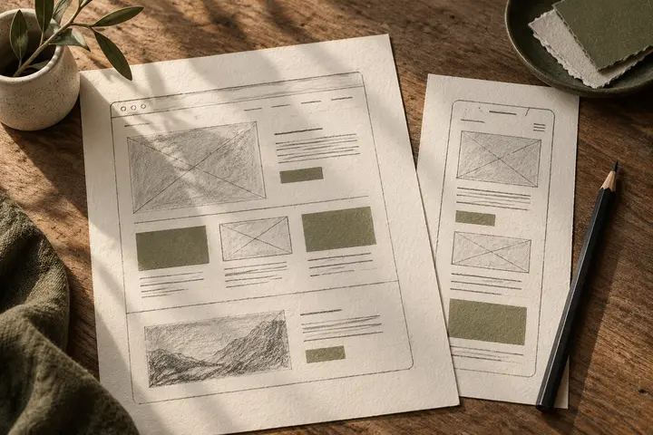
Web Design organises the digital encounter. Visitors should understand the offer, assess whether it fits their task and find a way to contact the business. An impressive opening image does not compensate for missing service information or an unclear contact route. Connect page headings, navigation, descriptions, genuine project examples and the enquiry process. Check how essential information appears on mobile as well; a desktop presentation does not represent every condition in which someone encounters the website.
Google’s helpful content guidance focuses on useful, reliable information for people. Apply that approach by answering real customer questions clearly. Do not introduce unsupported claims or repetitive keyword strings in pursuit of search or AI visibility. A descriptive H1, meaningful subheadings and relevant internal links support a readable information structure. They do not independently guarantee rankings or quotation by an AI system. The content still needs to provide a worthwhile and accurate answer to the visitor’s question.
Accessibility and maintenance belong to the digital identity
Colours and movement can express a brand while still allowing people to use the content. W3C design guidance addresses text contrast, clear navigation, form labels and layouts for different screen sizes. Treat these as part of the design review rather than a decorative layer added at the end. The digital experience includes how someone reaches information as well as how the business presents itself. A visual preference does not remove the need for appropriate technical assessment.
Ownership after launch also continues the design work. When services, people, project images or contact channels change, identify which pages require revision. Check that forms reach the correct recipient, links work and images remain relevant. Give future editors usable templates. A site that accurately describes the business on launch day can gradually drift away from reality if nobody owns updates. Define that responsibility alongside the initial work instead of leaving it for a later emergency.
Packaging, catalogues and sales material: Connecting promise with use
Packaging Design considers product recognition, differentiation between variants and access to necessary information. Catalogue Design organises material for examination and comparison. They can share an identity while serving different reading conditions. A brief shelf encounter and a detailed sales discussion do not require identical information density. The mark, colour relationships and typography can remain connected while layout and content depth respond to the task rather than follow one composition indiscriminately.
When proposals, brochures, presentations and labels develop independently, customers may struggle to recognise the same business across them. Identify the source of information such as product codes, prices and service names. A catalogue disagreeing with a website presents more than a visual problem: it requires approved data and version control. For physical production, also review material, finished dimensions and supplier requirements. A screen preview cannot independently confirm every condition in which a manufactured object will be read or handled.
Social content and customer communication sustain everyday continuity
Corporate Social Media Design can organise content types and information priorities as well as the appearance of a profile. Not every post requires the same template. Product announcements, process explanations and project presentations can use different treatments while retaining recognisable relationships and language. Build the calendar around material that can actually be produced and approved. Publishing unrelated content merely to fill a space may create activity without supporting a clear relationship between the audience and the business.
Customer communication is another touchpoint. A response to a question, the scope in a proposal and guidance after delivery all establish expectations. If a campaign promises an attentive relationship but nobody owns incoming enquiries, the communication arrangement remains incomplete. A studio can help establish visual and verbal systems, while the business assigns responsibility for service behaviour. Review the relationship between the trust being expressed and the working practices through which customers experience it day after day.
A hypothetical example: Testing a product brand across touchpoints
Imagine a hypothetical business selling handmade home products and wishing to explain materials and everyday use clearly. Its logo needs to work on a small label, while the identity relates several product families. Names on packaging match those on the website. The catalogue presents the same characteristics in a comparable format. A campaign introduces a selected range and directs people to the relevant information. Social material helps answer practical questions about using the products.
Test this through a customer’s task: can the person recognise the product, distinguish variants and find the purchasing or enquiry route? An attractive campaign still creates a broken experience if its destination shows an unrelated range. Correcting the destination may be more useful than replacing the identity. This scenario is not a claim about a real BOCW client or result. It is an exercise for moving brand coherence from an abstract preference discussion into a practical review of information and use.
Managing coherence: Priorities, responsibility and evaluation
Replacing every material at once is not compulsory. Inventory existing touchpoints and identify the ones creating misunderstanding or making decisions difficult. Distinguish an identity issue from a content, implementation or service-process issue. Assign an output, information source and approver to each task. Assess the budget through the work needed to connect these areas rather than only counting the final pieces. This makes coordination visible instead of assuming it happens automatically between separate suppliers.
For a BOCW discussion, bring logo files, identity materials, the website, sample campaigns and recurring customer questions. These help establish which encounter needs attention first. Look beyond preferences and impressions when reviewing the work: examine understanding, information finding, proposal clarity and continuity of application. Being a brand is not a design package completed once and placed on a shelf. It is ongoing work to maintain an understandable experience around the central promise while the business changes and grows.
Key takeaways
- Recognition comes from the mark; identity, communication and service behaviour explain what that recognition means.
- Make guidelines usable through real templates, current files and identified owners.
- Check the campaign promise against the destination, quotation and actual service conditions.
- Use coherent names and approved information across websites, packaging, catalogues and social content.
- Fix the disconnection affecting the customer’s task first; every problem does not require a new identity.
Frequently asked questions
Should becoming a brand start with commissioning a logo?
Clarify the audience and offer before approving the mark. For an existing business, a new logo is not automatically the first priority; missing information or a disconnected customer route may need attention sooner.
How does a logo differ from corporate identity?
The logo is a visual sign identifying the brand. Corporate identity is the wider arrangement through which that sign works with colour, typography, layout, imagery and applications.
Is a strong advertising campaign enough to be a brand?
A campaign can communicate a particular message. Lasting coherence also requires the destination, quotation and actual service to sustain the expectation it creates.
Must every material use the identical design?
No. Preserve recognisable relationships while adapting compositions to different tasks. Packaging, a website and a catalogue can share an identity without becoming interchangeable layouts.
Where should an existing business begin improving its brand?
List touchpoints and recurring customer questions. Prioritise material that creates incorrect expectations, hides useful information or weakens recognition, then identify approval and update ownership.