In this article
Web design shapes both how a brand appears online and how people find information or take action. A convincing interface should express the organization’s character while making tasks such as reviewing services, exploring projects and requesting a conversation understandable. That requires more than an impressive opening image. Teams first need to identify visitor questions, content priorities and the requests the business can actually handle. This guide provides a practical framework for evaluating design through use as well as appearance, from the first discussion to the handover of approved screens.
Quick answer
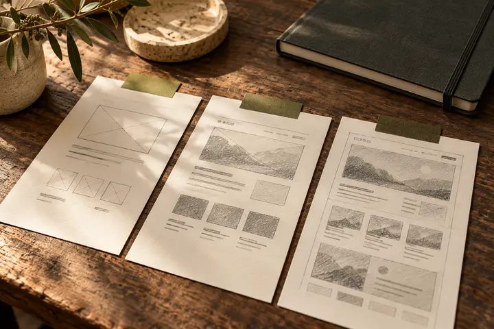
Web design brings together content structure, page layouts, typography, color, imagery and interaction. Its purpose is to help visitors understand a business and complete relevant tasks. A useful process moves through discovery, content mapping, wireframes, visual design, prototyping and implementation review. Quality should be assessed with realistic content and different viewport sizes, rather than through presentation images alone.
Describe success as a visitor task
Instead of asking for a website everyone finds beautiful, define three tasks visitors should be able to complete. For a hypothetical consultancy, these could be checking service suitability, examining a relevant project and requesting an introductory meeting. Write down where each task begins, what evidence the visitor needs and what finishes the journey. This makes it easier to decide whether a large introductory video contributes anything. Pairing business goals with visitor goals creates a shared basis for reviewing proposals.
Let content priorities shape the layout
Giving every service equal emphasis on the home page leaves visitors to discover the priorities themselves. Establish what the business does and whom it helps before introducing supporting services, work or process information. If final copy is unavailable, use realistic text lengths. A layout approved with very short headings may change substantially once actual explanations arrive. Give each page a principal question to answer, then explain how the next page continues that discussion instead of repeating it.
Build a visual language beyond the logo
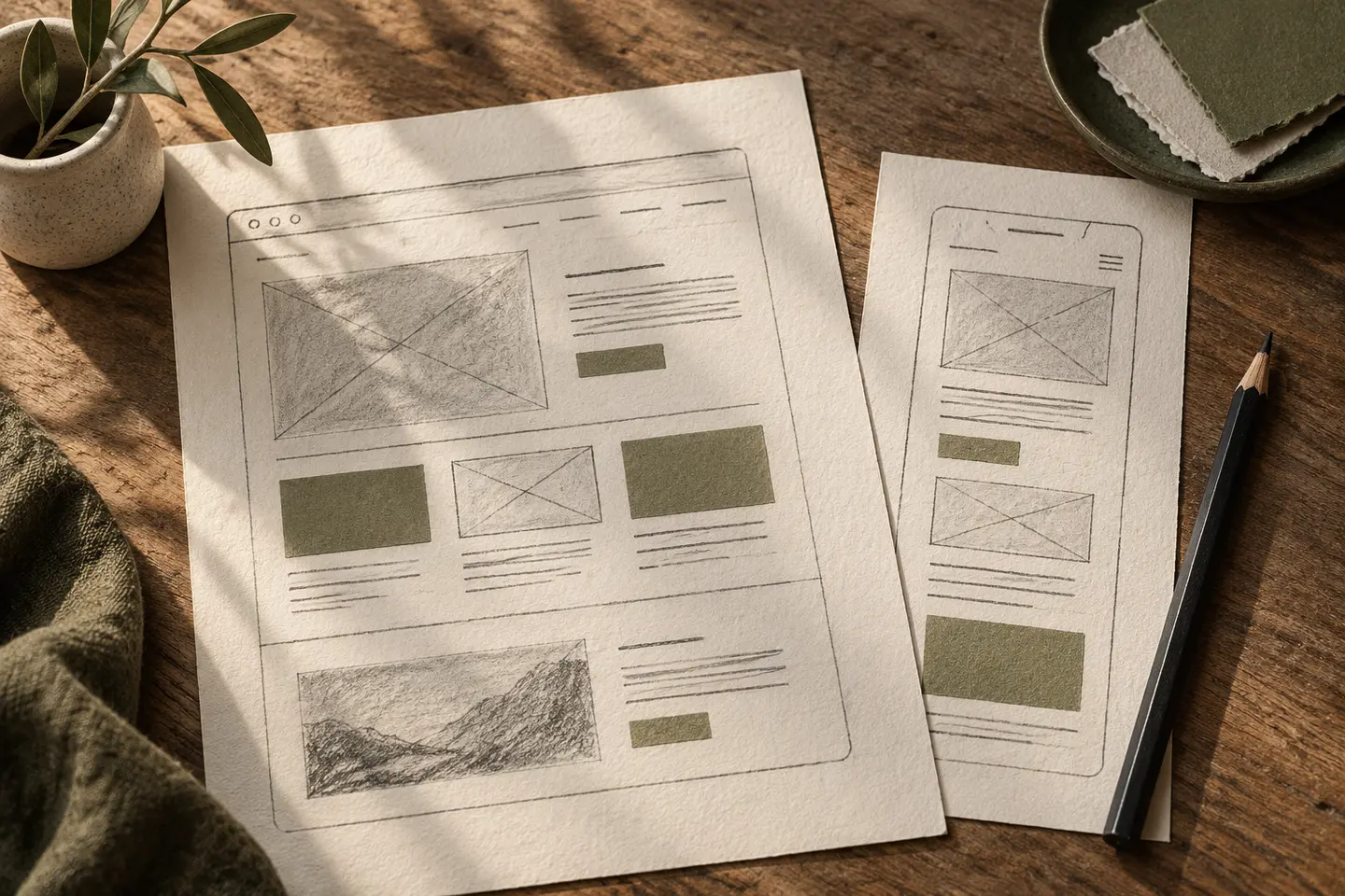
A logo, color palette and typeface do not automatically create a coherent interface. Heading scales, spacing, image proportions, cards and button variants also need consistent rules. When primary and secondary actions look identical, priorities become harder to understand. A small set of reusable components can help later pages develop coherently. Avoid forcing every type of information into one card pattern, however. A project story, an address and a comparison table have different reading requirements and may deserve different structures.
Review mobile as a content decision
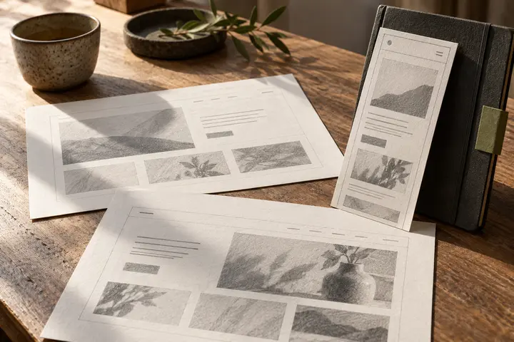
Shrinking a desktop composition is not always enough. Long menus, wide tables and oversized opening sections may require alternative arrangements. Responsive design addresses adaptation across viewing conditions, and the web.dev course provides a technical starting point. During review, inspect actual heading wraps, the visibility of the following section and the completion of forms. Decide which information appears first on a narrow screen while the design is still flexible, rather than leaving every ordering decision to development.
Include accessibility in the design work
W3C WAI identifies contrast, identifiable controls, form labels and clear feedback as design considerations. Apply these to the actual screens being delivered. For example, explain a form error in text as well as through color. Document interactive states and visible keyboard focus so implementation has a clear reference. Reviewing visual designs alone does not establish accessibility conformance; the working site also needs evaluation. Treat these requirements as part of the experience, rather than a decorative adjustment at the end.
Use prototypes to investigate uncertainty
Give someone a task in the clickable prototype and observe what they expect to happen. In the hypothetical consultancy example, can they move from a suitable service to the inquiry form without an explanation? If a presenter must explain every screen, the interface may need clearer direction. Separate observations into blocked tasks, confusing decisions and visual refinements. Resolve important issues before approval, while remembering that prototype sessions provide useful evidence rather than a guarantee of future business results.
Key takeaways
- Define visitor tasks before selecting visual references.
- Evaluate mobile layouts with realistic copy and forms.
- Document component rules and interaction states with the approved prototype.
Frequently asked questions
Is web design the same as development?
Design defines the structure, appearance and behavior of the experience; development turns those decisions into a working system. One supplier may provide both, but the quotation should identify the separate responsibilities and deliverables.
Does approving the home page approve the whole website?
No. Service pages, project pages, search and forms may require separate review. Shared visual direction can be approved while content hierarchy and interaction details for other page types remain unresolved.
Will a redesign increase inquiries?
A clearer experience can support the inquiry journey, but outcomes also depend on traffic quality, the relevance of the offer and the business response process. Design alone cannot guarantee a particular increase in conversions.