In this article
Logo design gives a business name a visible form and creates a visual arrangement people can recognise in different settings. A useful starting point is to explain the audience, the offer that distinguishes the business and the places where the logo will appear. Those decisions guide a selection beyond an attractive drawing. This guide provides a practical framework for preparing a brief, evaluating creative directions and getting an approved logo ready for everyday use. The aim is a consistent working mark across the business.
Quick answer
Logo design develops the brand name, typography, symbol, proportions and colour as a connected whole. A useful logo expresses an appropriate character, offers distinctive features and remains legible in its required settings. Assessment should combine the explanation behind the design with tests at realistic sizes. The delivery scope must be as clear as the creative decision.
Start with the brand question before visual preferences
A brief needs more than a description of what the business sells. Explain the situation in which a customer should choose you and the concern your offer addresses. A hypothetical home maintenance brand might prioritise easy access to help or meticulous workmanship. That choice can influence whether its logo feels approachable or formal, although the mark cannot prove service quality. Set three priorities rather than filling the brief with conflicting adjectives. Describe the impression you want to avoid just as clearly.
Separate the jobs of the symbol and the name
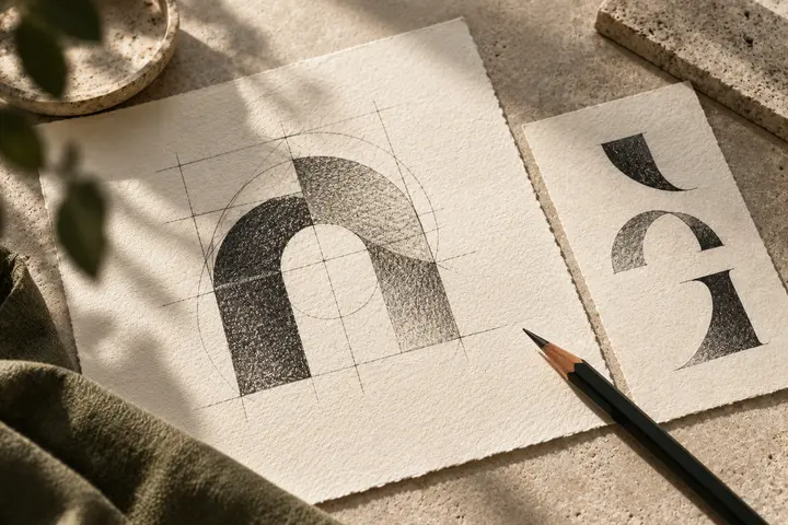
A short, distinctive name may support a strong typographic solution. A long name or a restricted placement can create a practical reason for a symbol. The symbol does not need to illustrate every business activity; its relationship with the name and purpose matter more. Consider carefully whether a new brand should use the symbol alone. Removing the name can make communication harder before customers recognise the mark. Plan the situations that require horizontal, stacked or compact arrangements instead of treating them as incidental exports.
Compare directions under the same conditions
Review creative directions at equivalent sizes, on the same background and in comparable applications. An impressive sign mockup for one proposal and a plain page for another can distort the decision. Ask which priority each direction addresses, where it offers an advantage and where its limitations lie. Personal preference belongs in the discussion, alongside these criteria. Once you select a direction, refine its underlying idea. Combining attractive fragments from unrelated proposals can weaken the logic that made each direction coherent in the first place.
Bring the hardest application into the design
Do not assess the logo only on a large screen. Include the smallest label, website header, social profile and planned production methods in the initial brief. For a hypothetical ceramics workshop, a paper card and a stamp on the base of a product may require different levels of detail. Any simplification can become a defined application version. An actual-size print makes spacing and small gaps easier to discuss. Details that need a supplier trial should remain subject to that test rather than being approved through a presentation image alone.
Request usage information with the file package
Delivery should include the master artwork, useful digital outputs and a short explanation of which file belongs in each setting. W3C defines SVG as capable of containing vector shapes, images and text. Check the artwork itself rather than assuming the extension proves its construction. PNG is a pixel-based output suitable for many everyday placements and can include transparency. Clear filenames, colour versions and approved arrangements help different suppliers use the same identity consistently. A usable package saves the client from guessing which attachment represents the final decision.
Run a small acceptance check before launch
Review the approved logo in the three environments you expect to use most. Is the name correct? Are suitable versions ready for light and dark backgrounds? Do the filenames prevent confusion with earlier proposals? These operational questions affect implementation as much as visual taste. Packaging, the website and communication materials can then be planned as separate applications or a wider identity programme. For a conversation with BOCW, share your business model, existing visuals and priority uses so the appropriate scope can be defined around your actual requirements.
Key takeaways
- Explain the audience, distinction you want to make and hardest application in the brief.
- Compare creative directions through their reasoning and equivalent presentation conditions.
- Check approved arrangements, files and usage notes as one delivery.
Frequently asked questions
Does every logo need a symbol?
No. The name itself can carry a distinctive visual character. A symbol becomes useful when it meets a real need, such as restricted space or a separate recognition device. Assess its relationship with the name.
How many people should review a logo?
Roles matter more than numbers. The decision maker, communication owner and someone familiar with implementation can review shared criteria. A large preference vote may reveal little about the target customer or actual usage requirements.
Does logo design include corporate identity?
That depends on the quotation. The logo creates the central mark; colour systems, typography, document layouts and other applications can form a broader identity scope. Agree each deliverable in writing at the start.