In this article
A delicatessen counter brings together many colours, textures and product names. Its logo can act as a shop signature within that variety. The common thread between cheese, olives and prepared foods is the shop's selection and presentation. The design need not depict every item. Someone carrying a package should find the business name easily, while a small weighing label should retain the character of the larger storefront identity.
Quick answer
For a delicatessen, consider open lettering, a restrained palette and a composition that can travel between packages. A traditional badge is one option, not an automatic consequence of selling traditional foods. Relate its style to the shop's presentation and tone of service. A tiny label and a wide window sign provide useful tests of different reading distances.
Separate the signature from the product name
The shop name and the variety of cheese perform different roles on a label. Serif lettering can bring warmth, but extreme differences between thick and thin strokes may weaken small printing. More even strokes can appear composed on wrapping paper. A long name may benefit from two lines rather than narrow, compressed letters. Check that the second line still belongs to the business name. Customers should not mistake it for the name of a product or an unrelated producer.
Compare a badge with open lettering
A circular badge offers a convenient arrangement on a jar lid. The same arrangement may shrink too far within a narrow window strip. An open wordmark suits horizontal surfaces but can leave awkward space on a round label. These conditions suggest related arrangements using the same letterforms, rather than two unrelated logos. A cheese wedge symbol also narrows the apparent category. A shop expecting to expand its selection may find a name-led identity easier to carry across unfamiliar products.
Let wrapping materials influence colour decisions
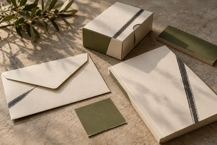
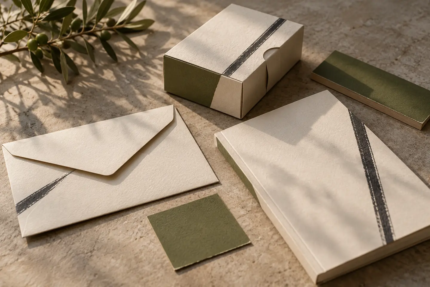
Cream, deep green and burgundy only become meaningful choices when viewed on the intended material. Brown paper may absorb the visual presence of a pale logo that looked strong on a bright screen. White labels and kraft wrapping should not be presented as though they create identical colour effects. Show the difference honestly. Since the products already provide substantial colour, the logo may need no additional variation. A single dark ink can become a consistent signature across an otherwise varied set of materials.
Try a jar label and a folded wrapper
For a hypothetical first application, print a circular jar label 45 millimetres wide. Keep the name clear of areas that curve out of view. Next, stamp a 250 millimetre sheet of wrapping paper in one colour. Fold it around a product and see whether the name splits across a seam. Adjust placement or the repeat pattern if necessary. Inspect both trials at normal handling distance. A decorative date that disappears inside the small badge deserves removal; required product information belongs in a separate layout.
An example brief for a selective retailer
Imagine a delicatessen selling goods from several producers while packaging purchases under its own name. The identity should express selection without implying that the shop manufactured every product. Acceptance requires a recognisable name on weighing labels, intact main lettering after wrapping and window decoration that does not overpower the words. Review empty packaging as well as attractive counter photography. This makes everyday packing part of the judgement and prevents the proposed identity from borrowing all its appeal from a beautifully stocked display.
Key takeaways
- Compare a badge on both round packaging and horizontal signage.
- Proof pale colours directly on the proposed kraft paper.
- Give the shop signature and the product name separate visual roles.
Frequently asked questions
Must a delicatessen logo look old fashioned?
No. Clear contemporary lettering may suit the shop's presentation. An aged appearance alone does not communicate product quality.
Should every product use the same colour?
Labels can vary while a consistent logo colour and placement relationship connect the range visually.
Should a founding year appear in the badge?
Only when verified and useful at the intended size. An invented date is not an appropriate way to create heritage.