In this article
A custom pattern should do more than occupy empty space on a package or social post. It may connect product families, support recognition or create a distinctive secondary surface. It does not need to cover every item. A useful project starts by explaining the pattern’s role. This guide moves beyond selecting one attractive motif to examine repetition, density and scale. The aim is a graphic language that future applications can sustain, rather than one presentation image whose appearance cannot be reproduced consistently.
Quick answer
A corporate pattern is a graphic element governed by motifs and repetition rules across brand applications. Define its purpose before drawing, then establish spacing, scale, direction and colour relationships. Check that it does not compete with important text and remains suitable across surfaces. Show the rules needed to create another application, not only the finished example approved during the initial presentation.
Explain the pattern’s communication role
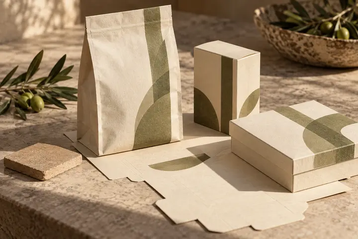
A pattern may relate product variants, create an interior packaging surface or connect event materials. Record which purpose matters. Do not introduce it simply because a competitor has one. A hypothetical coffee brand could use a dense interior pattern and a quieter treatment beside product information. These perform different jobs. Their explanation should identify how necessary content remains visible rather than merely describing how much decoration each surface is expected to receive.
Avoid reducing the motif to repeated logos
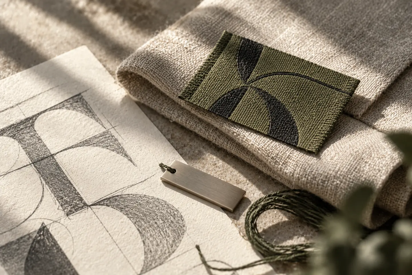
Part of the logo can provide a starting point, but duplicating the complete sign is not the only approach. Explore line behaviour, geometry or original forms connected to the brand’s field. A relationship should remain apparent without every unit being mistaken for another logo. Develop a reasoned graphic idea rather than borrowing another company’s distinctive arrangement. Changing colours alone does not establish that an existing pattern has become an original identity element.
Define rhythm and examine where repeats meet
Inspect the relationships formed when units join horizontally and vertically. Unintended lines, gaps or additional shapes can emerge. A fragment looking attractive in a corner may behave differently across a large surface. Show open coverage alongside cropped applications. Specify repeat direction, spacing and edge behaviour. Without those decisions, another designer could use the same motif while producing a visibly different language, making the approved example difficult for the wider team to maintain.
Assess scale and density alongside information
At a larger scale the pattern may read as separate motifs; at a smaller scale it can become a general texture. One scale need not suit packaging, cards, screens and textiles. If headings repeatedly require opaque boxes, reconsider density. A hypothetical catalogue cover may preserve quieter areas without eliminating the pattern altogether. Connect the screen presentation to the physical output size instead of judging every option at an arbitrary zoom level in a design application.
Set boundaries around colour and material
Multicolour, single-colour and embossed treatments involve different production decisions. Learn supplier conditions while considering the idea. Avoid promising identical results across surfaces before those conditions are established. Where patterns help distinguish variants, retain explicit names as well. A customer should not need to infer which product is present only from a change in density. Visual relationships and clear wording should cooperate, especially when the same product family appears across different manufacturing methods and sales channels.
Make the rules visible in the BOCW delivery
Provide the motif source, approved repeat file, colour options and representative densities. Define the limits of rotation, cropping and scaling. Include examples with plain backgrounds so a future editor knows how to begin a new package or presentation. During approval, ask whether the pattern supports recognition and preserves the information task, not only whether it is attractive. The deliverable should make another coherent application possible without requiring the original designer to reconstruct every decision.
Key takeaways
- Define the communication role before drawing the motif.
- Specify repetition, scale and density as well as the basic shape.
- Review production conditions and reading tasks through real applications.
Frequently asked questions
Must the pattern come from the logo?
No. Original motifs can share a visual logic with the identity. Explain and test that relationship in applications.
Should every surface carry the pattern?
No. Quiet areas can belong to the system too. Use the pattern where it supports recognition or the content task.
Will one pattern work at every size?
The repeat logic may remain, but scale, density and manufacturing conditions should be reviewed for different uses.