In this article
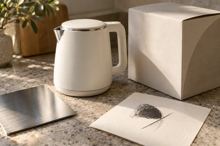
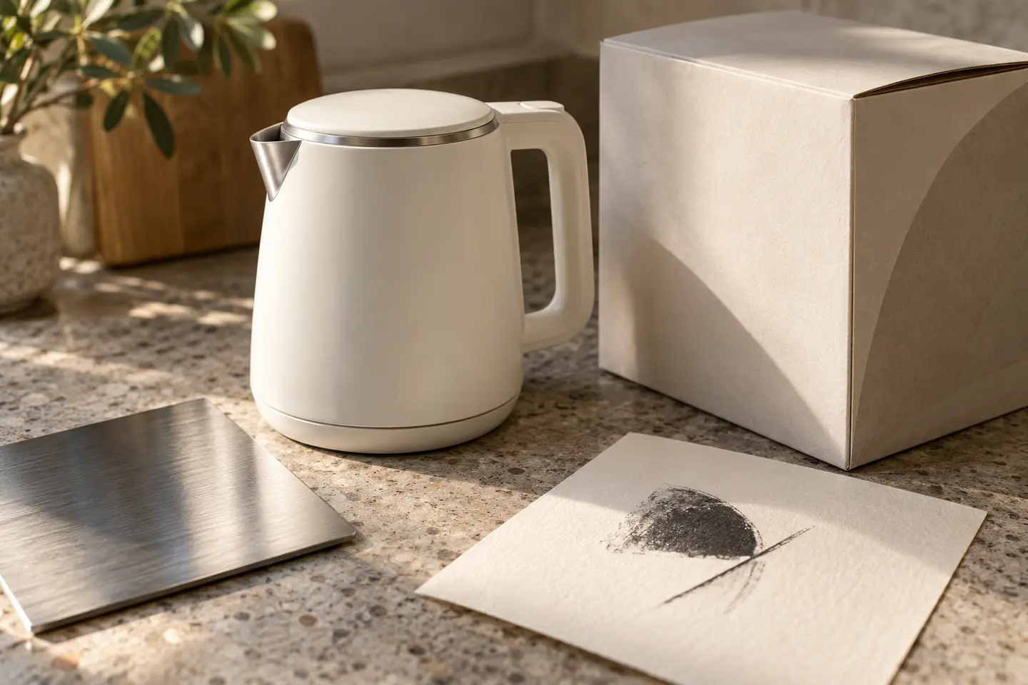
A small appliance brand may place the same name in kitchens, bathrooms and retail displays. Its identity therefore needs room to extend beyond a toaster or coffee cup. The important relationship is between the modest marking on a curved product and the much larger signature on its carton. Before drawing symbols, collect the intended body colours, printing areas and packaging layouts. Those surfaces reveal whether a promising logo can become a coherent signature across the proposed product family.
Quick answer
A useful small appliance logo combines distinctive lettering with a symbol that remains simple enough for compact product marking. Fine internal lines, decorative shadows and detailed appliance illustrations need careful scrutiny. Compare a single-colour body application with a full carton layout before choosing the preferred direction.
Describe a family rather than one machine
A blender silhouette explains one category quickly but becomes awkward when an iron joins the range. A more flexible direction might draw on a controlled turn, a balanced grip or two parts meeting. These ideas should remain visual observations rather than promises about the mechanism. Rounded corners can relate comfortably to household objects, although excessive softness may make some products appear toy-like. Compare the alternatives on actual product photographs, including angular and curved bodies, so that an appealing sketch does not dictate the entire collection.
Letter spacing on a reflective body
The same wordmark can feel different on brushed metal and printed board. Close spacing creates a compact signature, yet reflections may make neighbouring letters appear joined. Examine the counters of small letters such as a and e, and include any Turkish characters in the original type exploration. Keep model names below or beside the brand as a separate information level. This allows new product numbers to change without repeatedly rebuilding the signature or letting a lengthy model code become the dominant element.
Colour independent of the appliance finish
Pale grey lettering developed only for white bodies will need another answer on dark appliances. Establish a dark single-colour version and a reversed white version first. A supporting accent can then operate on cartons and digital material without competing with product information. If a metallic finish is desired, describe it as an application treatment rather than an essential part of the drawing. Compare cream, black and an accent against the proposed range; none of these colours independently demonstrates product quality.
Two trials at the intended dimensions
For the first trial, place the wordmark at 24 millimetres wide on a hypothetical kettle body, using one colour. Inspect the curvature and the open spaces within letters. For the second, print a carton front at its intended 180 millimetre width with the product photograph and model description present. The smaller trial examines recognition; the carton examines hierarchy. Measure the relationship between symbol and name in both, because generous spacing on a box may consume too much of a compact marking area.
A hypothetical breakfast collection
Imagine a brief for a brand beginning with breakfast and coffee appliances while planning other household products. Its requested character is calm, practical and compatible with domestic objects. Develop one direction around a distinctive letter connection and another around a separate rounded emblem. Compare both on the same carton, appliance body and instruction booklet cover. Acceptance should depend on consistent name recognition across the collection, together with clean monochrome reproduction, rather than on which isolated icon attracts the strongest initial reaction.
Key takeaways
- Keep model codes separate from the permanent brand signature.
- Compare monochrome marks on both light and dark product bodies.
- Review the 24 millimetre marking alongside a full-size carton layout.
Frequently asked questions
Does every appliance need its own logo?
Usually the parent signature can stay consistent. If ranges need separation, use model lettering and layout rules rather than redrawing the emblem for each device.
Should metallic effects appear in the master drawing?
A flat master is a flexible starting point. A metallic appearance can be specified separately for a suitable surface and production method.
Can a coffee cup work as the symbol?
It may suit a deliberately coffee-only range. For broader plans, test lettering or a more open-ended emblem before committing to an illustration of one product category.