In this article
The long shape of pide offers an appealing starting point for a logo, but it can become awkward in narrow spaces. A long illustration beside a long business name may produce an excessively horizontal mark. Shrinking everything is not the only solution. The task is to preserve the name while suggesting the product selectively. Considering the box lid, oven frontage and small order label together helps decide which details belong in the principal signature and which should become supporting graphics.
Quick answer
Choose one feature, such as pointed ends, a folded edge or an oven curve, instead of copying the full product length. Build balanced lettering that keeps the name readable. Compare a long box application with a small round label. Open spaces in the single colour drawing provide a useful acceptance criterion for carrying the same identity across different backgrounds.
Shortening the shape need not remove its meaning
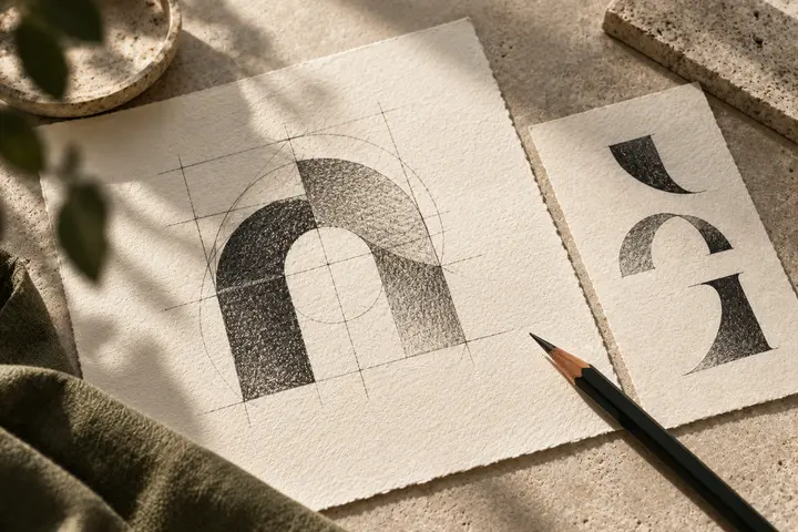
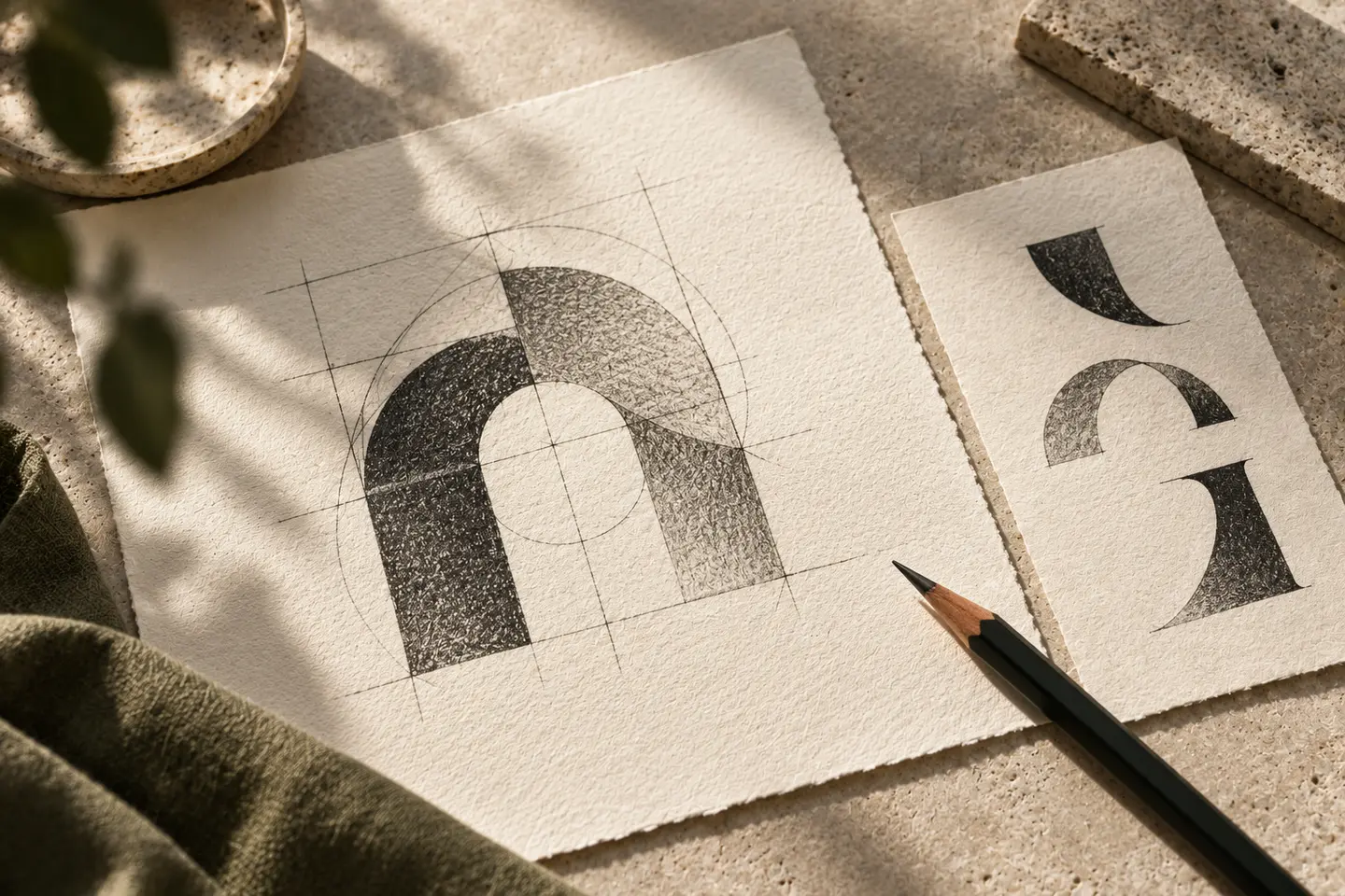
Two pointed ends may be enough to suggest pide. Drawing many ingredients inside can create a confusing patch at small sizes. Explore several simple options by adjusting the ends and central opening. If the symbol underlines the word, check whether it extends the composition unnecessarily. A small reference within one letter may create better balance. Preserve the letter’s basic structure, however. A product reference should not survive at the cost of misreading the name, which remains the principal recognition device.
A wide box does not require stretched lettering
The logo need not fill an entire long lid. A smaller balanced signature in the centre may leave useful room for product information on either side. Horizontally stretching letters weakens their proportions. Retain the natural word width and treat empty space as part of the composition. Two word names offer alternative line arrangements. Review a version without a category descriptor before squeezing one underneath. Where the product context is already clear, removing an unnecessary explanation can give the name more room.
Express warmth beyond orange
Orange, red and brown are options, not consequences of serving hot food. A dark wordmark against a light box can also feel lively. Include the materials and lighting around the oven in the presentation. Review single ink printing beside the colour version. If the packaging uses a separate paper liner or another lid material, examine the real sample. The same colour specification may not create the same visual weight across surfaces. Let application proofs inform the decision rather than relying on screen brightness.
Try a long lid and a round label
Place a logo 90 millimetres wide on a long pide box for the first trial. Check whether lid folds interrupt the pointed ends of the symbol. Then test a simplified mark on a round label 30 millimetres across. Develop a different arrangement rather than forcing the long wordmark into a circle. These are proposed prototype dimensions. Read the label at normal distance and preserve shared letter character and spacing logic. Also inspect which part remains visible when the box opens or the seal tears.
A hypothetical open kitchen brief
Imagine a pide restaurant combining table service and takeaway orders around an open kitchen. This hypothetical brief seeks a clear, lively identity adaptable to different products. Compare an abstract symbol emphasising pointed ends with a strong wordmark alone. Present both on the same box and frontage layout. Acceptance should include immediate reading, intact strokes on the small label and space for new product headings. Include surrounding menu photography if it will appear near the logo. A clean isolated presentation square is not enough to establish success.
Key takeaways
- Select one characteristic feature from the long product shape.
- Do not stretch letters to fill the width of the box.
- Prepare a related compact arrangement for round labels.
Frequently asked questions
Does a pide logo need a product illustration?
No. A distinctive wordmark can be sufficient. If using a product image, consider a simple form rather than a detailed drawing of ingredients.
How can a long logo fit a small circle?
It may need another arrangement. Try two balanced lines or a compact symbol while retaining the principal letter character and colour logic.
Should an oven and a pide both appear?
Only if they form one clear idea together. One distinctive shape may read more effectively than two symbols competing for attention in a small space.