In this article
A mark can appear unbalanced even when its drawing boxes are evenly spaced. Open sides, diagonals and areas of solid colour create different visual relationships. Optical balance examines these relationships instead of relying entirely on numerical equality. That does not mean changing details randomly according to preference. This guide distinguishes what measurements describe, then tests visual adjustments in representative applications. The aim is not a universal formula claiming perfection, but an arrangement whose decisions can be explained, compared and retained in future uses.
Quick answer
Optical balance assesses the apparent weight, spacing and position of logo elements. A mathematical centre or equal distance does not always create an equivalent visual impression. Review letter pairs, the complete word and the relationship between symbol and name separately. Verify adjustments at small and large sizes and on relevant backgrounds. One zoomed-in view should not become the sole evidence for a final decision applied across every medium.
Separate the bounding box from the visible form
The area inside a symbol’s outer boundary may not have uniform density. Placing its box at an exact centre therefore may not create the expected visual relationship. Establish the geometric position first, then inspect where the visual weight accumulates. Keep those assessments distinct. Retain the starting arrangement when making an adjustment and compare what changes. A visual correction should become an approved placement, rather than remain an undocumented nudge another person must guess later.
Distinguish kerning from overall spacing
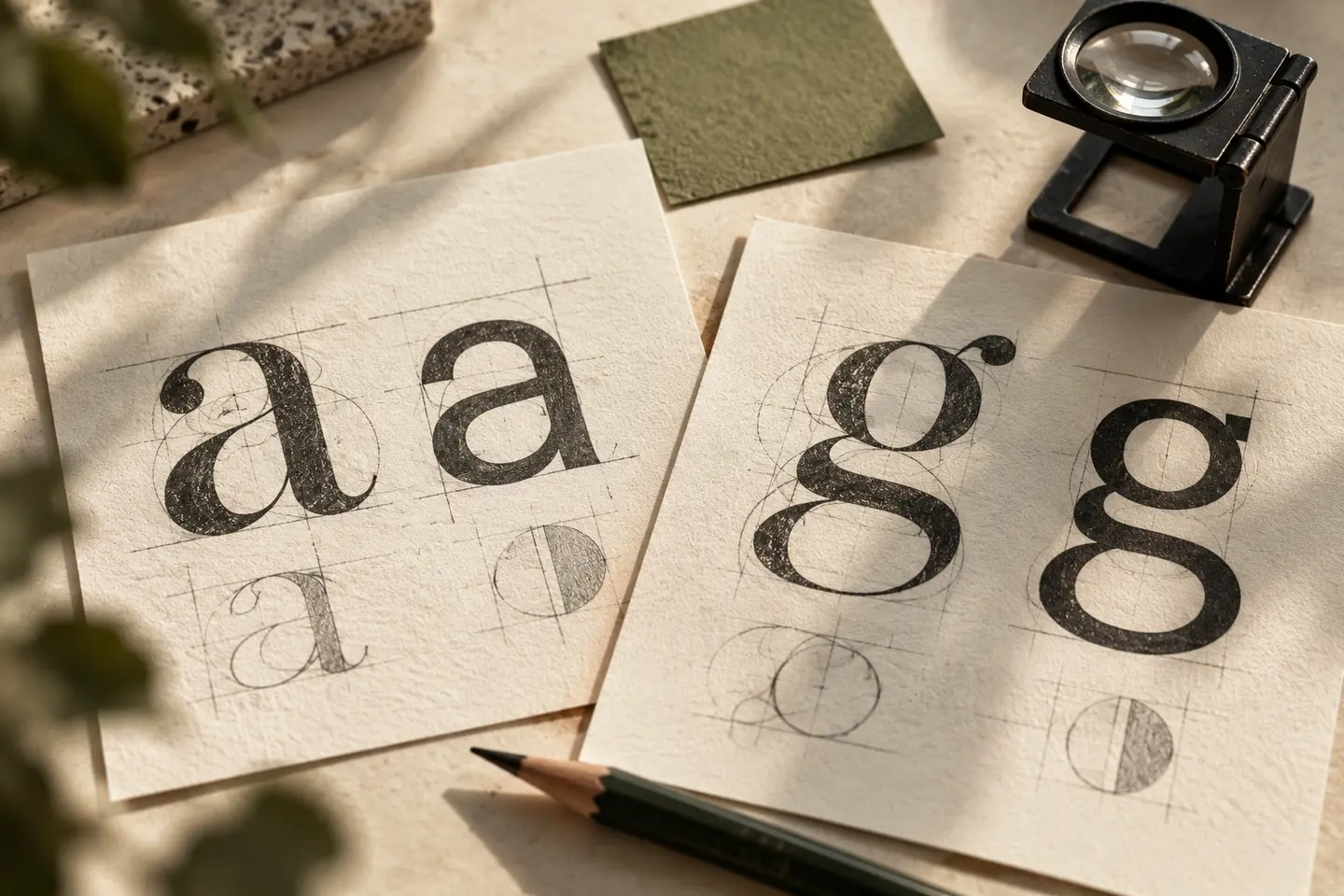
Adobe explains kerning as adjustment between individual character pairs and tracking as adjustment across selected text. Opening the whole word to repair one difficult pair can disrupt other relationships. Inspect the pairs, then the rhythm of the complete name. Excessive tightness can merge forms; excessive openness can fragment reading. Instead of searching for one universal value, evaluate the actual character sequence and intended application. The settings are tools for that judgement rather than substitutes for it.
Do not force symbol and name into equal dimensions
A symbol may be wider or denser than the accompanying name without making the arrangement wrong. Identify which part should be recognised first and how both should be read together. In a hypothetical consultancy identity, a compact sign might support a clearly written full name. Try relevant line lengths. The space from symbol to name and the gaps between letters perform different roles, so forcing them into the same numerical value can create an unnecessary constraint.
Verify adjustments at the intended scale
A small difference noticeable on a large screen may disappear at profile or business-card size, while a gap that looks comfortable when enlarged can close visually when reduced. Inspect several actual destinations and record which issue is present in use. Review physical trials at their intended size where relevant, alongside supplier conditions. Limit comparisons to specific reading tasks so a prolonged examination of one detail does not replace a practical assessment of the overall sign.
Keep the surrounding placement in the review
A logo can appear different beside a heading, page edge or another image. Approval should not happen only on an empty sheet. A hypothetical sign review, for example, can show the mark’s distance from edges and neighbouring information. Examine light and dark arrangements. Provide approved frames and placement examples instead of leaving every supplier to reposition the logo by eye. Preserving optical balance should not require an uncontrolled redesign each time a new surface is introduced.
Make adjustment boundaries clear in the BOCW handover
Supply the approved artwork, proportions and relevant examples together. Implementers should understand which spaces belong to the logo itself and which belong to the surrounding layout. Show alternatives at equivalent sizes during review so a larger presentation does not gain an artificial advantage. Briefly record what changed. Spacing or alignment corrections can then survive subsequent transfers instead of being reset accidentally, becoming a maintainable feature of the identity rather than an invisible decision lost between applications.
Key takeaways
- Review numerical equality and apparent balance separately.
- Revisit the complete word after adjusting individual character pairs.
- Retain approved spacing and positions in sources and usage examples.
Frequently asked questions
Should every letter gap have the same numerical width?
Equal distances may not create the same visual impression. Evaluate the pair, the complete word and its reading task together.
Does optical balance concern only lettering?
No. It also concerns the symbol’s construction, its relationship to the name and the placement relative to neighbouring elements.
Can one software setting complete the correction?
A setting may help, but it does not replace review of the actual characters, size and context. Verify the result in use.