In this article
Choosing a font for a logo involves more than liking a typeface in isolation. The same font creates different letter combinations and rhythms in different names, so selection should use the complete brand name and actual applications. Logo lettering also has a different job from everyday document or website typography. This article offers a practical check of character, legibility, special letters and licensing for businesses discussing typography decisions. Assessing candidates through the full name and intended settings makes the reasons for selection clearer.
Quick answer
Choose logo fonts through the complete name, intended character and application size. Test weight, spacing, special characters and long-name arrangements together. Distinguish customised logo lettering from general identity typography. Verify the particular font's licence: supplying a static logo, editing live text and using typography on a website can create different requirements. Check conditions for the actual font and provider.
Write the name before selecting a category
Categories such as serif and sans serif can guide exploration but do not determine the result. Set the full name in each candidate and examine the upper- and lowercase treatment appropriate to the intended character. A font convincing in a short name may occupy excessive width in a long one. A hypothetical craft brand seeking a handmade quality might lose clarity through elaborate lettering. Evaluate the complete name instead of assuming a category automatically communicates trust, innovation or luxury. The name's specific letters make the practical difference.
Test weight and scale in the intended setting
Fine letters can appear refined in a large presentation yet lose detail on the intended small label. Heavy letters can crowd narrow gaps. Compare candidates at an equivalent visual size and produce a trial in the first application. Identical point sizes do not necessarily produce identical apparent sizes across typefaces. Ask whether the name reads, internal spaces remain distinct and the weight supports the desired character. If production creates a constraint, assess a supplier sample. A screen image alone cannot resolve every application question.
Check Turkish letters and other languages early
If the name contains Ç, Ğ, İ, Ö, Ş or Ü, examine those letters in each candidate. Dots and accents in relation to the letter body can matter in a tight arrangement. Share requirements for an English version or another script early. The presence of characters in the primary name does not establish support for every future document language. Create separate tests for logo artwork and general communication typography. Seek a consistent solution rather than filling a missing character arbitrarily from another font.
Assess spacing and custom letters as a whole
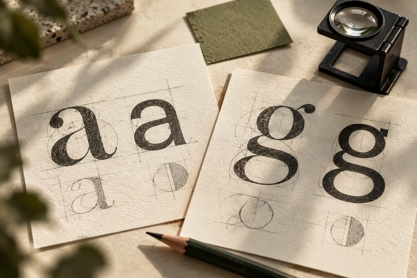
Logo lettering can involve custom adjustments to spacing or forms. This does not mean every letter should be changed. Ask what the adjustment contributes to rhythm, recognition or character. For a hypothetical two-word name, the relationship between words may matter more than a decorative letter. Review refinements in small use alongside enlarged details. Altering lettering artwork and modifying font software are separate activities, so make the intended technical scope clear. The useful question is whether the refinement improves the name in the environments it must serve.
Read licensing through the delivery scenario
A free download does not establish permission for every use. Record the font's actual terms. SIL OFL documentation permits logo use of fonts covered by that licence. Adobe Fonts guidance distinguishes supplied graphic artwork from a client's direct font access for text editing; the latter requires the client's own licence. These conditions should not be generalised to all fonts. Verify the provider, version and intended use. Identify who needs to use the font and which file they will edit before delivery.
Separate logo lettering from identity typography
Customised letters in a logo belong to a fixed identifying mark. Typography carrying changing text in presentations, quotations or a website has another job. It should suit sustained reading and the team's everyday needs. A supporting font can be chosen instead of automatically extending logo lettering into all communication. Share both requirements in a brief discussion with BOCW. The delivery note should distinguish the family used, any custom artwork adjustments and the recommendation for general text. This helps the business apply each element in its intended role.
Key takeaways
- Test candidates with the full name and all required characters.
- Review custom letter adjustments in small-scale applications too.
- Verify licensing for the provider, user and delivery scenario.
Frequently asked questions
Can a free font be used in a logo?
Yes, when its licence permits the intended use. Price alone is not enough information. Check the actual terms and relevant conditions rather than extending one provider's explanation to every font.
Must the client receive the font file?
Font transfer and delivery of logo artwork are different questions. Establish whether the client needs to edit text or access the font. Verify any transfer conditions through the relevant licence.
Does changing one letter create originality?
A custom letter can form a useful signature, but it is not sufficient by itself. Assess the relationship with the complete name and distinction from similar brands. An arbitrary addition can reduce legibility.