In this article
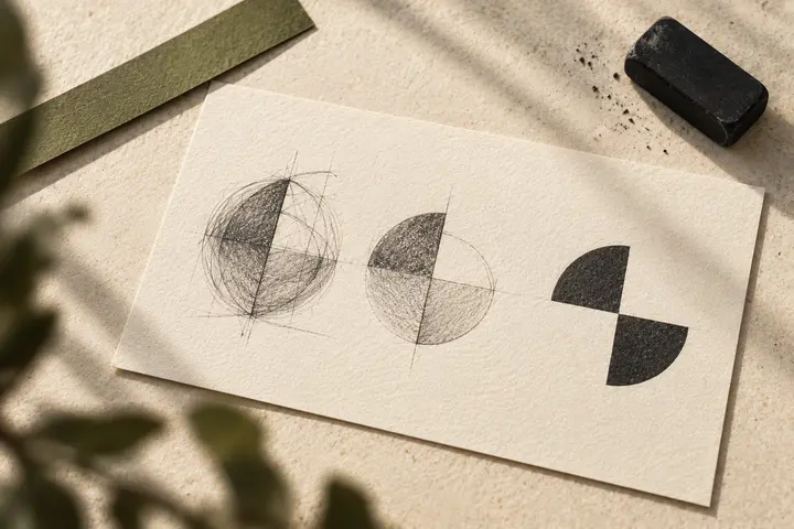
Empty space in a logo is more than a region that has not been drawn. It contributes to how the surrounding shapes are perceived. Sometimes the area between two elements suggests another meaning; sometimes it simply helps the sign remain readable. Negative-space design does not require a hidden object in every mark. This guide distinguishes an intriguing visual puzzle from a usable brand sign, asking how the main form and its spaces work together without requiring every viewer to make the same discovery.
Quick answer
Negative space in logo design is the deliberate use of areas within or between solid forms. It can suggest another shape or meaning, but should not undermine the primary sign’s reading task. Examine the design in one colour, on relevant backgrounds and at small sizes. Assess the relationship the space creates rather than treating an elaborate explanation of hidden meaning as proof that the logo works.
Make sure the primary form works without the story
Ask what remains when the viewer does not notice the secondary meaning. If the sign looks like a random collection of cut shapes, strengthen its main structure. In a hypothetical workshop identity, a space between two pieces could suggest a path while the overall mark remains distinguishable without that association. Temporarily remove the presentation narrative. Reviewing the basic reading independently from the presenter’s explanation provides a clearer basis for deciding whether the construction serves the brand.
Identify the boundaries creating the space
A negative area may come from the distance between solid elements, an opening in a letter or an interruption in an outer contour. Trace which edges establish the relationship. Numerous small cuts may introduce noise instead of strengthening meaning. When one part changes, inspect the neighbouring letter or symbol for distortion. If revealing the hidden idea repeatedly damages the primary sign, reconsider whether a simpler arrangement could express the thought with less conflict.
Protect the name’s reading task
A typographic mark can alter letter parts to create space, but a name repeatedly read incorrectly may have lost its intended function. Test similar characters and long names through the actual word. An impressive isolated letter does not prove that the complete name remains understandable. Review the candidate both as a negative-space construction and as ordinary name reading. If the results conflict, discuss which priority supports the applications rather than assuming the hidden image must always win.
Investigate gaps that disappear at small sizes
An opening visible in a large presentation may become indistinct in a small application. Do not approve narrow spaces only while zoomed in. Check the intended profile image, label or single-colour document at its real size. Manufacturing conditions also matter, so discuss relevant requirements with the supplier. Avoid applying one universal gap measurement to every job. Use representative outputs, and document a related small-space variant when the original needs adaptation for that task.
Recheck the relationship when the background changes
A dark sign on a light background and its light version on a dark background may not create the same impression. Review the relationship when the surrounding area changes. Photographic detail visible through a gap can weaken the intended secondary reading. Identify approved backgrounds and any supporting panel arrangement. Even a successful single-colour sample should not become unrestricted approval for every future background without examining how the construction behaves in actual use.
Use two acceptance questions in the BOCW review
First ask whether the name or main sign can be understood at the required size. Then ask whether the negative-space relationship supports that structure. In a hypothetical review, show candidates at equivalent dimensions and on identical backgrounds so animation or mockups do not conceal a weak opening. Record the approved variants. The negative-space idea then becomes a repeatable application decision rather than a clever story that works only when the designer explains the presentation.
Key takeaways
- Check the primary sign without relying on a presentation story.
- Do not sacrifice the name’s reading task for a hidden image.
- Verify the openings in small sizes, backgrounds and representative production.
Frequently asked questions
Must negative space contain a hidden symbol?
No. Space supporting separation, rhythm and reading is also part of the design. A second object is not compulsory.
Must everyone notice the secondary meaning immediately?
No. The main sign should still perform its role without requiring a lengthy explanation of the intended association.
Is there one minimum gap measurement?
No value suits every sign and manufacturing process. Assess final size, material and method together through representative outputs.