In this article
Minimal logo design involves a deliberate choice about which elements identify the brand and which details contribute little to that task. Removing unnecessary parts can make application easier, while excessive reduction can create a generic form that resembles many other marks. This article provides an assessment framework for businesses seeking simplicity. It connects lettering, space and silhouette with actual use, helping the client and designer reduce detail while preserving character. The appropriate result depends on the name and requirements rather than a single visual formula.
Quick answer
A minimal logo aims to create a distinct brand mark with few visual elements. Its success depends on identifying decisions in the name, proportions, lettering and spacing alongside low complexity. Compare the effect of every reduction. Test small-scale and single-colour use, check that character remains and define any required application variants. Fewer parts alone do not establish a successful result.
Identify the problem reduction should resolve
Begin with an observed requirement rather than a style label. Small lettering may be unreadable, numerous lines may complicate production or separate components may compete for attention. These problems need different responses. Removing a detail and rebuilding the main proportions are different decisions. Write down the problem, then assess whether the changes address it. This establishes a visible relationship between a cleaner appearance and a more usable mark. It also gives the review a concrete purpose when several people disagree about how much detail to retain.
Choose where the brand's signature will remain
With fewer elements, a small decision about a letter, proportion or gap becomes more prominent. One of these relationships can carry the character. A hypothetical jewellery store with a short name might develop a particular letter combination instead of neutralising every letter. The change should contribute something beyond difference for its own sake. Ask which feature distinguishes this name. If nobody can describe the identifying element, reduction may have removed too much character. A minimal result still needs a meaningful point of distinction.
Do not treat basic geometry as a complete solution
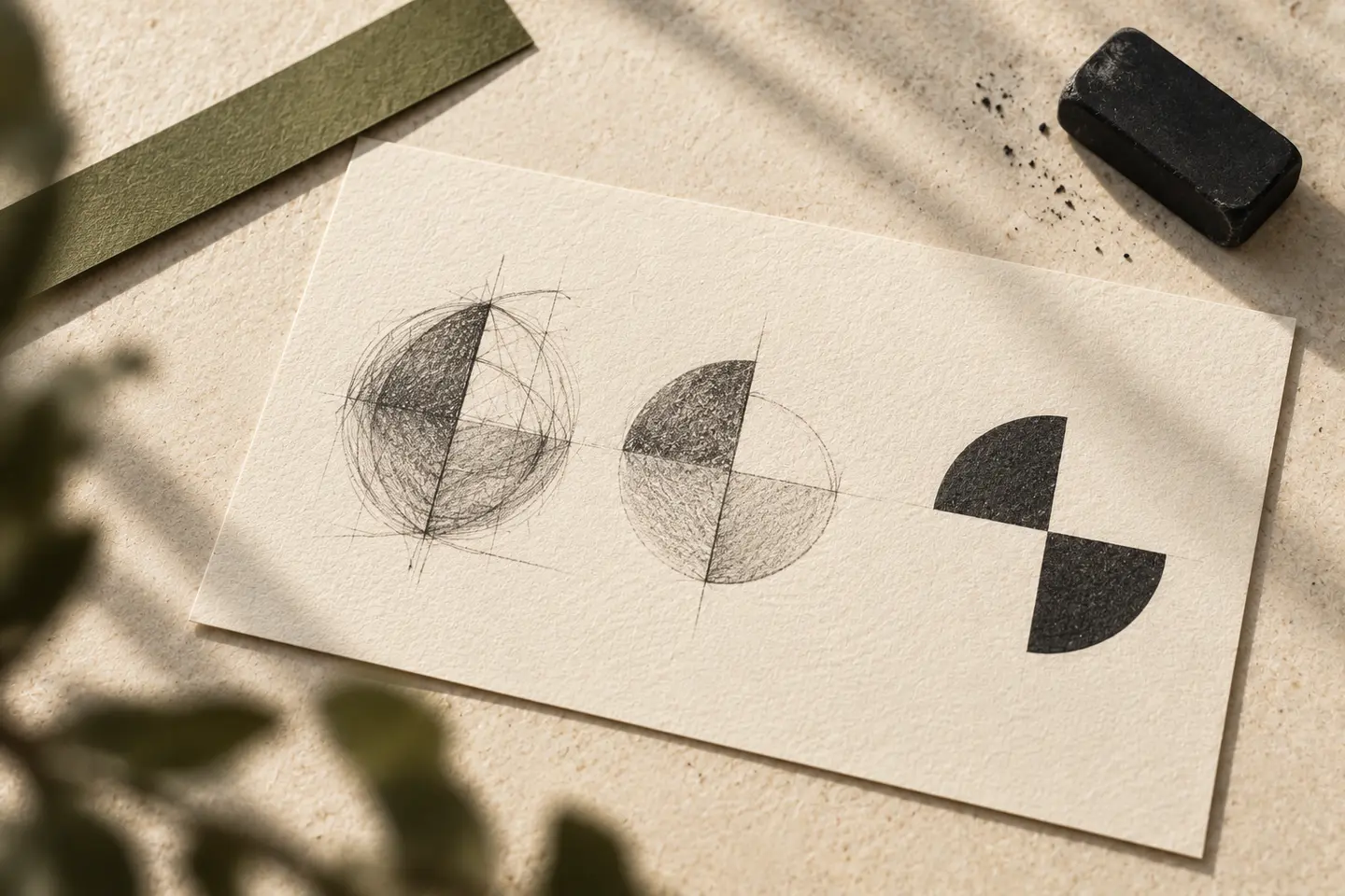
Circles, squares and parallel lines are common forms available to many brands. They can work through a particular relationship with the name, proportions and arrangement. Perfect symmetry is not automatically the most appropriate visual balance either. Examining mathematical construction can help, but assess the appearance at actual size as well. If symbol and lettering feel unequal in weight, alignment to a grid alone should not decide approval. A minimal structure still calls for detailed visual judgement because small differences become a substantial part of its character.
Review the spaces as carefully as the remaining parts
With fewer components, distances between them become prominent. Letters placed too far apart can fragment the name; close letters can merge in small use. The relationship between symbol and name helps the logo read as a whole. Examine spacing in actual website headers, labels or document layouts alongside a large presentation. Review nearby text and images too. A restrained logo surrounded by uncontrolled visual clutter may lose the intended quiet character in practice. Usage arrangements therefore support the effect that reduction was meant to create.
Avoid removing useful information arbitrarily
A request for minimalism can lead to removing a long name or necessary description. That may make communication harder when customers do not yet recognise the brand. A compact arrangement, supporting mark or adjusted typography can address restricted space. For a hypothetical new service brand, the social profile and proposal header need different amounts of information. Define approved versions with their intended settings. A minimal approach does not require one immutable arrangement everywhere; appropriate variation can preserve both the visual character and the information each context needs.
Compare the reduced version under equal conditions
Show the proposed reduction beside the previous or more detailed version at the same size, background and application. What became clearer? Which character remained? What information disappeared? These questions provide a basis for approval. For a new project, the comparison can also work between creative directions with different levels of detail. In a BOCW brief, explain the application problem you want to resolve alongside the word simple. Final acceptance should consider visual restraint and distinction together. A low line count is only one aspect of the design.
Key takeaways
- Start reduction with a visible communication or application problem.
- Preserve the letter, proportion or spacing decision carrying the signature.
- Test whether fewer elements support both clarity and distinction.
Frequently asked questions
Does a minimal logo always work better at small sizes?
Less detail can help, but fine lines and narrow spaces can still cause problems. Test at the intended size. Construction and suitable variants matter more than the number of parts alone.
Should I shorten the name for a minimal design?
A name change is a separate brand decision. Do not shorten it automatically to solve an artwork difficulty. Examine arrangements, typography and compact versions first.
How can I tell when simplicity becomes generic?
Try describing the distinguishing feature and compare similar marks under equivalent conditions. If the structure looks very general without the name, reconsider the relationship between letters, proportions or symbol.