In this article
A jewellery store logo has to do more than make a name look elegant. It may need to attract attention on a storefront, stay discreet in a product photograph, feel considered on a box and remain recognisable on a tiny metal surface. These settings do not all support the same level of detail. Start by defining the jewellery selection and shopping experience, then test the identity where customers will actually encounter it. Consistency across those settings matters more than a glamorous presentation.
Quick answer
A jewellery logo should express the store's position while remaining readable across signage, packaging, digital images and small marking areas. Gold colouring and diamond symbols are optional design choices. Assess the full name and a small-use mark together, and approve engraving or printing on a sample of the actual production material with the supplier.
Define the store before depicting the jewellery
A shop offering everyday design pieces and an appointment-based bespoke workshop do not need the same visual language. The brief should describe the product range, consultation style, presentation and customer relationship. Write three observable qualities, such as a focused selection, clear advice and careful packaging. Then identify a visual expression for each. This gives the designer a specific business to represent, instead of asking a generic gemstone to communicate everything about the jewellery trade.
Examine delicate lettering at its actual size
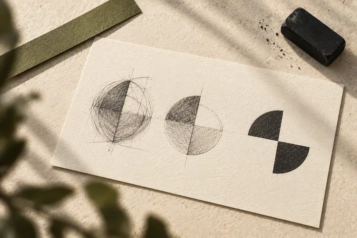
Fine lettering can look compelling on a large screen and become fragile on a small tag. Prepare examples using the longest form of the name, relevant language characters and a single colour. Examine enclosed spaces, neighbouring strokes and custom letter joins. If recognising a letter requires unusually close inspection, try a different arrangement. Reading the complete store name and recognising a tiny monogram are separate tasks; neither version should be assumed to replace the other everywhere.
Move from a metal rendering to a production sample
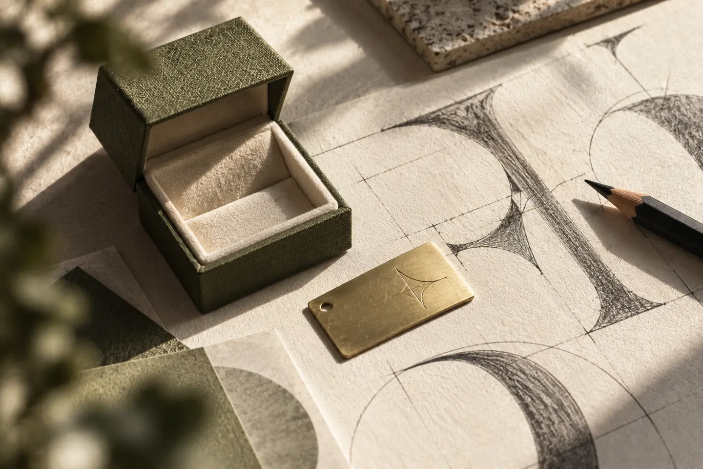
If engraving is planned, a glossy three-dimensional mockup is insufficient for approval. Describe the surface, coating, marking area and desired appearance to the production partner. Trotec's material-testing approach includes assessing feasibility and engraving quality on supplied samples. Separate approval of the design from approval of production. Remove unnecessary detail in the small-use version, then examine the sample under different lighting at a normal viewing distance. Ask whether one sample adequately represents the other surfaces in the product range.
Give storefronts and boxes their own treatment
Metallic signage may read differently as the lighting changes, while a matte box can benefit from quieter contrast. Compare actual sign materials, paper and printed samples instead of selecting everything from a gold colour on screen. Consider the space around the mark, the first surface revealed when opening the box and the wording on the care card. A logo in a product photograph should leave the jewellery visible. Photographic style and typographic hierarchy can also convey the identity.
A hypothetical brief for two collections
Imagine a new store selling both everyday jewellery and special-occasion pieces. Its brief could request one main name, a shared monogram and a secondary heading system for the collections. The presentation would include a ring box, small product tag, storefront photograph and mobile shop header. The decision would depend on whether changing collections still feels like the same store, rather than whether each collection receives its own decorative symbol. The final review can compare both collections in the same display and packaging system to check that the store remains identifiable.
Connect the handover to production decisions
Supply the full logo, small mark, horizontal arrangement, single-colour version and dark-background version with clear usage notes. Explain how the simplified engraving version relates to the main logo. The quotation should distinguish logo design, packaging layouts, signage adaptation and sample production. Record the file version sent to the supplier and retain a photograph of the approved sample. When a new material or process is introduced, request another proof rather than assuming an earlier successful application will transfer unchanged.
Key takeaways
- Assign separate roles to the full name and small monogram.
- Approve engraving on a sample of the intended surface.
- Compare packaging, storefronts and product photography in one presentation.
Frequently asked questions
Does a jewellery logo need a diamond or crown?
No. Such a symbol can be useful when it expresses the store's particular approach, but familiarity within the sector is not a sufficient reason. Distinctive lettering or an original symbol can also identify the business. Compare alternatives in realistic storefront and packaging applications.
Can every engraving use the same minimum stroke width?
A single measurement is not a sound acceptance rule for every surface and production process. Ask the supplier for the constraints of the intended material and equipment. Check which gaps close and which lines disappear in a sample before approving the small-use mark.
Should each jewellery collection have a separate logo?
First decide whether the collections operate as independent brands. If customers experience them as part of one store, a shared logo with secondary collection names can be easier to manage. The decision depends on the customer relationship and future use, rather than the collection name alone.