In this article
A greenhouse grower's identity can refer to both the plants and the structure around them. A detailed greenhouse drawing may become a tangle at small sizes, while one generic leaf may offer little distinction. Establish whether the business grows produce, supplies greenhouse structures or combines activities. This discussion focuses on a grower. The logo can develop its own character from order and cultivation rather than repeat the photographs of the vegetables surrounding it.
Quick answer
Consider a structural frame beside clear lettering for a greenhouse logo. A roof line, growing-row pattern or space derived from a letter provides different directions; they need not all appear together. Compare crate labels with an entrance sign to judge fine-line loss, visibility against bright surfaces and the clarity of the symbol in ordinary use.
Connect the name and structure deliberately
A roof placed casually above the name can suggest property branding. Establish a particular proportion between lettering and frame. A horizontal name may suit a long greenhouse frontage yet demand too much space on a compact crate label. Investigate related arrangements using the same letters. Very thin strokes can vanish against pale or translucent structures. More balanced weight can preserve the name without making the identity feel visually harsh or excessively industrial.
Reduce the greenhouse to a clear rhythm
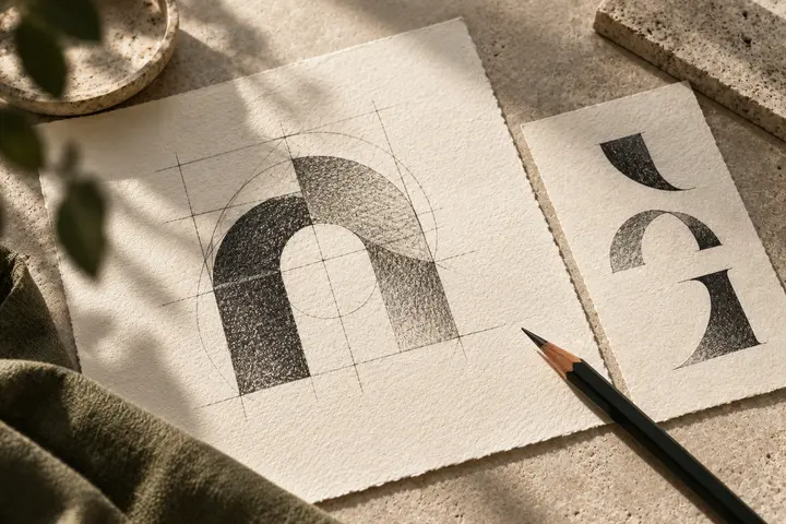
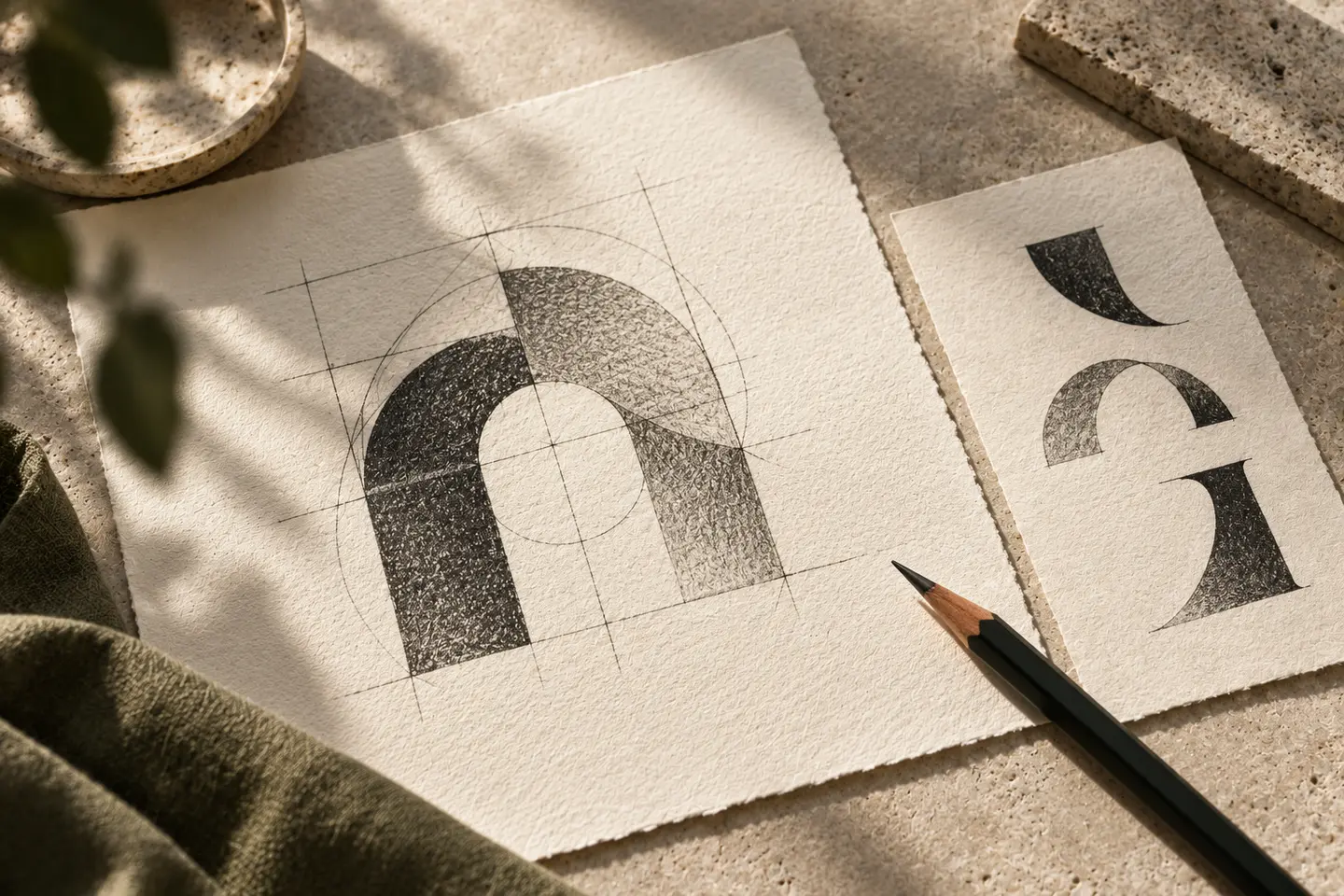
There is no need to draw every structural division. Two arches or one open frame may communicate the relevant rhythm. If adding a leaf, inspect whether it merges with the roof into an uncertain patch. Bands derived from planting rows offer another direction, though their resemblance to roads or fields also deserves review. A symbol need not explain the complete business by itself. It should feel internally resolved and form a strong composition with the company's name.
Give colour a role beyond plant green
A green logo may disappear among plant images. Compare dark neutral lettering, a limited green accent or a warm tone. Review the identity beside actual product photography. Roof materials and bright sky also change the entrance background. A dark monochrome version may help, but do not assume it solves every setting automatically. Explain palette decisions through separation and recognition rather than unsupported statements about production methods or product attributes supposedly conveyed by a particular hue.
Test a crate label and the entrance
For a hypothetical first trial, print an 80 by 50 millimetre harvest-crate label with the logo, produce name and dispatch information. Next, examine a proposed entrance sign 1.5 metres wide from the actual viewing distance. Confirm production dimensions on site. Look for closing gaps between small arches and lettering weakened by a bright sign background. Reference photographs from different times can support review. They test visual conditions, not the technical performance of the greenhouse or growing operation.
Brief a grower with several crops
Imagine a greenhouse company growing different vegetables and dispatching them in crates. Its requested character is orderly and lively without attachment to a tomato or cucumber drawing. Accept the identity when the label name remains visible, the entrance frame does not dominate with an unintended category association and the monochrome version stays open. Include an empty crate without plant photography in the final review. Appealing produce should not make an unresolved identity seem stronger than its actual lettering and symbol.
Key takeaways
- A grower and a greenhouse-structure supplier may need different visual emphasis.
- A greenhouse symbol need not show every structural line.
- Test lettering weight against the actual bright entrance environment.
Frequently asked questions
Does the logo need a greenhouse roof?
No. Row rhythms or letter-derived shapes may work. If using a roof, consider its associations with other industries.
Will green work beside plants?
Not always. Similar tones can merge, so compare colour against imagery and the intended application background.
Should the logo change for every vegetable?
The company identity can stay fixed while photographs, headings or a separate colour system identify the products.