In this article
A food brand logo is difficult to assess through appearance alone. On a shelf, will shoppers notice the brand, product type or flavour first? How will the same identity behave on a glass jar label, flexible pack and small online product image? A useful brief addresses those questions together. The brand mark cannot replace product information; it belongs to a system that can carry changing details. Review the logo on representative packaging and in realistic sales settings rather than only on an empty page.
Quick answer
Design a food brand logo within a packaging system that distinguishes the brand name, product type and variant. Do not rely on colour alone to identify flavours. Check name recognition in small sales images and test print on the intended pack. The scope should specify logo versions, product-range layouts and spaces for label information approved by the business.
Give the brand and product name separate jobs
A preserve brand may retain one name while strawberry, apricot and citrus varieties change. Binding both pieces of information into the logo can create unnecessary redesign work when a new product arrives. Establish the brand's position and space, then arrange the product name, quantity and business-supplied descriptions in a separate hierarchy. A logo can suggest a category through its character without illustrating every ingredient. The central decision is the order in which shoppers should encounter the information on each pack.
Balance appetite appeal with information density
A hand-drawn direction may be chosen to suggest a small-producer character, while a restrained wordmark may organise a broader range more easily. Neither proves quality or natural ingredients. Explain each direction's gains and compromises. Decorative details can enrich an identity but consume space on a small label. A very simple mark may need support from photography, typography or layout. Connect the decision to the brand's actual story and packaging information needs.
Visual language should not invent food claims
A fruit illustration, farm scene or seal-shaped device can imply something about the product even when treated as decoration. Avoid adding unverified claims about ingredients, origin or production through the design. Türkiye's Ministry of Agriculture and Forestry announced an update to its food labelling guidance in March 2026. The business's responsible team should approve current label content. The designer provides readable space for that approved information; a visual preference meeting should not substitute for the business's review of applicable requirements.
Hypothetical brief: a jar range starting with three variants
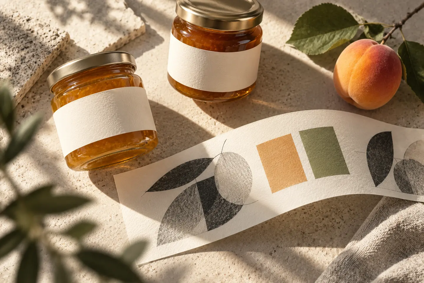
Imagine a food business launching three marmalade varieties and considering sauces later. Its brief includes a master identity, front jar labels, lid labels, outer-carton identification and online product cards. The variants use different colours, with names always provided as text too. A possible future sauce label tests the structure without presenting that unlaunched product as available. The business supplies quantity, ingredients and other required content. This hypothetical example does not describe a BOCW client.
Approve the design on the shelf and in the hand
Print the label at actual size and apply it to a jar. Curvature, lid shadows or busy photography may weaken the name in ways a flat screen image does not reveal. Place several packs together to check family resemblance and variant distinction simultaneously. Inspect the small online product image separately: the brand and product type should be distinguishable without enlarging the pack. Review substrate, surface and colour samples with the printer. Approval of one proof applies to that particular material and application.
- Check the reading order of brand, product type and variant.
- Identify variants when their distinguishing colours are removed.
- Confirm that decoration does not crowd approved information areas.
Separate logo scope from packaging scope
Designing the master identity is a different scope from preparing each product label. A quote should state the number of pack formats and variants, who supplies dimensions, and responsibility for content updates and print proofs. Specify photography, illustration or custom structural development separately. Possession of logo files does not mean every pack is ready for production. Defining which parts of the first product family will be prepared creates a clear basis for consistent later variants and for comparing proposals from different design teams.
Key takeaways
- Separate the fixed identity from changing product information.
- Identify variants through both colour and explicit names.
- Specify the logo and individual packaging adaptations as distinct scope items.
Frequently asked questions
Does a food logo need an image of the product?
No. A product image may help identify the category, but it can also limit a brand expanding into different products. Packaging photography or a clear product name beside the mark may provide the necessary information.
Can every variant use the same logo?
Yes, if the range structure supports it. Keep the master identity stable while changing variant names, product types and required details in separate areas. Test a representative pack before extending the system into a new category.
Which sample should we see before printing?
Request actual-size output on the intended material. Apply it to the pack, review a shelf arrangement and inspect a small sales image. Separately confirm that the proof uses the latest label content approved by the business.