In this article
A butcher shop logo should help customers recognise the business and find the information they need to buy. A street sign and a small package cannot carry the same detail, while counter labels also need room for product names and prices. The business's approach, product presentation and ordering methods belong at the centre of the brief. An animal silhouette may be appropriate, but it cannot establish trust by itself. A useful identity also brings a clear structure to everyday labelling, packaging and digital orders.
Quick answer
A butcher logo should remain recognisable on signage, small labels and packaging without overwhelming product information. Define the business's actual approach, then test name readability in single-colour printing, counter labels and mobile order headers. Sector conventions do not make any symbol or colour compulsory. The identity works through a combination of the mark, accurate information and considered presentation.
Describe the everyday service in the brief
Do customers select at the counter, collect prepared packages or place orders by telephone? These differences shape the design requirements. Describe services the business actually offers, such as custom preparation, clear product explanations or organised order collection. Replace broad claims of quality with behaviours customers can observe. Any wording added to the logo should share that clarity. A visual identity should not be presented as proof of an unsupported product attribute; it needs accurate information and a consistent everyday experience beside it.
Balance an animal symbol with the business name
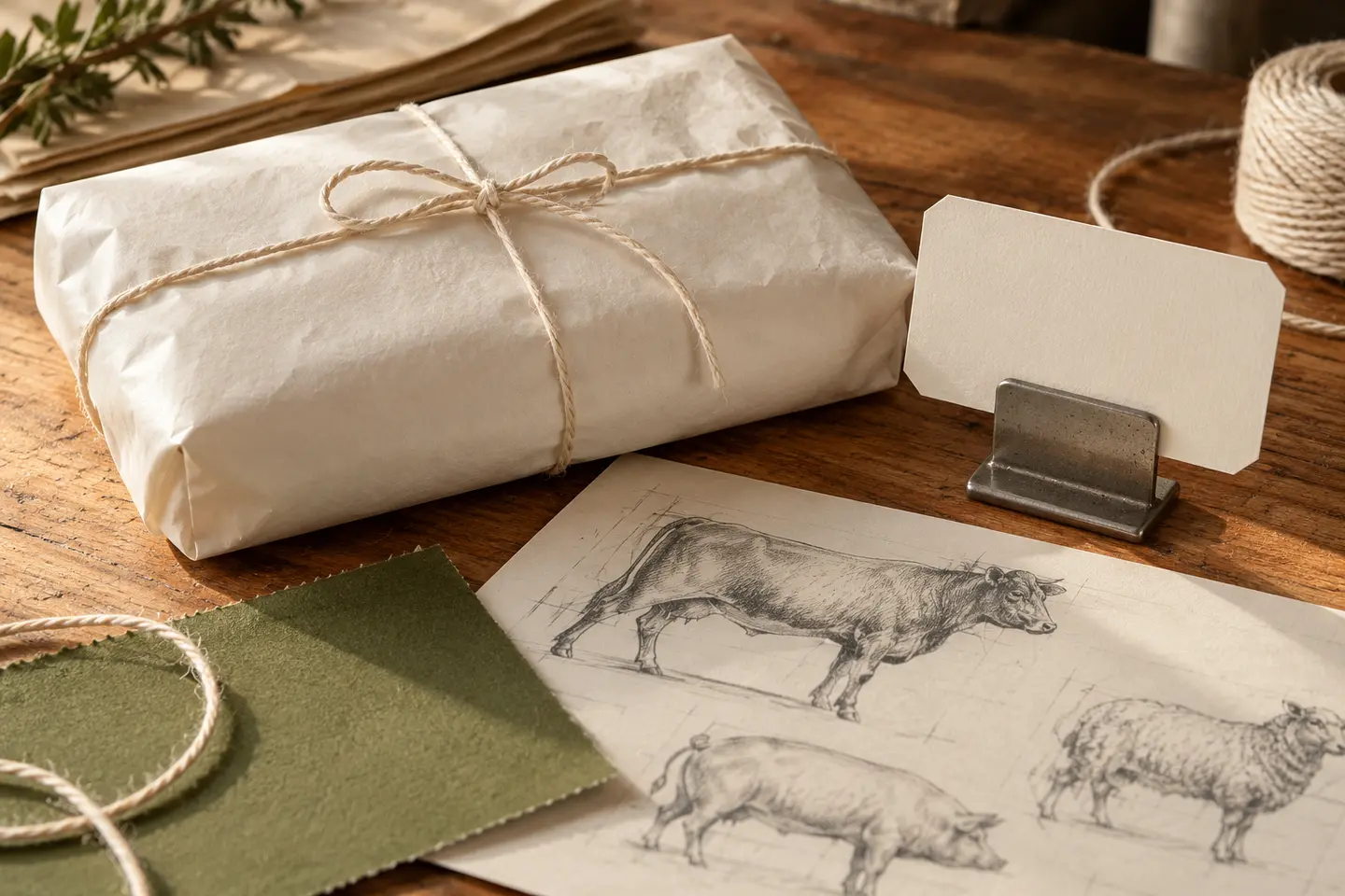
An animal symbol can indicate the product category, but it may also resemble many neighbouring businesses. Begin by examining different ways to read the name. A long name may need a horizontal arrangement, while a small label may benefit from a compact mark or initial. Check which parts of a detailed illustration survive reduction. Red, black and wood-effect styling are choices rather than sector rules. Assess the proposed language on actual sign materials and the intended packaging colour.
Put shopping information first on the label
Counter labels need a deliberate hierarchy between brand, product name and price. A larger logo does not necessarily make purchasing easier. Reserve space for product information confirmed by the business, and test how changing text will be entered by hand or through a system. Include a long product name in the examples. Separating the mark from information fields helps preserve the layout during daily edits. Design approval does not replace the business's responsibility to review the content of its labels.
See what the identity can do in one colour
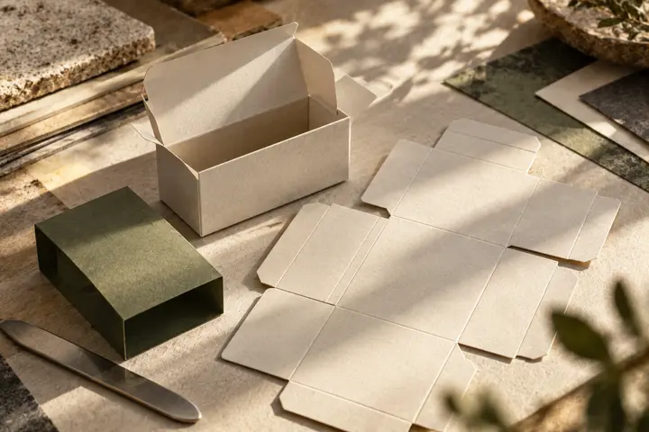
Wrapping paper, bags, boxes and small stickers may use different printing processes. Request the relevant supplier's proof for each surface. In a single-colour version, a clear relationship between name and symbol matters more than shadows or fine decoration. Examine whether folds and closures interrupt the logo. Handle and carry realistic examples rather than inferring production durability from a digital mockup. A colourful storefront identity should still recall the same business when reduced to a simple mark on a package.
A hypothetical neighbourhood-shop brief
Imagine a butcher combining counter sales with packaged orders. The brief prioritises recognition from the street and organised information on packaging. The presentation includes a facade, counter label with a long product name, single-colour wrapper and order header on a phone. If an animal symbol is chosen, it takes a simple supporting role instead of competing with prices or descriptions. At acceptance, check that customers can read product information, staff can update labels and the store name remains visible as a package is opened.
Deliver templates the staff can actually use
Logo artwork alone may not keep daily product labels consistent. Specify editable labels, package stickers and order-announcement templates separately in the quotation. Show which text fields change and which layout elements remain fixed. Staff preparing new labels need access to the necessary typefaces and colour references. Creating a trial label with the person who will use the template is a useful acceptance step. It turns the identity into an everyday working tool instead of an attractive mark seen only in the presentation.
Key takeaways
- Preserve the visual priority of product names and prices.
- Proof single-colour packaging and labels with long product names.
- Request editable templates for the people preparing daily labels.
Frequently asked questions
Does a butcher logo need an animal symbol?
No. It can explain the product category, but making the name readable and distinctive is a more fundamental need. Lettering-led designs or other original marks can also work. Compare alternatives on a small label and the actual storefront.
How much space should the logo leave for product information?
There is no single useful proportion for every label. Evaluate the real product name, price field and other information together. If customers cannot read what they need, reduce the logo or move it into a separate area. Test both short and long content.
Is package design automatically included in a logo quotation?
Do not assume it is included unless it is specified. Logo files, package layouts, editable label templates and print coordination are different tasks. Describe the package types and production partner in the brief, then compare deliverables against that same list.