In this article
A dairy logo has to connect the name on a milk carton with the small mark on a yoghurt lid. Adding a separate personality to each product is easy; maintaining one recognisable voice across the family takes more deliberate choices. The starting point is therefore not a cow or a drop, but a shape that can stay consistent. This guide examines visual identity across packaging rather than making claims about the products inside.
Quick answer
A useful dairy identity separates a readable brand name from product descriptions and gives it a stable silhouette. White is one possible background, not a requirement. The same letter structure should remain identifiable on coloured lids, pale labels and single-colour print. Product information should sit beside the logo rather than become part of its drawing.
Depicting milk or connecting the range
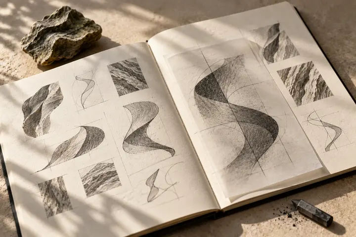
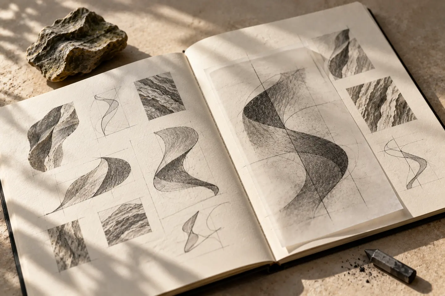
A cow illustration may suit a narrowly focused milk identity, but it may explain less when cheese, yoghurt drinks and butter sit together. A distinctive flowing symbol can extend more easily across those products, although excessive abstraction can make it resemble unrelated beverage brands. Compare the meaning of a symbol with the breadth of the intended range.
Put the first sketches on three empty packaging layouts. Give the logo comparable visual weight in each. This reveals whether a concept disappears among product graphics or overwhelms the rest of the panel.
Giving rounded letters a clear rhythm
Soft corners can relate to the curve of a lid without turning every letter into a bubble. Too much rounding can remove the distinctive rhythm of the name. Repeated circular letters need optical adjustment so their counters appear balanced. When pairing a substantial wordmark with a fine secondary face, check that the actual product description remains easy to find.
Turkish dots and accents need space near a folded carton edge. If a long name will not fit a small container, develop a compact arrangement as well as a horizontal one instead of simply squeezing the lettering.
Treating white as an active surface
White may come from the packaging material itself. A pale mark can lose its edge on a white lid, while a large dark panel can make the whole range feel unnecessarily heavy. Draw light and dark versions together. Product colours can change around a stable brand colour; each flavour does not need to recolour the logo.
Foil and glossy labels behave differently from a flat screen presentation. Keep those finishing effects as application decisions instead of building a simulated metallic gradient into the master mark. The underlying shape should remain useful without the effect.
Two trials at the intended dimensions
For the first trial, print the mark on a sample yoghurt lid measuring 40 millimetres across. Cut out the full-size print and place it on the container. Check whether the sloping edge crops the name or the opening tab interrupts the symbol. Then use the logo at 32 millimetres wide on a milk carton front.
Place that carton between three sample variants at eye level. Record the reading order of brand and product type separately. Acceptance means the same lettering is recognised and the product name remains independent in both trials, beyond the appeal of an enlarged presentation.
A hypothetical dairy family
Imagine a fictional dairy launching milk, yoghurt and white cheese. Its brief could explore a curved wordmark with a small, single-line flow symbol. On the cheese label the symbol becomes subordinate; on the lid a compact arrangement replaces the horizontal version. These choices should express one family without forcing every package into exactly the same composition.
Approve the route only when the name reads comfortably on all three surfaces, the flow survives one-colour printing and variant colours do not create an unintended new symbol. The example is hypothetical. Origin statements, ingredients and other specialist product wording come from the business as separately approved material.
Key takeaways
- Compare lid geometry with the rhythm of the lettering.
- Keep the brand silhouette stable as variant colours change.
- Test the carton and lid independently at actual size.
Frequently asked questions
Does a dairy brand need a cow symbol?
No. Explore it when it explains the range, but consider a wordmark or an original flowing form when a literal animal limits the identity.
Can the logo be entirely white?
Yes, against a suitable dark area. Develop a readable version for pale packaging too, rather than assuming an added outline will solve every application.
Should product names be inside the logo?
A separate information layer is usually more flexible. Adding a new product then leaves the proportions and spacing of the main brand name intact.