In this article
Café logo design creates a mark that carries the venue's character into everyday service materials. The name seen from the street, a takeaway cup and a menu should identify the same business, although each may need a different size or arrangement. A useful brief connects table service, takeaway sales, product variety and the venue's visibility. The first decision is not which coffee cup to draw, but which name and experience the identity should communicate. Test that decision on the actual surfaces the business uses.
Quick answer
Design a café logo around its name and character alongside cups, menus, windows, aprons and digital profiles. The main name arrangement and any compact versions should retain one identity. Check reading on curved cups, single-colour printing and street visibility through real examples. Specify the logo, menu design and packaging adaptations as separate scope items in the proposal.
Describe how the venue operates through the day
A venue serving quick morning coffee and one where customers spend longer at tables may need different communication priorities. The first may emphasise street recognition and takeaway cups; the second may focus on menus and the interior relationship. This is a difference in use, not a fixed style category. Describe service methods, product range and identity placements in the brief. Develop directions against daily tasks rather than selecting a logo solely from attractive interior reference photographs.
Handwritten character or a clearer name arrangement?
Handwritten lettering can offer a personal expression but may complicate a long or unfamiliar name. More open letterforms can support recognition while needing accompanying graphics to communicate the venue's character. Compare both approaches on signs, compact cup marks and menu headings rather than through taste alone. Coffee beans and cups are optional symbols. If the range may expand, consider whether an identity tied to one drink would still represent the business and its intended products appropriately.
A cup offers less predictable space than a flat page
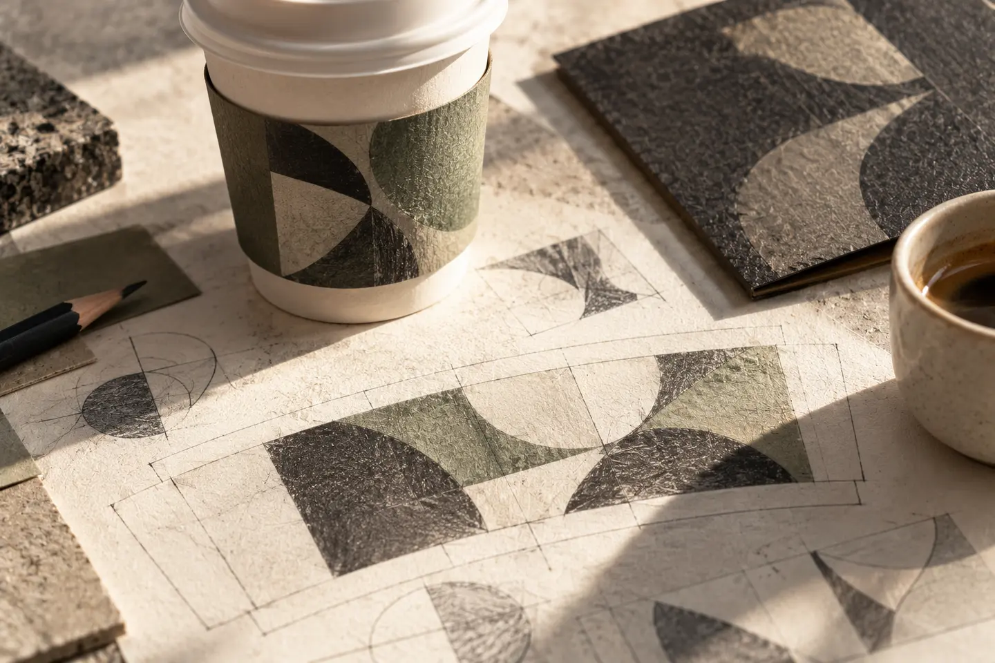
Do not assess cup artwork as a flat surface alone. Curvature and the way it is held change which part of the mark is visible. Use the producer's template to establish the principal viewing area, keeping identity and necessary information clear of relevant joining or cutting areas. Single-colour printing or stamping offers a different expression but requires detail checks. Consider sleeves too. Screen mockups illustrate appearance; a physical printed sample provides firmer evidence for name recognition and placement.
Hypothetical brief: a corner café with bakery products
Imagine a café offering morning takeaway coffee, daytime table service and bakery products. Its brief includes the master logo, window graphics, cups, a paper-bag stamp, menu cover and apron identification. Bags use a single-colour version while the window shows the full name. Menu content stays outside the logo in an editable layout. A prospective packaged-coffee label tests later expansion.
Think about service during acceptance
Assess the window or entrance name with surrounding visuals included. Put actual-size menu and cup samples on a table, then check which part of the name appears when the cup is held. If stamped letters merge, reconsider detail or application size. Plan an approved compact version if profile cropping loses the name. Menu product and price text needs its own legibility review. Approval of the logo does not automatically approve every service graphic or the accompanying information layout.
- Compare the same brand character on windows, menus and cups.
- Try stamps and single-colour output on the intended materials.
- Identify the approved version for small digital crops.
Separate the items staff will update
Menus and seasonal announcements may change frequently; the logo should not need redrawing each time. Identify the master identity, menu template, cup and bag adaptations separately in the proposal. Specify responsibility for producer-required artwork preparation and physical manufacture. Show staff the editable areas while maintaining the fixed mark's proportions and placement. Guidelines should explain what work is needed for later products or packaging. This supports consistent everyday communication after opening, as well as the first set of launch materials.
Key takeaways
- Include service methods and actual surfaces in the identity brief.
- Approve cups, stamps and windows through separate samples.
- Manage changing menu content separately from the stable brand mark.
Frequently asked questions
Does a café logo need a coffee cup?
No. A name-led or abstract mark may represent the venue effectively. If other products will be offered, consider whether a cup narrows the perceived range. A familiar symbol alone does not distinguish the business from other cafés.
Is a single-colour café logo enough?
It can be useful for many applications. Test it on stamps, bags and cups; plan digital and interior colour use separately. The single-colour version should retain a clear relationship with the main identity and remain readable in practice.
Is cup printing part of logo design?
Artwork adaptation, production files and delivery of printed cups may be different scope items. Specify cup sizes and the number of versions. Clarify the producer's template, sample preparation and printing responsibilities separately in the written proposal.