
In this article
A layered burger shape is an appealing starting point, but an illustration as detailed as the product can become heavy on small surfaces. Rather than depicting every ingredient, establish a recognisable outer shape. The same principle applies to lettering: choosing a heavy weight does not create character by itself. The rhythm of the name, letter spacing and surrounding area must work together. A signature that looks confident on a carrier bag should still introduce the same business clearly on a wrap label or menu board.
Quick answer
Choose one principal idea: a strong wordmark or a restrained layered symbol. Do not expect every detail to remain separately visible in small printing. Keep counters open and colour controlled. Compare a generous wrap application with a small seal through physical samples. Give the brand name, individual products and menu explanations different levels of emphasis.
Prioritise silhouette over the number of layers
Two curves and one intervening line may be enough to suggest a burger. Giving every layer another colour may leave the identity fragmented when colour disappears. Review a black silhouette. Leave open areas between upper and lower sections so the shape does not become a closed oval. A burger form can grow from a letter, provided the word still reads correctly. The logo and product photograph need not perform the same job: the photograph can describe detail while the mark establishes identity.
Find character inside substantial lettering
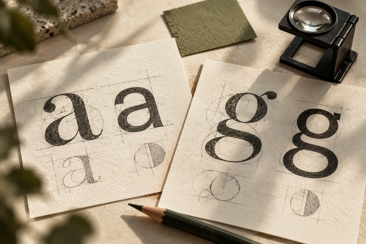
Broad, heavy type can look confident, but ambiguous characters can make the name anonymous. A particular terminal cut, curve or balanced letter pair may provide more character. Do not compress the lettering merely to fit a narrow area. Balance gaps visually, especially between adjacent round letters. If a category line becomes too small, remove it from selected applications rather than forcing it to remain. A principal name that feels complete alone can adapt more readily to wraps and labels, with supporting text arranged separately.
Separate menu colour from identity colour
A menu board already contains product photographs, headings and price fields with their own visual rhythm. The logo need not participate in every colour. Begin with one principal tone and neutral counterparts. If using a bright accent, identify where it genuinely improves reading. A patterned wrap may need a plain area for the signature. Inspect colour on real paper and prepare dark and light versions together. Do not assume that fine spaces behave identically in both. Colour decisions should complement the assessment of form.
Proof a wrap and a small seal
Print the logo 65 millimetres wide on burger wrapping paper, then close it around a representative form. Note which letters meet the folds. Next, prepare a compact mark inside a seal 22 millimetres across. These are example prototype dimensions. Review physical prints without enlargement. If layers merge in the seal, reduce their number rather than arbitrarily thickening everything. If the closed wrap hides the full name, adjust placement or plan a second area carrying it. The actual wrapping method belongs in the identity review.
A hypothetical daytime and evening restaurant
Imagine a burger restaurant serving quick daytime meals and evening gatherings. This hypothetical brief seeks confidence without a shouting appearance. Compare custom lettering alone with quieter letters balanced by a simple burger symbol. Use the same bag, wrap and menu board for each. Acceptance should cover finding the name quickly, retaining open areas in the seal and preventing the pattern from overpowering the signature. Do not invent product qualities or portion claims to justify a direction. Brand statements should be approved separately using actual business information.
Key takeaways
- Seek a recognisable outline without increasing the number of layers.
- Review counters and letter pairs in heavy lettering.
- Include the actual wrapping method in the proof.
Frequently asked questions
Can a burger identity work without a burger picture?
Yes. Distinctive lettering and consistent packaging can be sufficient. The menu and premises already provide the context needed to understand the products.
Do heavier letters always create a stronger logo?
No. Closed counters make a name harder to read. Strength also comes from proportion, spacing and identifiable letter character, rather than weight alone.
Should the logo repeat across the wrap pattern?
It can, but each repeat need not be readable. A clear principal signature with a quieter supporting rhythm can provide a more controlled composition.

