In this article
A cosmetics or personal care logo often appears on a small, curved or restricted surface. The same identity may need to remain recognisable on a bottle, carton, product page and sales presentation. Visual decisions should therefore extend beyond an attractive cover photograph. Product naming, variant distinction and information placement belong in the brief from the start. This article concerns the visual system. It does not assess ingredients, health effects, regulatory label compliance or certification; approved product information must come from the business and the relevant specialists.
Quick answer
Corporate identity for cosmetics and personal care should establish priorities between the main brand, range, variant and information areas. Test the logo on small physical surfaces and use colour and typography to support the product family. Packaging and digital images should carry consistent approved names. Design should not introduce unverified product effects, ingredient claims or certification implications through words or imagery.
Establish an order from the brand to the variant
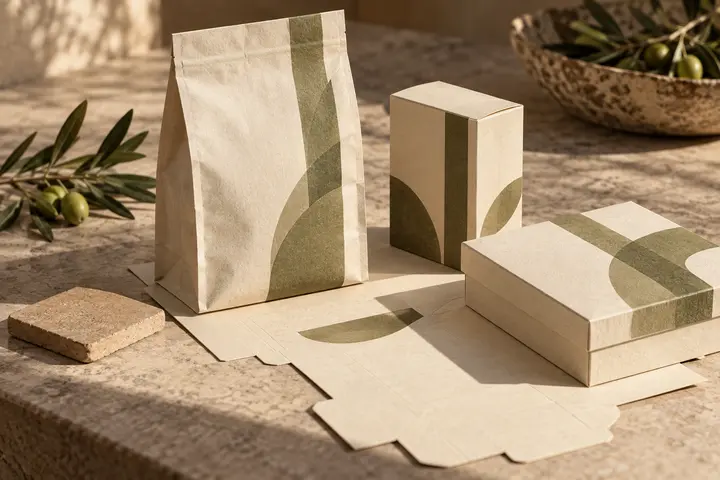
Making every word equally prominent may not help someone choose. Separate the jobs of brand, range and variant names. Distinctions such as fragrance, volume or form should follow approved business information. The arrangement needs to clarify which product is which. Do not rely exclusively on colour to distinguish variants. Written names and placement should also contribute, with a clear rule explaining which level changes when another product joins the family.
Evaluate the logo on the actual packaging surface
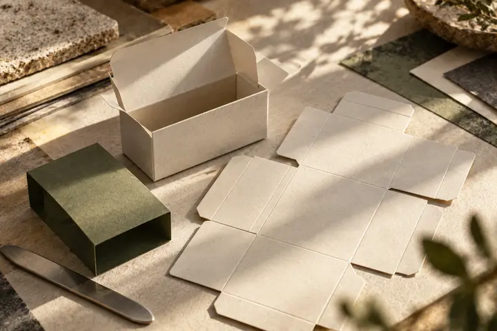
A cylindrical bottle, narrow tube and broad carton provide different visible areas. Reviewing a flat label does not represent every aspect of holding the product. Check the mark at its actual size on the intended surface. Once materials and production methods are known, arrange suitable proofs with the manufacturer. Instead of inventing one universal minimum size, record the accepted application and dimensions. Show which approved arrangement belongs to each package within the identity documentation.
Keep atmosphere separate from product claims
Photography, illustration and texture can establish a visual atmosphere. Consider separately whether they imply an unverified ingredient, origin, effect or certification. A decorative leaf, laboratory photograph or badge should not appear simply because it looks appealing. Discuss its meaning with the information owner. The design team communicates approved material clearly; it should not manufacture new technical or health claims. Refer uncertain wording and imagery to the responsible reviewer before visual approval becomes production approval.
A hypothetical range with several products
Imagine a personal care brand with three variants and two package volumes. Designing only one bottle initially could conceal problems with the longest product name. Include all names, sample sizes, physical surfaces and sales channels in the brief. If the range is sold both with and without cartons, plan information distribution separately. This is not an account of a real BOCW project. It demonstrates why testing difficult examples early is more useful than approving only the simplest representative package.
Match product photographs to the approved label
Check whether the package shown in an online listing carries the current design. An old label image combined with a new name can create confusion. Colour editing should not misrepresent the product. Give the design team an approved mapping of product codes and photographs. Define the roles of detail shots, family arrangements and contextual imagery. Preserve a coherent brand language while retaining the information people need to distinguish the right variant rather than merely recognise an attractive product collection.
Separate information approval from design approval in the brief
Share identity files, product lists, manufacturer templates and approved wording with BOCW. Distinguish corporate identity, master packaging, variant adaptation and photographic work in the scope. Confirm that the name, code, package version and digital page agree. Identify who approves information and who reviews visual implementation. Maintain a current file library after production so later ranges start from approved material rather than an old experiment. Revision dates and responsible owners should remain visible in the handover record.
Key takeaways
- Give the brand, range and variant distinct information roles.
- Review real packaging shapes and manufacturer templates early.
- Do not confuse visual atmosphere with substantiated product or certification claims.
Frequently asked questions
Does every cosmetics variant need a different logo?
No. The main brand can remain consistent while names, colour relationships and hierarchy distinguish the range.
Does label design determine all product information?
No. Approved content and necessary assessments come from the responsible business specialists. This guide addresses the visual identity.
Is one packaging example enough for approval?
Also test long names, alternative volumes and surfaces. One attractive example does not demonstrate suitability across an entire range.