In this article
Logo design develops the visual mark used to identify a brand. That mark need not be a picture: a distinctive treatment of the name can perform the same role. In everyday conversation, logo, brand and corporate identity are sometimes used interchangeably, although they describe different needs. Understanding the distinction helps clients request the appropriate service. This article explains the basic components, why a business develops a logo, how the mark should be assessed and where it connects with a wider identity programme.
Quick answer
Logo design turns a brand name or symbol into a recognisable visual arrangement through typography, shape, proportion and colour. The logo is a central identification device; it does not create the product, customer experience or complete communication system. Corporate identity can include the broader visual rules and applications around it. Each project's scope should make that relationship explicit.
When does a graphic function as a logo?
An attractive drawing alone does not make a logo. It needs a relationship with a particular brand and consistent use in identifying it. A decorative leaf on packaging serves a different purpose from a leaf mark identifying the same business across its materials. Design establishes both the form and its intended use. Distinctiveness matters, while customer recognition develops through consistent exposure and experiences with the business. The artwork provides a starting point for that relationship rather than creating established recognition on the day it is delivered.
Wordmarks, symbols and combined arrangements
A wordmark focuses on the visual treatment of the name. A symbol-led solution foregrounds a mark, while a combined arrangement uses both. These are different approaches rather than levels of quality. Name length, desired character and applications influence the choice. A hypothetical furniture business with a short name might develop character through letter proportions. An educational institution with a long name might need a separate mark for restricted placements. The decision should follow the requirement instead of assuming every business must have an illustrated symbol.
Design involves more than selecting colours
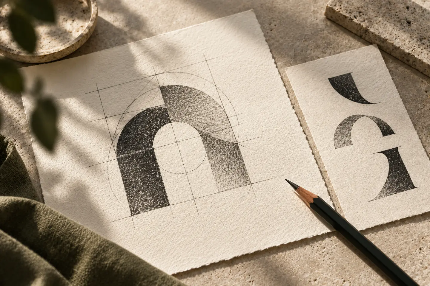
Letterforms, spacing, the size relationship between name and symbol, and the arrangement of elements are core decisions. Colour supports the structure but cannot resolve every structural problem. If the name is difficult to read, reviewing the letters or spacing may be more useful than trying another colour. Construction of the artwork also affects application. W3C defines SVG as a graphics language that can contain shapes, images and text. A requirement for vector-based logo artwork therefore needs to be checked through the file's contents.
A logo does not tell the entire business story
Expecting a mark to illustrate the founding story, every product and all values can make the design unnecessarily difficult. It highlights selected qualities and creates an identifying focal point. Other information belongs in the name, tagline, text, photography or customer experience. A hypothetical maintenance service can use an approachable visual character, but its operation must demonstrate timely service. Understanding this limit helps a client choose appropriate design priorities without loading the logo with claims that the artwork cannot substantiate on its own.
The logo provides a starting point for identity
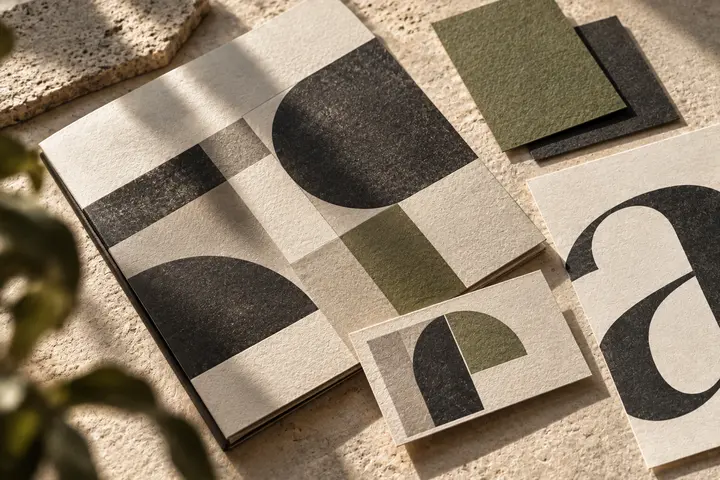
A corporate identity project can organise the visual environment in which a logo appears. Colour roles, typography, page layouts and image direction form parts of that environment. Two businesses can receive similar logo file packages and still have very different application needs. Business cards, websites and packaging should therefore be defined explicitly in the scope. Agree which rules and applications will be developed. This makes the relationship between the central mark and its wider system clear enough to evaluate and implement.
Turn the concept into an actual requirement
Explain where the business needs visibility and what currently makes identification difficult. Is the name unreadable? Do suppliers use inconsistent versions? Does a new activity require a different visual character? These questions establish the problem the design should address. An acceptance check can cover correct spelling, required arrangements, small-scale uses and background options. A concise application list shared with BOCW turns a broad request for visual improvement into a requirement that can be discussed, developed and checked against the business's everyday materials.
Key takeaways
- A logo is a visual mark identifying a particular brand.
- Wordmarks and symbols serve different requirements rather than a hierarchy of quality.
- Define identity applications separately from the logo file package.
Frequently asked questions
Are a logo and an emblem the same thing?
Everyday terminology can overlap. Emblem often refers to the symbol, while logo can describe the overall brand mark. In a project conversation, clarify the element to be designed and used rather than relying on terminology alone.
Can an icon be used as a logo?
An icon can perform that role when developed and used to identify a specific brand. A general functional icon is designed to convey a shared meaning across settings, so it may provide little distinction for one business.
Does logo design replace brand strategy?
No. Strategy addresses decisions such as audience, offer and positioning. A logo contributes to their visual expression. If those questions remain unresolved, the project may need research or advice alongside the design work.