In this article
A wedding and event venue identity shares space with each celebration’s own colours, names and personal marks. Its task goes beyond looking romantic: it must identify the place while leaving room for the hosts. Rings, infinity symbols and intertwined initials can resemble a particular couple’s identity rather than a venue. A courtyard proportion, garden entrance or architectural rhythm may provide a more lasting reference. The resulting mark should also feel credible when the same space hosts celebrations outside the wedding category.
Quick answer
A venue logo should combine a readable name with a measured reference to the place. Leave space for changing event identities and test fine strokes or metallic colour in physical reproduction. Small invitation-footers and larger entrance-board trials should preserve the same character without making the venue compete with the event hosts’ names.
Build spatial memory rather than compulsory romance
An arch, garden opening or ceiling rhythm can provide a particular core. Hearts and rings may reduce every event to a marriage ceremony. If initials are considered, compare them with a personal wedding monogram. A multiword venue name need not be enclosed in a crest. A separate, quieter symbol can adapt more readily between large event boards and small location references. The architectural observation does not need to become a literal drawing of the building.
Find the readable limit of delicate lettering
Fine strokes and long flourishes may look appealing on a large screen yet disappear beneath an invitation. Simplify overlapping areas and make the order of similar capitals clear. A calligraphic name can be paired with a calmer venue descriptor. Space around the lettering matters as much as ornament. Keep dates and couple names outside the principal drawing: they belong to the changing event identity and should not require modifications to the venue’s own artwork.
Treat champagne colour as one option
Gold, cream and champagne tones may be relevant without suiting every event. A dark principal version and a light counterpart can offer flexibility across changing palettes. If foil is proposed, compare its flat-print counterpart using the same proportions. Low contrast should not become a substitute for elegance. Flowers and textures can vary around the identity, while the central symbol remains stable. Rebuilding it as a different pattern for each celebration makes the venue harder to recognise.
Trial an invitation footer and entrance board
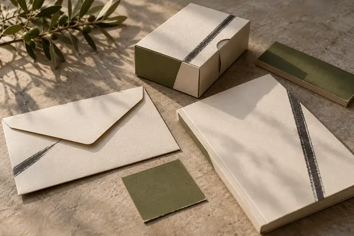
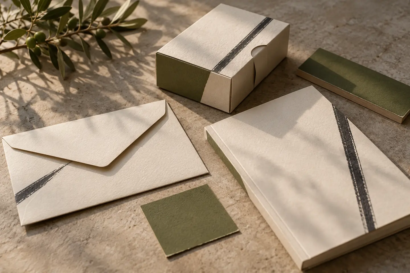
Place the mark at 25 millimetres wide beneath fictional host names and an address on an invitation. Then put the same identity below an event title on an A1 entrance board. These are proposed test dimensions. Fine lines should survive the small version, while the large composition should keep ownership clear. Compare metallic and flat-colour samples under the same light so that reflectiveness does not disguise readability problems or make a weaker drawing appear more effective.
Evaluate a hypothetical garden-venue brief
Imagine a venue with an open garden and simple gateway, hosting weddings, private celebrations and corporate events. The gateway opening becomes one symbol, with flowers reserved for supporting graphics. Accept it when the opening survives in the invitation footer, the event title leads on the board and the dark single-colour version retains its character. A couple’s monogram and the venue mark should remain distinguishable when displayed together. This fictional brief provides review criteria without claiming a completed client project.
Key takeaways
- Separate the venue mark from personal couple monograms.
- Inspect fine strokes at invitation-footer size.
- Keep the core symbol stable as event palettes change.
Frequently asked questions
Is calligraphy necessary?
No. Clear, measured lettering can also feel elegant. When calligraphy is chosen, inspect whether small letter combinations are still read in the intended order.
Should flowers be inside the logo?
Only when they contribute to the venue’s enduring character. Seasonal flowers may work better as supporting graphics so that the core mark can remain stable.
Can the venue mark be larger than the hosts’ names?
Venue advertising and an event welcome board have different priorities. The venue can lead its own promotion, while the hosts or event title may lead at a celebration. Review both compositions.