In this article
A vehicle wrapping company presents its own identity beside customers with very different visual styles. Some projects are glossy, others matte, and some use almost nothing but lettering. If the studio signature competes with each project, its portfolio can become confused. Identity design therefore needs to accommodate changing surfaces as well as suggest the craft. A peeled sticker corner is familiar but rarely specific to one name. A clear wordmark and disciplined placement may offer a more lasting distinction.
Quick answer
Express a layer or cut through one legible form. Use spaces that survive reduction rather than extremely fine blade-like lines. Define a placement that separates the company signature from customer graphics. Test a material sample label and a vehicle signature at actual size. The same name should remain clear on different film colours.
Deciding how much layering to show
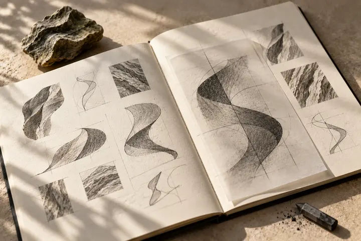
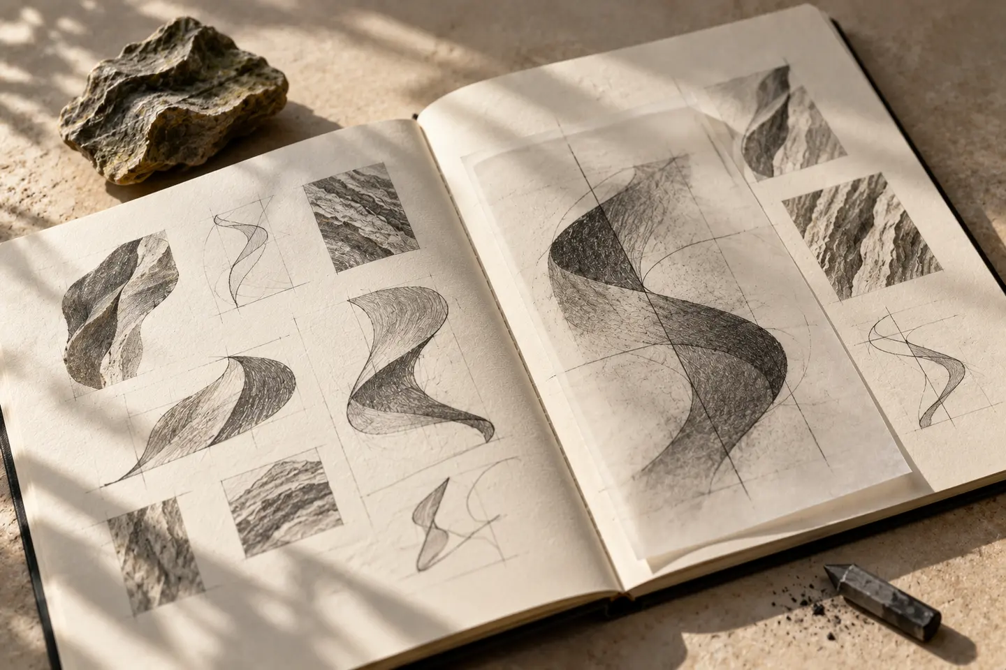
A folded corner, overlapping planes or an opening inside a letter offer different directions. Combining all three may create a diagram requiring explanation. Establish which line is essential. A fold that needs shading to make sense may be weak as the core mark. Decide first with flat artwork, then use dimensional effects in application imagery if useful. The symbol is a creative interpretation, not a diagram proving a wrapping method or material durability.
Letter spacing suited to cut graphics
A custom letter connection can suggest care in the work, but fragmenting every letter makes reading harder. Discuss fine bridges and narrow spaces with the production supplier. A short name might support generous spacing; a long one may need a compact layout and separate symbol. Include language marks as part of the drawing. If a door curve or panel join interrupts the name, move the application. Reviewing it only on a flat desk misses that relationship.
A calm presence beside colour samples
A company displaying many material colours need not make its own palette compete with all of them. Dark ink and a warm pale background provide one possible direction. A bright accent should not overpower material codes. Matte and gloss surfaces can make a colour feel different, so examine actual samples. Define a single-colour signature for customer vehicles where appropriate. Likewise, give portfolio photography a discreet signature position that does not obscure the work being shown.
Sample-label and vehicle trials
First, place the logo at 22 millimetres wide on a material sample label. Read it alongside the material name and code. Next, try a 30-centimetre-wide signature on a real vehicle panel using paper or temporary material. Compare flat and curved areas. These dimensions are proposed trial points, to be adjusted for supplier limits and panel size. Record broken lines, closed letter spaces and interference from panel joins. Enlarged screen mock-ups cannot replace this actual-size review.
A hypothetical application studio brief
Imagine a wrapping studio seeking a common signature for colour samples and finished-vehicle photographs. Its hypothetical brief asks for precision with an approachable character. Compare a letter-derived layering idea with a simple wordmark on the same matte grey and vivid yellow examples. Assess name recognition, economical cutting and considerate placement beside customer graphics. Include sample-label artwork, vehicle signature and digital portfolio position in the approval file. Material properties should appear only through descriptions supplied and approved by the business.
Key takeaways
- Make the layering idea understandable without a shadow effect.
- Place the studio signature considerately beside customer graphics.
- Test a small label and curved vehicle panel separately.
Frequently asked questions
Is a peeling film corner necessary?
No. Letter-based ideas or simple cut relationships can work. A peeled corner earns its place when it contributes something specific to the brand.
Can the logo change colour with every film?
Unlimited changes may weaken consistency. Approved light, dark and single-colour versions provide a more controlled way to accommodate materials.
Are very fine lines acceptable?
Application size and production method determine that. Inspect a real supplier sample before assuming that delicate details can be cut and applied successfully.