In this article
A textile company’s identity often appears on sample folders, fabric cards and exhibition panels rather than only on garments. Its signature must retain a clear voice beside patterns and textures. Combining thread, needles and a woven grid can create an overly literal illustration. Choosing one visual relationship offers a more useful starting point. Ask how the name will sit beside an actual fabric sample, as well as what the company makes. Those neighbouring surfaces are part of the identity’s everyday setting.
Quick answer
Repeated lines can suggest textile construction without reproducing a fabric pattern. Coordinate the rhythm of the lettering and the symbol, leaving enough quiet space beside busy samples. A woven label trial and a full size folder cover trial establish whether the small production mark and broader company signature belong to the same workable visual system.
Translate thread into a readable structure
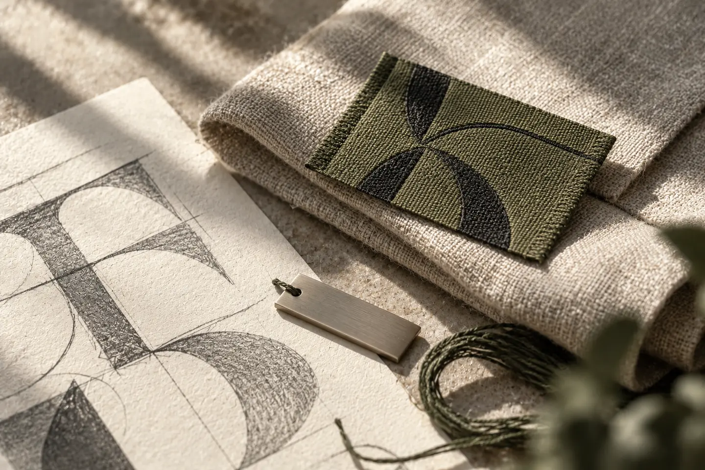
Overlapping two strokes of a letter can suggest interlacing. Adding tiny cuts at every crossing, however, may create a fragmented shape when reduced. Sketch three or four strong bands first, then decide whether they form a letter or an abstract emblem. A shape suspended between those readings can be difficult to recognise on a sample card. If patterned fabric sits immediately behind the logo, a plain background panel may solve the problem more effectively than further detailing the drawing. Keep the visual idea deliberate and compact.
Set the actual manufacturer name early
Stacked sample folders may reveal only their spines. Widely spaced lettering can exceed that narrow area, while heavily compressed type may merge on a woven label. Start with moderate width and open letter endings, using the actual name rather than a short placeholder. A business descriptor does not have to become a permanent part of the signature. It can move elsewhere when necessary. The small version must preserve recognition of the main name even if the secondary explanation is omitted from that application.
Keep a stable core beside changing fabric colours
Seasonal sample ranges should not require a newly coloured logo every time. Dark neutral and light single colour versions can establish a calm constant beside varied swatches. A vivid accent might belong in one part of the emblem or in the folder layout. Printed ink and woven thread do not necessarily appear identical. Review physical samples together instead of approving colour solely through a numerical reference. The objective is a coherent impression across materials rather than pretending that paper and textile behave as the same surface.
Compare a woven label and a sample cover
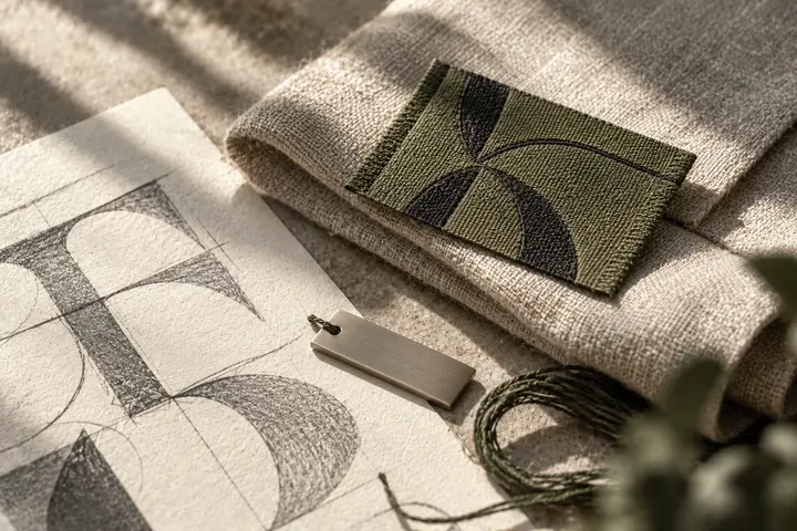
For the first trial, place the wordmark within a 30 millimetre woven label layout. Review a supplier sample for open counters and legible crossings. For the second, print it 70 millimetres wide on the actual sample folder cover. The name should remain clear beside fabric pieces, and nearby patterns should not appear to continue into the symbol. These dimensions belong to an illustrative brief. If a smaller product mark is required, test it separately instead of assuming a large exhibition panel proves the label will work.
Give the hypothetical collection a clear boundary
Imagine a manufacturer presenting upholstery and apparel samples under one name. The brief seeks a fixed producer signature while different patterns describe each collection. Include a plain folder, a densely patterned sample card and a single colour label in the review. Preserve the emblem’s proportions on all three. Treat pattern images as changing content rather than placing them inside the logo. This gives the identity room to accompany future fabric series. That is a proposed design objective, not a claim about an existing company or a commercial result.
Key takeaways
- Suggest textile construction through a small number of strong lines.
- Test the real name on the narrow spine of a sample folder.
- Compare woven thread and printed ink through physical examples.
Frequently asked questions
Does a textile logo need a needle?
Not necessarily. For a fabric manufacturer, lettering rhythm or an interlaced structure might describe its visual character more appropriately.
Can a fabric pattern fill the logo?
A dense pattern may obscure recognition when reduced. Keeping patterns in the changing sample content gives the signature a more stable role.
What if a descriptor fails on the label?
Protect the main name first. Move the explanation to another area and define an approved compact arrangement for the small application.