In this article
In textile logo design, the real surface is often fabric rather than paper. A name behaves differently on a woven label, chest embroidery and small metal accessory. Details that look elegant on screen may disappear in these applications or need changes requested by a manufacturer. Assessment should therefore start alongside the material plan. A fashion label and a fabric supplier also have different communication needs. Establish which products, sales channels and surfaces will carry the identity before judging visual directions.
Quick answer
Design a textile logo for labels, embroidery, printing and accessories as well as the brand's name and positioning. A controlled small-application version may be useful. Approve samples on real fabric, checking letter recognition and consistency across methods. The quote should distinguish graphic artwork from application files prepared by the manufacturer and identify responsibility for each production proof.
Fashion label or manufacturing business?
A consumer clothing brand may prioritise the identity on labels and garments. For a business producing fabric for other brands, swatch cards, shipment labels and corporate catalogues may matter more. The same fashionable monogram is unlikely to answer both briefs automatically. Specify how visible the mark should be on the product, whether sales are wholesale or retail, and the name's length. These decisions may favour a legible name arrangement over an elaborate symbol.
Woven labels and embroidery have different jobs
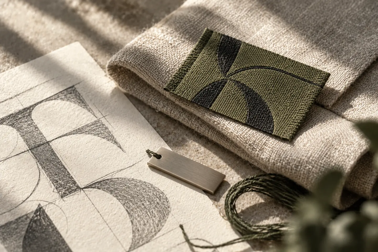
A woven label may carry the full name while a small chest application uses a compact mark. Explain their relationship through shared letterforms, proportions or a distinctive shape. Give the producer intended dimensions, fabric, placement and colour options rather than just a screenshot. Show proposed production changes to the brand coordinator. Letters thickened or details removed without approval should not quietly become a different logo that continues into later product runs.
The practical cost of a delicate appearance
Fine lettering and generous spacing can create a refined appearance, yet be difficult to preserve on a small label. Denser lettering may aid recognition but alter the expression. The answer is not automatically to choose the thickest line. Decide through samples and prepare a controlled small-application version when necessary. Do not transfer a metal accessory treatment directly to embroidery. Preserving the identity's character across surfaces is a more useful goal than reproducing every detail identically.
Hypothetical brief: shirts with a future home-textile range
Imagine a brand starting with shirts and considering home textiles later. Its initial brief includes neck labels, brand labels separate from care information, chest embroidery, swing tags and online store graphics. Turkish characters remain intact; the compact mark appears only in agreed locations. A home-textile example tests future extension. Name the sample workshop, approver and method for retaining approved specimens. This illustrative scenario describes a possible scope, not a BOCW customer or reference project.
Approve samples in the hand, not just in photographs
Physical labels and embroidery let reviewers assess letter spaces, clean edges and interaction with fabric together. For metallic thread, Madeira's FS40 guide specifically recommends trying the intended fabric first. Its settings for that particular thread should not be generalised to every textile logo. The producer chooses the relevant method and materials while the brand team approves appearance. Agree care and use testing separately with the manufacturer; a visual proof does not establish a durability guarantee.
- Check that the full name remains readable on the woven label.
- Compare embroidery and printing samples beside the master identity.
- Record sample dimensions, material and approved artwork version.
Make the workshop handover explicit
A graphic logo file is not necessarily a production file every machine can use directly. Distinguish identity design, label layout, application preparation and sample coordination in the quote. Assign responsibility for embroidery files or label manufacturing artwork prepared by the workshop. Show which products use the full name and which placements use the compact mark. Seasonal layouts can then change without each supplier reinterpreting the identity. Retained approved samples provide a practical comparison point for subsequent orders.
Key takeaways
- List product applications and sales channels before design begins.
- Develop any compact mark as a controlled relative of the master identity.
- Separate graphic delivery, workshop files and physical sample approval.
Frequently asked questions
Does embroidery require a separate logo?
Not always. Retain the master artwork if the sample works well. If details disappear, prepare an application version that preserves the character. Approve it explicitly instead of letting the workshop make independent changes.
Is a monogram enough on its own?
A new brand may need the full name to support recognition. Plan where that name appears. A monogram can serve as a compact product application while labels and sales images maintain clear name visibility.
Which samples should the quote include?
Choose the most frequent actual applications: woven labels, embroidery on intended fabric, printing or accessories. Specify responsibility for preparation, shipping and repeat samples. Do not assume one proof represents every material or method.