In this article
A telecommunications company may bring several services together under one name. Its logo therefore needs a broader role than illustrating a cable or handset. The important visual task is to make that name recognisable on equipment, documents and customer interfaces. A tiny device impression and a large event wall belong in the same design conversation. The identity should reflect the company’s approved description without suggesting unverified coverage, network performance or technical capability.
Quick answer
A useful telecommunications logo combines a distinctive wordmark with a controlled idea of connection. A symbol with few junctions and generous internal spaces is easier to assess at small sizes. Choose the form through a monochrome device-label trial and a normal-scale portal header before relying on a polished colour presentation.
Show a relationship rather than an entire network
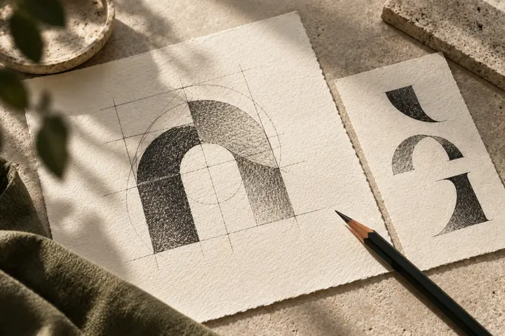
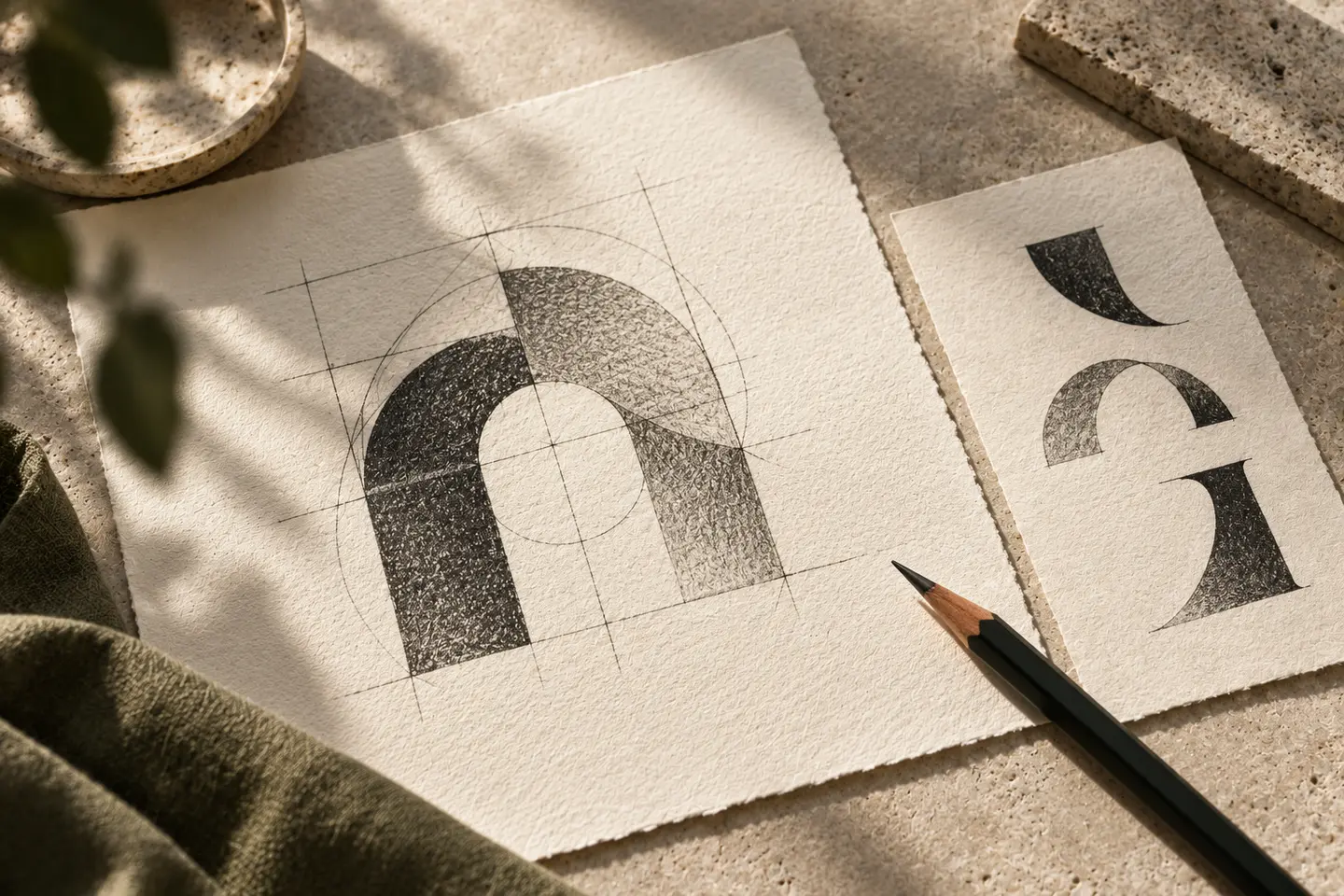
Two meeting surfaces, a deliberate interruption or a pair of corresponding strokes can suggest connection. An elaborate network of dots often becomes a texture when reduced. Ask which junctions actually contribute to recognition. A handset or antenna may narrow the interpretation of a company offering several communication services. With an abstract approach, the relationship between symbol and name still needs care. A detached icon should not become so dominant that people overlook the company name beside it.
Give long names a clear typographic rhythm
The brand name and its telecommunications descriptor do not require equal emphasis. A quieter supporting line can keep attention on the distinctive name. Consider a stacked arrangement before compressing every letter. Initialisms with repeated vertical strokes need particular attention because their boundaries can become unclear. Turkish dots and accents should remain complete rather than competing with nearby symbol details. Inspect optical spacing on printed samples; a round letter next to a diagonal rarely creates the same apparent gap as two straight stems.
Separate brand colour from interface status
A strong accent can make the identity visible, but its placement should not resemble a system status indicator. A red dot, for example, may sit near warning elements in a customer interface. Review that relationship in an actual screen composition. Prepare a dark mark for light backgrounds and a separate reversed version for dark fields. Gradients can support surrounding graphics without becoming essential to recognition. If the identity disappears when glow and lighting effects are removed, reconsider the underlying shape.
Run two trials at their intended size
Print the first candidate at 28 millimetres wide on a sample device label using one ink. Keep the customer-approved serial information and technical copy in place so the logo competes with realistic neighbouring content. Then build a portal header with a 220-pixel-wide logo and view it at normal screen scale. Inspect open junctions on the label and descriptor clarity in the header. A large presentation slide is useful for discussing character, but it cannot reveal the same failures as these two working samples.
A hypothetical corporate communications brief
Imagine a company grouping business connectivity services under one brand. The hypothetical brief asks for an organised relationship between elements rather than decorative speed streaks. A designer could explore two matching modules beside an open wordmark. Place the device label, proposal cover and event panel together during review. The same central symbol should survive all three, while the service descriptor may change position. Acceptance rests on consistent identification and readable naming, not a suggestion that the business provides a faster connection than others.
Key takeaways
- Check every additional network junction in a small monochrome impression.
- Separate the visual weight of the name from its service descriptor.
- Compare device labels and portal headers at their actual working dimensions.
Frequently asked questions
Does the logo need an antenna?
No. An antenna is an option when it matches the approved service focus. Correspondence, continuity or a relationship between letters may suit a broader company more comfortably.
How many colours should it use?
Start with a shape that works in one colour. Add another colour when it improves hierarchy. The basic connection idea should remain understandable without a colour difference.
Can the symbol appear without the name?
Yes, where recognition and space justify it. A small portal icon has different needs from a corporate announcement. On introductory surfaces, keep a version that clearly presents the company name.