In this article
A plastics manufacturer may appear on the underside of a colourful product and on the cover of a restrained technical catalogue. These settings expose different weaknesses: a delicate coloured symbol can disappear when embossed. The identity should therefore begin with a convincing flat drawing rather than a glossy material effect. Clear lettering gives the manufacturer a signature that travels across product families. Suggesting flexibility without copying a particular container also leaves the brand room to expand into different applications.
Quick answer
Balance solid shapes and open spaces in a mark that works in one colour. Flow or modularity should contribute distinctive geometry rather than a generic manufacturing gesture. Test an embossed product application and a catalogue heading at their actual sizes, and ensure the brand remains readable when the colour of the surrounding product changes.
Give a flow reference a definite purpose
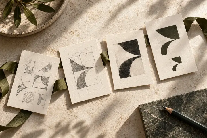
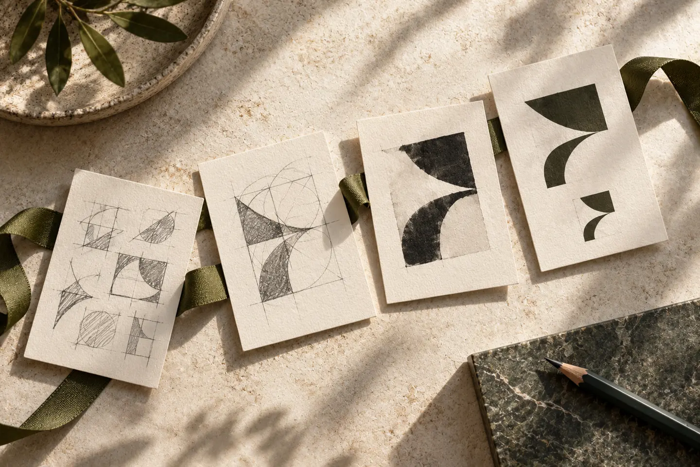
An infinity loop or arbitrary wave can suggest flowing material without identifying a particular business. A controlled turn within an initial offers a more specific starting point. Give the turn a clear beginning and ending, and check that it does not accidentally resemble a hose or pipe supplier. Interlocking modules are another possibility, provided their joints stay apart when reduced. An identifiable outer silhouette matters more than trying to explain the whole manufacturing process inside one symbol.
Letterforms must work without a glossy finish
Rounded letters can make the company approachable without turning it into a toy brand. Measured spacing and restrained terminals preserve a professional tone. Extremely fine strokes may break visually as reflections move over shiny plastic. Avoid making all the character depend on strong thin-thick contrast. For a long company name, a descriptive word can sit at a smaller scale while the core name stays intact. Keep the resulting signature distinct from adjacent product numbers and technical labels.
Separate brand colour from product colour
A business manufacturing in many colours does not need to change its logo to match each product. One principal colour, supported by black and white versions, can create a more coherent system. Vivid orange or purple may be useful choices when contrast supports them; neither proves innovation or environmental performance. When the product colour changes, a clear surrounding area may be necessary. Before adding a coloured box behind the identity, check whether a stronger silhouette would resolve the issue.
Compare embossing with catalogue reproduction
The first trial places a single-colour embossed mark at 18 millimetres wide on a flat product base. Ask the relevant producer for a sample using the intended process; attractive screen shadows are insufficient evidence. The second trial places a 35-millimetre signature beside a product code and dimensions table in an A4 catalogue. Closed gaps in embossing and weak lettering in print require different diagnoses. If one drawing cannot serve both, document a controlled simplified version with a visible relationship to the master.
A hypothetical cross-category identity brief
Imagine a manufacturer making industrial boxes and household organisers. Its brief might request an orderly wordmark that feels capable without becoming cold. Acceptance requires a recognisable initial on the small product base, a readable full name in the catalogue, and the same silhouette across changing product colours. Check whether sharp symbol corners clash with softer lettering. Compare the physical sample with the flat artwork after presentation effects are removed, so the final choice reflects the working identity rather than the rendered surface.
Key takeaways
- Treat embossing as a design constraint from the beginning.
- Keep product colours from replacing the brand colour system.
- Preserve a clear relationship between the full name and compact symbol.
Frequently asked questions
Must a plastics manufacturer use a flow symbol?
No. Flow becomes useful when it creates an identifiable letter or shape. An ordinary curve describing a production process may do little to distinguish one manufacturer from another.
Can embossing use a separate logo version?
A simplified production version can retain the master drawing’s proportions. It should feel like the same identity, with the removed detail and intended application clearly demonstrated.
Does green communicate sustainability?
Green may establish a natural association, but it does not substantiate an environmental claim. Judge it as a visual choice separately from the company’s verified statements.