In this article
Nuts and dried fruit already make a strong visual display. A logo must remain visible among almonds, pistachios and colourful mixtures without filling the pack with additional detail. One almond illustration may not represent the whole range. Think about the name, the transparent window and the colour field seen from a distance together. The useful opening question is how different products belong to one brand, rather than which individual nut to draw.
Quick answer
Choose readable lettering and a simple mark capable of supporting the complete range. Brand colour should remain distinct from flavour or variety coding. A botanical drawing that only works on a large pack is a weak foundation for the main logo. A small pouch label and a larger display box reveal different limits of the proposed identity.
Lettering beside a textured product
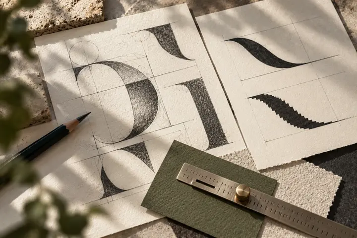
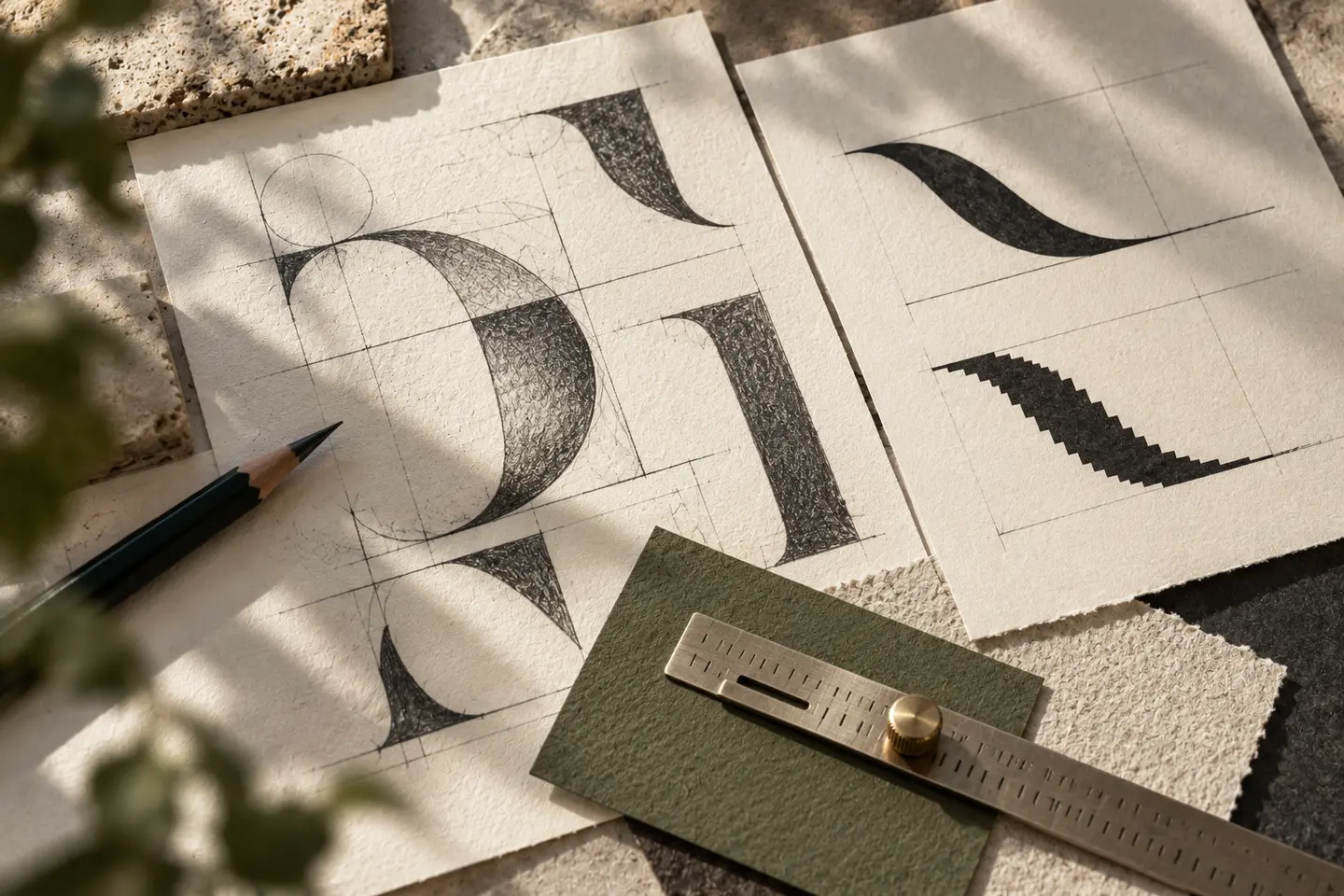
Rounded letters can feel approachable, while angular forms create a sharper character. Neither demonstrates flavour or freshness. Judge whether the name reads quickly and survives beside the irregular texture of the window. For a long name, investigate balanced spacing before compressing every letter. A descriptive line should not become a third competing heading between the logo and the product variety. Print the name alone first: its rhythm should remain convincing before decorative packaging begins to support it.
Build one mark instead of a catalogue
Putting almonds, hazelnuts and seeds into the same symbol can produce a miniature product catalogue. Opening shells, paired forms or the rhythm of clustered kernels offer more abstract starting points. Check which details actually distinguish the drawing. If removing tiny shell lines leaves a generic shape, reconsider the central idea. A badge is optional. A carefully shaped space within one letter might express the concept with fewer competing elements and give the name a more individual silhouette.
Separate brand colour from variety coding
Different packs may use different colours without changing the identity itself. A dark wordmark on a stable pale panel can remain common across the range. If the transparent window passes behind the logo, changing product colours may interfere with readability. Test an opaque label area instead. Metallic effects and warm browns also need review on the intended packaging material. A reflective pouch introduces highlights absent from a flat screen sample, so the presentation should not hide the surface the customer will actually handle.
Try a small pouch and a full display
For a hypothetical first proof, use a pouch label 70 millimetres wide. Place the logo beside the product name and other information rather than showing it on empty packaging. Next, evaluate a counter display box 300 millimetres wide. Its front lip must not cut through the brand name. Print at actual size, close the pouch and fill the box with sample packs. Disappearing outlines and a logo lost among the products are different faults; simply making everything heavier may not resolve both.
Write a brief for mixed ranges
Imagine a brand selling single varieties alongside fruit and nut mixtures. Its requested character is orderly, lively and generous towards the product. Accept the design when a new variety needs no alteration to the main logo, the small label still communicates the name and the monochrome symbol retains its structure. Compare the same identity beside pale almonds, dark raisins and a mixed product photograph. This prevents a solution that works beside one convenient product from being accepted without testing the rest of the family.
Key takeaways
- A stable logo panel can protect readability against changing product colours.
- Remove shell details to see whether the underlying symbol remains distinctive.
- Evaluate the display box while it contains sample packs.
Frequently asked questions
Must every nut appear in the logo?
No. A shared visual idea may accommodate new products better than a collection of individual illustrations.
Do roasted products require brown branding?
No. Test colour against the actual pack and product image; a hue alone does not establish a roasting characteristic.
Should the small label retain a slogan?
If it cannot be read, omit it from that arrangement and give the name and symbol sufficient clarity.