In this article
A logo for an iron and steel company does not need to imitate the weight of the material. Its more useful job is to keep the company recognisable across different product sections. Heavy lettering can suggest solidity, but closed counters make names difficult to distinguish on dispatch documents. The design problem is therefore one of identification in a visually busy industrial setting. A flat drawing should carry the character before polished steel photography or presentation lighting enters the picture.
Quick answer
Combine open letterforms, restrained section geometry and strong light-dark contrast. A profile, sheet or tube reference is useful only when it does not narrow the business to one product. Test the mark on a small dispatch label and a large facade sign, and require it to retain its identity without metallic rendering.
A section is a starting point, not a catalogue
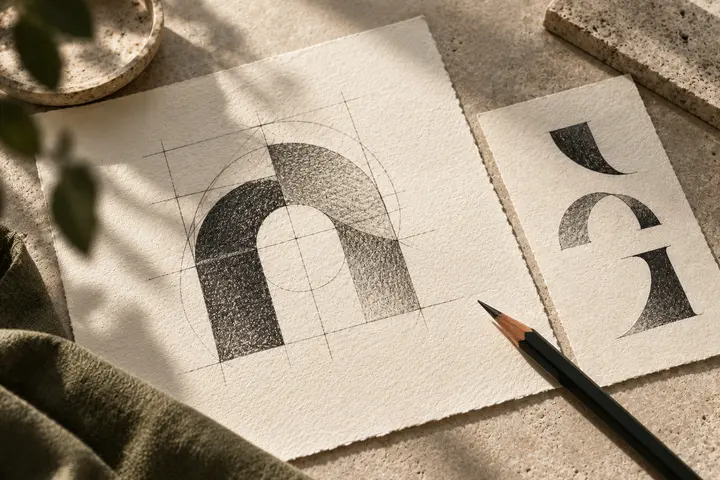
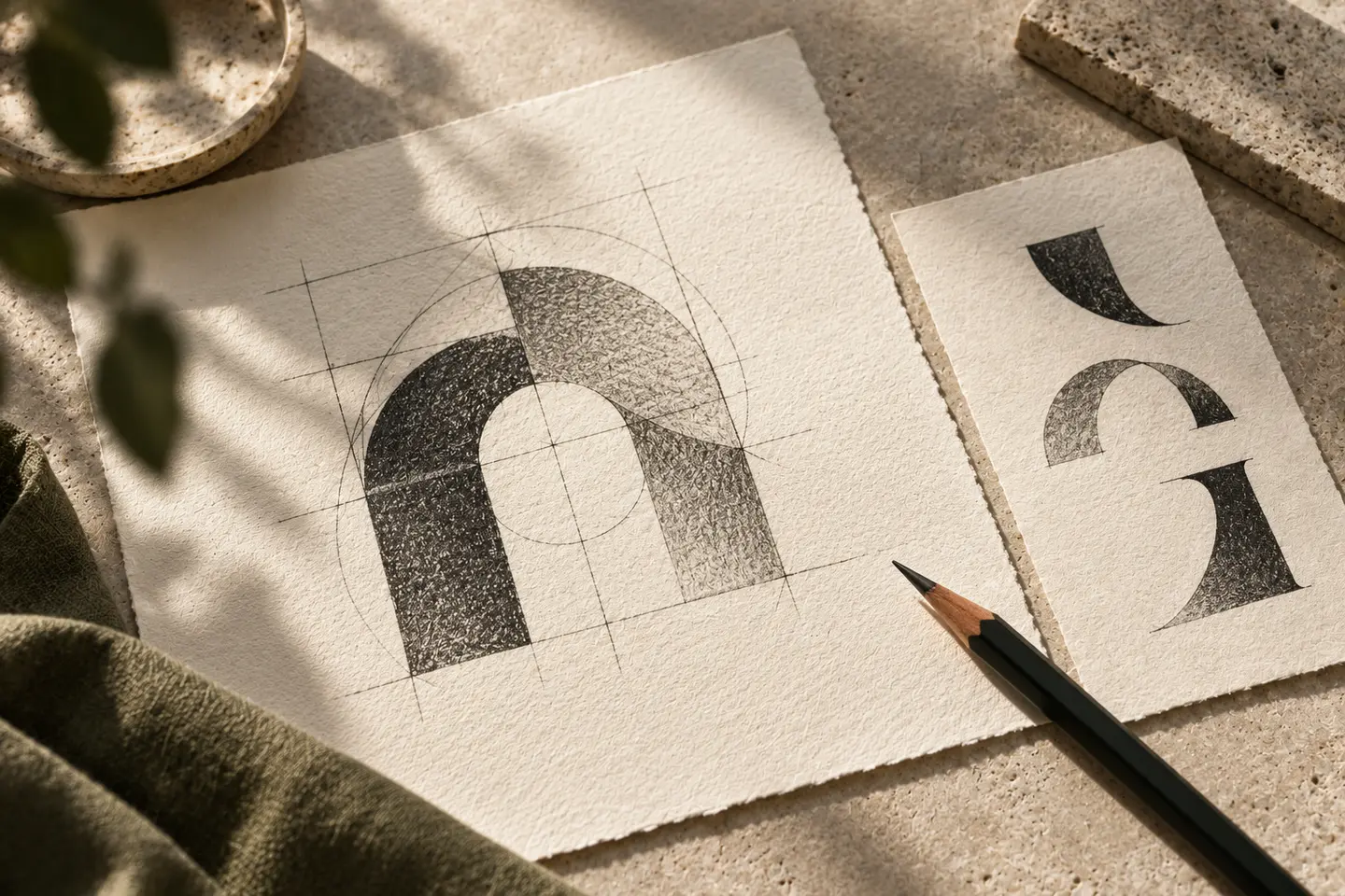
The flanges and web of an I section can provide a useful letter-building structure. Yet a company supplying tubes and sheets may outgrow a literal profile illustration. Borrowing the proportions or negative space of a section leaves more room for the product range. Two adjacent rectangles might suggest an initial through the gap between them. That gap needs deliberate drawing: a recognisable opening contributes more than an accumulation of sharp industrial details.
Let heavy lettering breathe
Very condensed capitals can become a single dark strip over photographs of cranes, stock and vehicles. Examine the most difficult letter pairs in the company name before choosing a weight. Dots and tails in Turkish characters should fit the same visual rhythm. An angular typeface does not need every corner customised. One controlled cut in a memorable letter can establish character while preserving a clean silhouette and straightforward reproduction on ordinary printed documents.
Steel grey is an option, not an instruction
A charcoal base with a warm accent can separate the identity from metal photography. A darker blue on pale stock may make documents feel quieter. Neither palette proves anything about material performance. Keep brand colours distinct from the company’s existing product identification colours. A white mark on a dark vehicle door and a black mark on a pale label should preserve the same internal spaces. Gradients should never compensate for an unresolved silhouette.
Run two physical reading trials
Place the first version at 45 millimetres wide on a dispatch label containing a product name and batch field. Print at actual size and check whether branding competes with operational information. For the second trial, evaluate a two-metre-wide facade signature from its intended viewing position. Record disappearing joins, closed letter gaps and separation between symbol and name as different problems. Enlarging a digital mockup cannot reveal how both working situations affect the reading of the mark.
A hypothetical brief and clear acceptance points
Imagine a manufacturer supplying profiles and sheets under a three-word name. Its brief asks for an orderly long signature rather than an aggressive factory illustration. Acceptance depends on the symbol remaining convincing without a product photograph, a compact version visibly belonging to the full name, and counters staying open in both trials. If the print fails, reconsider proportions instead of simply increasing every stroke. Review the plain artwork alongside the attractive presentation so that surface effects do not decide the outcome.
Key takeaways
- Abstract section geometry enough to accommodate the whole product range.
- Protect the reading of product information on the dispatch label.
- Judge facade lettering with metallic effects switched off.
Frequently asked questions
Does a steel company need a gear symbol?
A gear can suggest manufacturing but does not explain the specific steel business. Unless it creates a distinctive proportion connected to the name, a carefully drawn wordmark may communicate more clearly.
Can a rust-coloured palette work?
Warm earth colours can be a considered identity choice. Test them against stains and actual substrates so that the outer edges remain visible rather than merging into the material behind the logo.
How should a long name be shortened?
Develop a full horizontal signature and an approved compact arrangement. Their lettering should remain related; avoid inventing an unrelated abbreviation when the first narrow application arrives.