In this article
An internet provider’s identity often appears before a connection is installed. The application screen, appointment card and modem label all introduce the same business. Its logo should identify the name clearly without becoming another tariff badge. Speed arrows and wireless waves are available choices rather than requirements. Begin with the small surfaces customers encounter. That approach helps avoid a mark that looks impressive on a service van but disappears in the interface used to arrange installation.
Quick answer
An internet provider benefits from open letterforms and a stable colour system separated from changing tariffs. Any symbol should differ from the connection-status icons inside the customer panel. Test a 32-pixel icon and a 35-millimetre modem label to judge whether the visual idea survives its smallest important applications.
Look beyond the familiar wireless wave
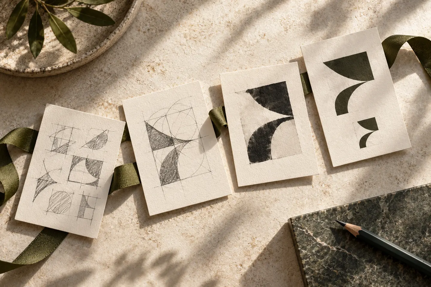
Three curved strokes can suggest wireless access, but they also resemble many interface controls. A starting line, an open passage or a distinctive letter from the name offers other directions. The spoken rhythm of a name can inform its visual rhythm. Review a circular symbol beside the panel’s home button to reveal possible confusion. The aim is not to draw the entire internet. A carefully composed group of simple parts can provide a signature that remains separate from descriptions of individual packages.
Keep the provider distinct from its tariffs
Package names may change while the main wordmark needs greater continuity. If tariff headings use bold italic lettering, repeating the same movement in the logo can crowd the screen. Lowercase lettering may support an approachable tone, though it is not the only answer. An uppercase short name can also feel clear when its spacing is generous. For a longer name, remove the descriptor from the main line before attempting to squeeze all the letters into a narrow strip.
Give colourful offers a stable centre
When several tariff cards have different colours, the logo should remain consistent above them. Recolouring the main mark for every package weakens the distinction between company and offer. Dark ink against a light field provides one starting point; an accent can occupy a limited part of the identity. Thin outlines may lose presence in a dark interface. Review the balance of solid shapes in both interface themes, using the actual surrounding cards rather than isolated logo samples on presentation backgrounds.
Measure a panel icon and installation label
The first trial is a 32-pixel square customer-panel icon. Instead of forcing the full company name into this area, assess a compact version of the symbol. The second is a printed modem label with a logo 35 millimetres wide. Include sample connection information and customer-approved wording in its intended positions. Look for merging parts on screen and filled letter interiors in print. Record the clear space in each successful sample so later layout adjustments do not quietly eliminate the breathing room that made it work.
A hypothetical household connectivity brief
Imagine a provider seeking a straightforward identity for household customers. The hypothetical direction could use a shared opening in two letters rather than a literal roof. Carry that opening into the app icon while keeping the complete wordmark on the installation card. Add an appointment reminder and van-door composition to the review. The design does not communicate guaranteed speed or uninterrupted service. Acceptance depends on the same name remaining recognisable across a compact interface and practical materials used during an installation visit.
Key takeaways
- Keep tariff colours distinct from the enduring provider identity.
- Compare the brand icon directly with connection-status interface symbols.
- Read a modem label at its intended printed dimensions.
Frequently asked questions
Is a Wi-Fi symbol unsuitable?
It can be suitable, but the familiar shape alone may not distinguish the business. Consider the name and nearby interface icons when developing a more individual arrangement.
How can a long name fit an icon?
Create a separate compact symbol instead of shrinking the entire name. Keep the full wordmark on application and information screens where customers need to learn the provider’s identity.
Can the logo change for each tariff?
Supporting graphics can identify tariffs while the principal mark stays consistent. This makes it easier to understand that different package options belong to the same service provider.