In this article
An interior design identity spends much of its life beside tactile samples and visually rich rooms. The logo should express the studio’s approach without becoming another layer of decoration. Arches, fabric folds and furniture silhouettes are possible references, but binding the identity to one interior style deserves careful thought. A studio presenting quiet homes today may design vivid commercial spaces later. A signature that remains comfortable across both settings gives its work more room to develop.
Quick answer
An interior design studio logo needs a clear name and a measured character within rich material surroundings. Type, symbol and colour need not repeat the same decorative gesture. Test a compact sample-label arrangement and a spacious portfolio signature together, using stone, timber and textile imagery. Warmth can emerge through proportion and spacing as effectively as through ornamental detail.
Translate atmosphere without copying decoration
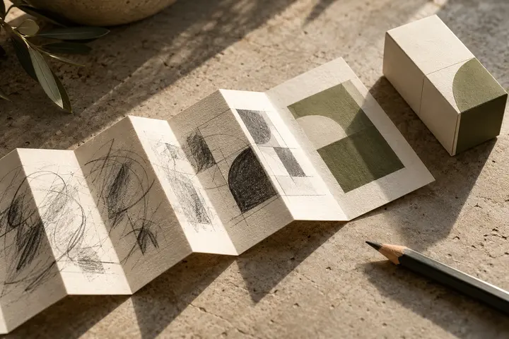
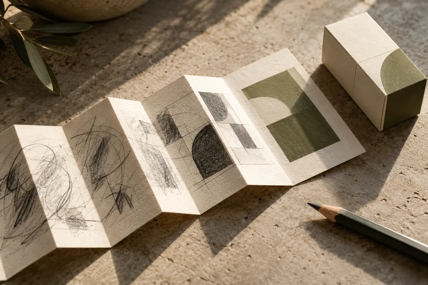
Rather than drawing an arch literally, explore the relationship between its open and enclosed surfaces. Rounded corners can soften a mark, but rounding everything may remove its character. One purposeful formal decision often reads more clearly than several decorative flourishes. Place the sketch beside three contrasting studio projects. A symbol that appears to belong to a particular chair or wall treatment may inadvertently narrow the practice. Its purpose is to support the rooms, while allowing different interiors to retain their own visual voices.
Give the name personality without fragility
A typeface with pronounced stroke contrast can feel considered, yet its finest lines may vanish on small sample labels. Generous spacing should let a name breathe without scattering it into unrelated letters. A long interior design descriptor need not be reduced until it fits under a short name; an alternative horizontal arrangement may work better. If the founder’s name becomes a signature, assess personality and legibility separately. The irregularities of personal handwriting do not automatically become useful characteristics of a professional mark.
Distinguish brand colour from a project palette
Sand, clay or olive tones may suit a warm approach, but material-focused studios do not all need the same palette. Compare a proposed colour with pale oak, dark stone and patterned fabric. On a sample board, the identity should remain distinct from the material it labels. Prepare light and dark flat-colour versions rather than relying on translucent overlays. A useful long-term aim is for the brand to remain stable when a project’s wall colour, furniture finish or photography style changes.
Make a sample label and a printed cover
Create a 35-millimetre-wide label containing the logo, a material code and a short description. Attach it to a real textile or timber sample and inspect both the name and the small symbol. Separately, print an A4 landscape project cover with an 80-millimetre-wide logo beside a busy room photograph. These are starting dimensions. Fine details disappearing on the label and excessive spreading on the cover are different problems; simply enlarging one master drawing may not resolve both. Each arrangement needs an intentional proportion.
Test a hypothetical practice across several interiors
Imagine a studio adapting older buildings for contemporary use. The brief asks for continuity and layering without copying historical ornament. Two overlapping simple planes and open name spacing could provide a design direction. For acceptance, apply the same identity to a home, a shop and a workplace presentation. The name should remain readable, sample information should remain separate and the central idea should survive single-colour printing. Remove the beautiful photographs as a final check: the mark should still have a balanced shape on its own.
Key takeaways
- Material texture need not become part of the logo itself.
- Create a compact signature that leaves sample codes readable.
- Use contrasting project types to expose dependence on one decorating style.
Frequently asked questions
Does handwriting feel more personal?
It can, but an unreadable name weakens identification. Check recognition at the intended size before valuing its personal quality.
Can texture belong to the logo?
Texture can enrich supporting graphics. The basic mark should still be recognisable without it.
Does every sample need the complete signature?
An approved compact arrangement may suit limited space, provided the full name is clearly available elsewhere in the presentation.