In this article
An insulation company may work with heat, sound and several types of building surface. Trying to include a sun, snowflake, sound wave and shield in one logo can turn that breadth into visual clutter. Choose the central idea through which the firm should be recognised: a layer, boundary or controlled passage may provide a clearer structure. The symbol also needs a distinct role beside product information, without appearing to document performance merely through its visual form.
Quick answer
An insulation logo should express a simple layer or boundary idea while keeping the company name clear. Explore mass and space rather than relying on an implied protection guarantee. Test a package face and a compact application plate at actual size. Parent name, product description and technical markings need separate levels, with layer relationships remaining visible in one colour.
Show a relationship rather than count layers
Several stacked lines can suggest layering, but increasing their number may turn the identity into a hatch pattern. An opening between two masses can create a stronger outer shape. Its width relative to the solid strokes becomes important at small sizes. Dividing the mark into warm and cool colours is an option, but recognition should not depend entirely on that contrast. Print it in one colour to see whether the same relationship survives. Keep its context distinct from an actual product cross-section or construction detail.
Separate name, service descriptor and product series
When the company name is long, compare a side-by-side descriptor before shrinking insulation wording into an illegible lower line. Letter weight should relate to the symbol so that the name does not appear weak beside a heavy sign. A product series already named on the package need not be repeated within the logo. Duplicating the same term at different weights wastes space and complicates hierarchy. Open forms and controlled spacing can help within colourful packaging. If initials are used, establish their link with the full name in the first presentation.
Keep colour in a supporting role
Blue and orange may suggest temperature contrast, but that need not be every insulation company’s central message. An acoustic specialist or a broader business may prefer a more neutral base colour. Compare the palette with packaging, vehicles and technical-document backgrounds. If a bright accent separates symbol components, introduce adequate space in the monochrome arrangement. A design whose central relationship disappears when colour changes may be overly dependent on its palette. Brand colour should also remain distinct from product classes or performance codes supplied in the surrounding information.
Test a package face and a compact plate
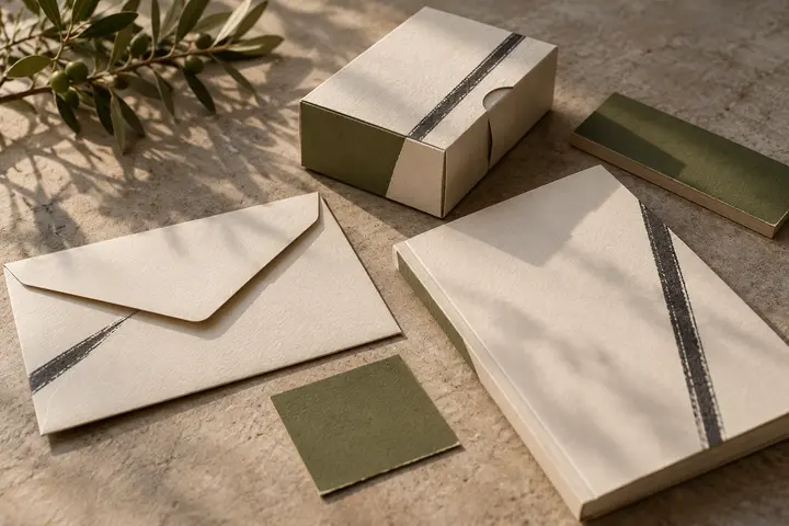
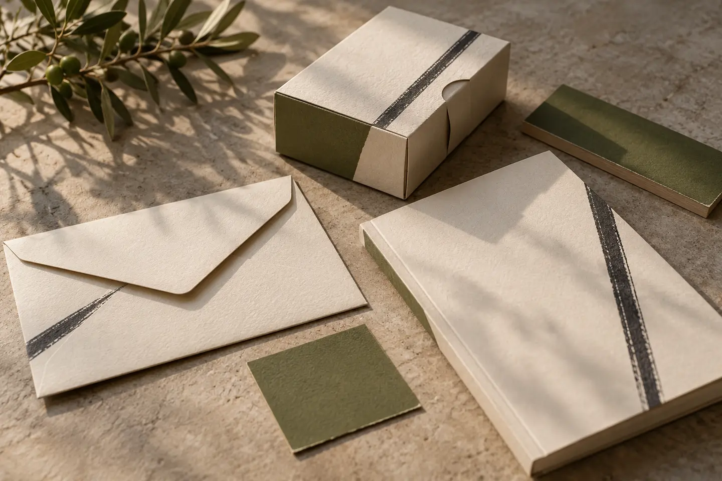
Build a hypothetical 40-centimetre-wide package face with a 12-centimetre logo, product name and information block. Lightly crease the paper and examine the layer gaps and name recognition. Separately, test a 22-millimetre signature on a 60 by 30-millimetre application plate containing a short description. These are suggested trial dimensions. Reconsider the complete layout rather than shrinking necessary information to make the logo larger. Once the production surface is established, a specimen on that material can provide an additional check of the design’s actual appearance.
Review a hypothetical multi-application brief
Imagine a firm appearing on residential and commercial building applications. The brief asks for an ordered layer relationship without dependence on one heat symbol. Two masses separated by a clear gap and a moderately weighted name could provide a direction. Compare package, vehicle signature and small plate together. Acceptance requires separation of layers in monochrome, distinction between company and series names and enough room for technical copy. Visual judgement does not establish insulation value, fire behaviour or suitability. Such information belongs in separately approved material supplied by the company.
Key takeaways
- Strengthen silhouette and spacing rather than adding more layers.
- Keep brand colour separate from product or performance coding.
- Check the balance of symbol and name on the small plate.
Frequently asked questions
Is a shield a good insulation symbol?
It may be an option, but should not imply unsupported protection. Layer and space relationships offer another clear starting point.
Do thermal and acoustic services need separate signs?
The parent identity can remain shared, with services and product series distinguished through supporting information.
Should the logo show a real product section?
A logo does not replace a technical section. Explain product construction through separate drawings and company-approved descriptions.