In this article
A hospital logo has to remain identifiable in an environment already full of information. An impressive entrance symbol may become a dark knot on a staff badge, while a delicate wordmark can disappear against a busy reception wall. Start by considering the institution’s name, the relationship between departments and the places where visitors encounter it. The visual task is to create a recognisable institutional signature. It should communicate consistently without using imagery that implies a particular treatment outcome or claims to replace clear written information.
Quick answer
Design a hospital logo around a deliberate relationship between the name and its symbol. Open letter counters, moderate stroke weights and a restrained palette can help the identity survive changes of scale. Test the actual composition on an entrance sign, patient folder, staff badge and screen header. Department colours should support the navigation system without becoming necessary for recognising the hospital itself.
Give the symbol room to remain open
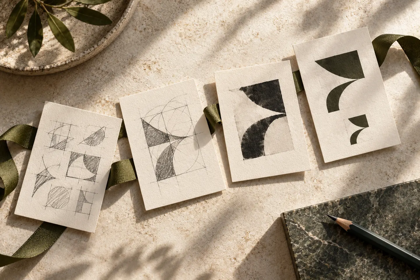
Begin with a solid black silhouette before adding colours or effects. Look at the spaces between components as carefully as the components themselves. A cluster of abstract shapes might suggest connection, but adding a roof, heart and several people can create competing readings. An entrance application does not justify making every line heavy: that same weight may fill the spaces at badge size. Surrounding space also matters on forms, where the mark needs separation from names, reference numbers and administrative text.
Make a long name read in order
A distinctive name can lead, with the hospital descriptor on a secondary line. This arrangement only works if readers still understand which words belong together. Compare a compact stacked version with a horizontal composition and inspect the letter spacing in both. Condensed lettering saves width but may reduce differentiation between characters at a distance. On staff identification, position the institutional signature separately from the individual’s name so that neither becomes an accidental continuation of the other.
Keep institutional colour separate from navigation
Blue and green are possible choices rather than automatic evidence of trust. Evaluate a proposed palette on white paper, dark signage and a bright screen. A pale principal colour may look pleasant on a presentation board yet lose presence on a folder. Supporting department colours can occupy their own navigation layer. Check that the main logo remains identifiable when these colours are absent. For a reversed white version, examine small internal spaces rather than assuming that changing the fill is sufficient.
Inspect the identity from a visitor’s position
Place the design into a realistic entrance photograph, then print a badge at its intended dimensions. Read the sign from the direction of approach and the badge at a natural conversational distance. Copy a folder cover in monochrome to see whether recognition depends on colour alone. Beside directional arrows, ensure that the logo does not resemble another navigation instruction. Use invented administrative details for these trials; there is no visual benefit in putting personal patient information into a design review.
A hypothetical multi department hospital
Imagine a hospital with a long institutional name and several departments. One visual direction could combine an open geometric initial with an understated wordmark; another could use distinctive lettering without a separate symbol. Apply both to identical sign, folder and badge layouts. Judge how quickly the name becomes clear, how well internal spaces survive and how naturally department labels sit nearby. Record the circumstances where each direction struggles. This produces a visual decision grounded in use rather than a vote for the most familiar medical illustration.
Key takeaways
- Keep the hospital signature recognisable without department colours.
- Compare long names in stacked and horizontal arrangements.
- Review badge details as closely as the entrance application.
Frequently asked questions
Does a hospital logo need a heart?
No. A heart is one possible motif; distinctive lettering or an abstract institutional mark may provide a more specific identity.
Should every department have a separate logo?
First test a shared naming hierarchy. Separate marks can fragment the visitor’s understanding of which institution they are dealing with.
How should a white version be checked?
Reduce it on its intended dark background and inspect the counters, gaps and narrow joins that could close visually.