
In this article
An electronics brand logo serves a different purpose from a product model name. The brand travels across device families while individual identifiers change. Establishing that distinction early gives packaging, housings and screens a clearer hierarchy. Before judging a dramatic presentation, find out how much space the logo actually occupies on plastic or metal. The relationship between a small physical impression and a digital startup image needs to come from the form itself, rather than colour effects alone.
Quick answer
A strong electronics logo uses controlled stroke weight and letters that remain distinct at small sizes. A simple wordmark may be sufficient on a housing. If a symbol is added, it should differ from feature badges on the box. Compare an 18-millimetre product impression with a 160-pixel startup-screen sample before selection.
Create a form beyond one device category
A headphone illustration suggests audio products, while a screen outline suggests display equipment. A broader range may benefit from a construction based on the letters of the name. This does not make abstraction compulsory. Consider which future products a chosen picture might appear to exclude. Instead of inserting product features into the main logo, give those features a separate information layer on the packaging. That distinction lets the identity introduce the maker while other graphics explain the particular item inside.
Draw letters for a physical housing
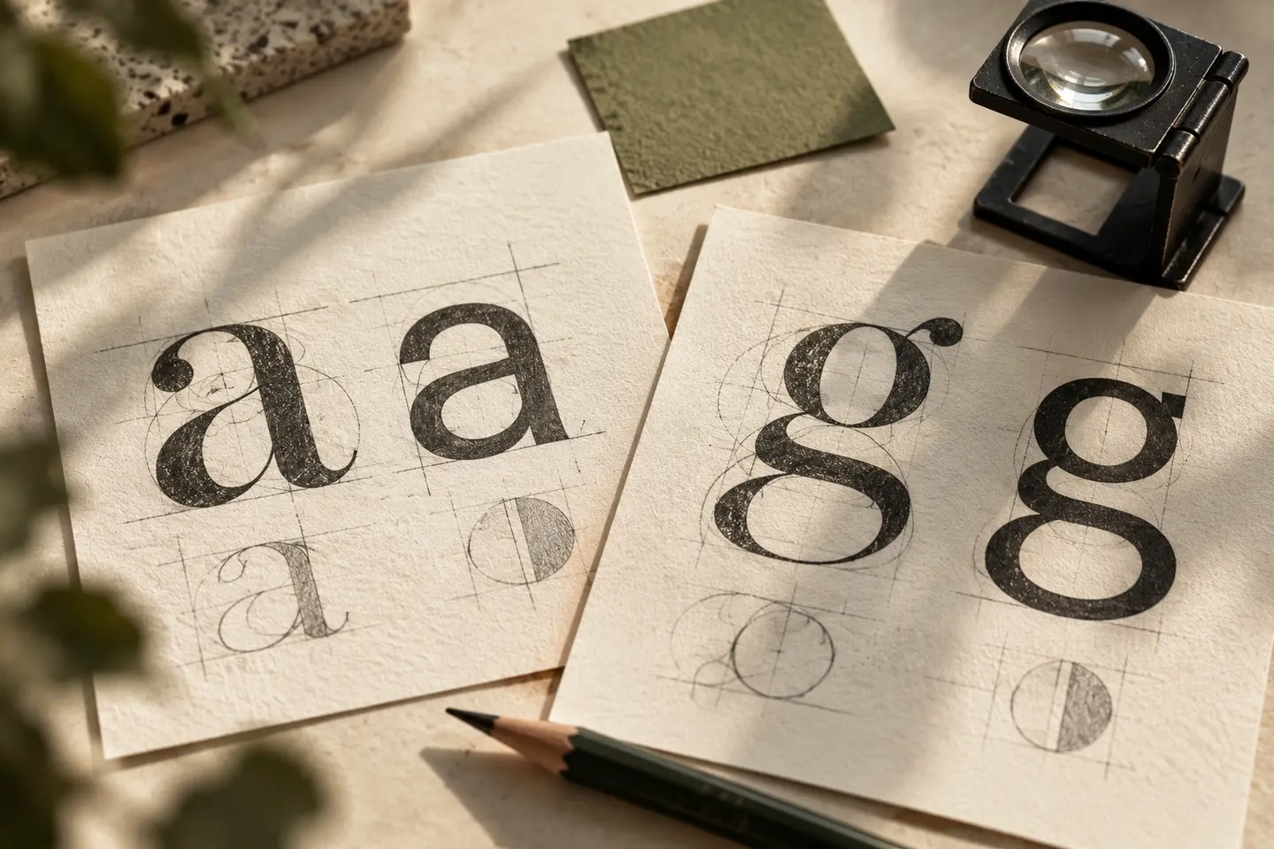
Find a useful balance between delicate lines and heavy shapes. Thin strokes can look faint on a sample surface, while very heavy lettering can close small internal spaces. Rounded corners may create a deliberate contrast with an angular device. Cutting every letter to make it look technical, however, can make the name harder to read. Compare similar letterforms beside model codes. The brand needs its own visual rhythm so that a customer does not mistake it for another serial identifier.
Let the material contribute its own colour
Prepare white artwork for a dark housing and a dark version for a light one. A reflective metal surface already has a strong character; an artificial metallic effect is not required within the logo artwork. The colourful carton and the uncoloured device impression should share the same core shape. Packaging accents can distinguish a product family without continually recolouring the main brand. On photographic backgrounds, reserved space around the logo often provides a cleaner solution than an added outline around every letter.
Inspect a housing and a startup screen
The first trial is a single-colour mark printed 18 millimetres wide on a representative product surface. Use a sample that reflects the intended texture instead of relying only on smooth white paper. The second places the logo at 160 pixels wide on a startup screen. If animation is proposed, inspect its final resting frame separately. Letter interiors should remain open, the symbol should not resemble a feature badge, and the model name should not overpower the brand. Record these observations alongside the dimensions.
A hypothetical desktop accessories identity
Imagine a brand bringing several desktop accessories into one visual family. The hypothetical brief could explore repeated corner shapes in a short name instead of an illustration of a connector. On the box front, place the brand above the model name and customer-approved product information. The housing may carry only the wordmark. Review a light product and a dark product together with the package prototype. This is a design comparison; the mark should not be presented as a seal proving any particular technical quality.
Key takeaways
- Separate the model identifier visually from the main brand.
- Inspect representative matte and reflective material samples.
- Assess the final frame of a startup animation as a still image.
Frequently asked questions
Must an electronics logo be angular?
No. Rounded or angular letters can relate to the product language. Avoid decorative cuts that reduce clarity merely to create a technical appearance.
Is a metallic logo necessary?
Metallic material is an application choice. The identity should remain recognisable in flat colour. A shiny presentation effect does not establish how a physical impression will look.
Can a product carry only the symbol?
Sometimes, when space and recognition support that choice. Preserve the complete name on introductory surfaces such as packaging and startup screens, and assess the symbol within its actual placement.

