In this article
An electrical panel company operates among lines, numbers and technical symbols. Reducing a circuit diagram into a logo often fails to create the necessary separation. The brand needs a voice distinct from information explaining the panel itself. Modular order or one controlled connection can provide that voice. Readable company naming remains central. Lettering that works on a small metal manufacturer plate should identify the same business on a project presentation, without adding unnecessary complexity merely to appear technical.
Quick answer
Use module proportions and ordered lettering instead of imitating a circuit drawing. Reduce fine connections and keep counters open. A small metal manufacturer plate and a larger project-file cover provide two actual-size trials. Acceptance should include the mark reading as a brand rather than technical information or an operational control on the panel.
Give modules a relationship to the name
Adjacent rectangles can reference panel organisation but may also resemble shelving or a software interface. Building an initial within one module makes the construction more particular. Choose a dominant direction rather than multiplying connection lines. The orientation should be apparent on first inspection. If rotation makes it look like another symbol, specify its intended direction. Symmetry is optional; a clear, recognisable structure matters more than making every part interchangeable.
Make technical lettering readable
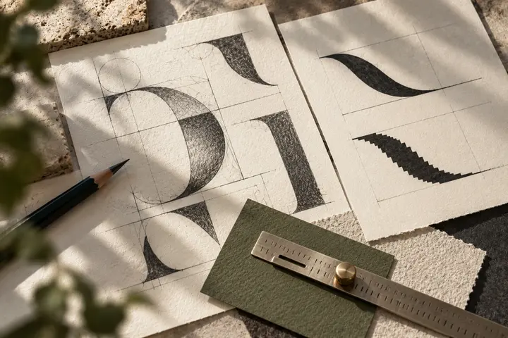
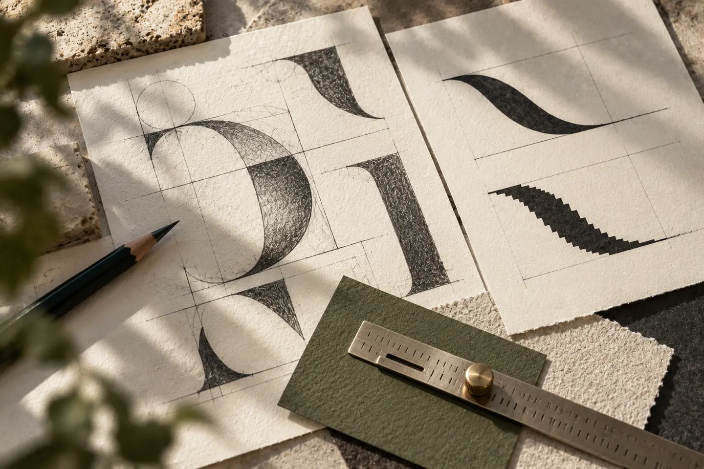
Squarish letters and even weights can create an ordered character. Cutting every letter into pieces turns the name into a code. One or two custom details offer more control. Adjust narrow combinations such as I, İ and L individually in Turkish naming. Keep the panel descriptor separate from the principal name without making it disappear. Repeat this hierarchy beside a long project title rather than judging the lettering only on an empty identity board.
Separate brand colour from technical coding
A vivid accent with a darker body colour can work, provided it has a different role from existing technical display colours. Asking a brand colour to explain an electrical function creates ambiguity. Framing the symbol like a button or status light can cause a similar problem. These are visual hierarchy considerations; specialists supply technical marking content. Confirm separation between shapes in black and white before deciding whether the coloured version is persuasive.
Test the metal plate and project cover
Put a 24-millimetre mark on a manufacturer-plate example using the actual plate dimensions and proposed application method. Include interruptions such as screw positions. Then place a 90-millimetre signature on an A4 project-file cover. The project title should lead while the manufacturer name stays readable. If lines merge in the small application, reduce unnecessary connections. Adding colour alone does not resolve a structural drawing problem that will return in monochrome production.
A hypothetical modular-panel brief
Imagine a company producing panels in different sizes under a long trading name. It asks for an orderly contemporary signature rather than an illustration of electric current. Acceptance requires readable naming on the small plate, no confusion with a functional control, and a balanced full signature on the project cover. If a version omits the descriptor, demonstrate its intended setting. Keep the visual language separate from claims about technical conformity or product performance, neither of which the logo establishes.
Key takeaways
- Keep circuit complexity outside the brand mark.
- Include screw positions and edges in the plate trial.
- Give accent colour a role separate from technical displays.
Frequently asked questions
Is a lightning symbol necessary?
No. Lightning suggests energy broadly but may not identify a particular panel manufacturer. A module or letter relationship can create a more specific signature.
Can the small plate omit the second line?
An approved compact arrangement can do so. Show where other information belongs instead of retaining tiny lettering that only appears readable in an enlarged mockup.
Can letters resemble circuit traces?
A limited detail may work. If connections and cuts hinder reading, understanding the company name should take priority over the technical appearance.