In this article
A doner shop’s name is often seen during a brief ordering moment or on a wrapped takeaway. A lengthy decorative descriptor can compete with it in that setting. Show where orders are placed and packages handed over, as well as explaining the product range. The commission is not only about an appetising illustration: it should make the business identifiable across surfaces with different amounts of space and changing order information.
Quick answer
Separate the shop name, product descriptor and branch information when ordering a doner logo. Compare folded wrapping paper, small package labels and a populated menu board. Reserve room for variable order details. Handover should identify the monochrome wrapping arrangement, compact digital version and master mark independently of the information that staff update for each order.
Do not let the product silhouette replace the name
A doner or carving-tool shape may be proposed, but ask how it supports name recognition. If a broad silhouette forces a long name to shrink, reconsider the priority. The client should supply approved product groups rather than allowing extra dishes to be added for presentation richness. Keep a permanent descriptor separate from temporary product promotions. Use the actual full name in the proposal, preventing the decision from resting entirely on an emblem that looks persuasive by itself but has not accommodated the real wording.
Review the paper after wrapping
A repeating logo can appear in fragments once the paper is folded. Discuss whether the business needs a repeat pattern or a controlled central placement. Provide the paper size and supplier’s application boundaries. Imagine a hypothetical shop using the same paper for a wrap and another differently shaped pack: inspect both closed examples. Show how letters cross folds. A flat paper drawing alone does not reproduce the encounter customers have with the finished order, so it should not be the only basis for approving the arrangement.
Preserve the menu board’s ordering role
The business identity shares the counter view with product choices. Reconsider an oversized mark if it compresses those names. Use client-supplied headings at realistic lengths and request another example containing an additional category. The logo commission does not determine the menu or ordering method; the client should explain the current workflow. A useful design establishes a hierarchy in which the name remains visible while customers can still locate what they need to make a selection, rather than treating the board as a large brand poster.
Separate package labels from delivery profiles
An order label helps distinguish a package, whereas a small digital profile identifies the business. The same square image need not serve both. Reserve a defined label area for client-specified order numbers or other variable content. In the digital version, consider a compact mark if the complete name becomes unreadable. Use a client-provided platform example for the trial. A phone-size preview creates a different assessment from the enlarged logo presentation and can reveal detail that contributes little at its intended size.
List branch and vehicle applications explicitly
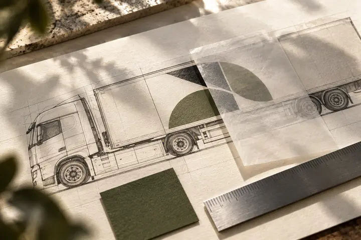
With several addresses, keep the main identity distinct from branch information. Request an example showing that the branch line can change without altering master proportions. Add a vehicle or delivery-bag application to the quotation when needed; small-pack work does not automatically cover it. Separate the master, wrapping pattern and daily label template in the final package. The owner can verify names while each supplier checks its relevant surface. A concise list of approved applications helps later orders use the intended file instead of whichever image is easiest to find.
Key takeaways
- Inspect recognition on the finished, closed package.
- Give order labels and digital profiles different information roles.
- Keep changing branch details independent of the master proportions.
Frequently asked questions
Must the logo illustrate doner?
No. The name and surrounding communication may establish the category. A proposed illustration should demonstrate its contribution on folded paper and in the small digital image.
Must every repeated logo be completely visible?
Not every repetition will be. Judge whether the resulting closed package still presents a recognisable identity by reviewing actual wrapping examples rather than the flat pattern alone.
Is vehicle artwork part of the logo fee?
Only if specified. Vehicle surfaces require different placement inputs from packaging or menus, and the quotation should identify whether production artwork is included.