In this article
A defence industry company logo is a corporate identifier. It does not need to resemble official insignia, an authorisation document or a seal proving technical capability. Establish that distinction in the design brief. Exhibition cards, company reports, visitor material and presentation covers define the communication surfaces under review. This is a visual identity task, rather than the development of a weapon or technical system. Any descriptions of the company’s activities should come from information supplied and approved by the customer.
Quick answer
A simple geometric mark and clear wordmark can provide a sufficient corporate identity for a defence industry company. Review compositions that might resemble official insignia carefully. A 30-millimetre exhibition-card impression and a 55-millimetre report-cover application offer concrete ways to test name hierarchy, monochrome clarity and the character of the symbol.
Begin with restrained corporate geometry
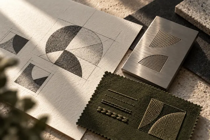
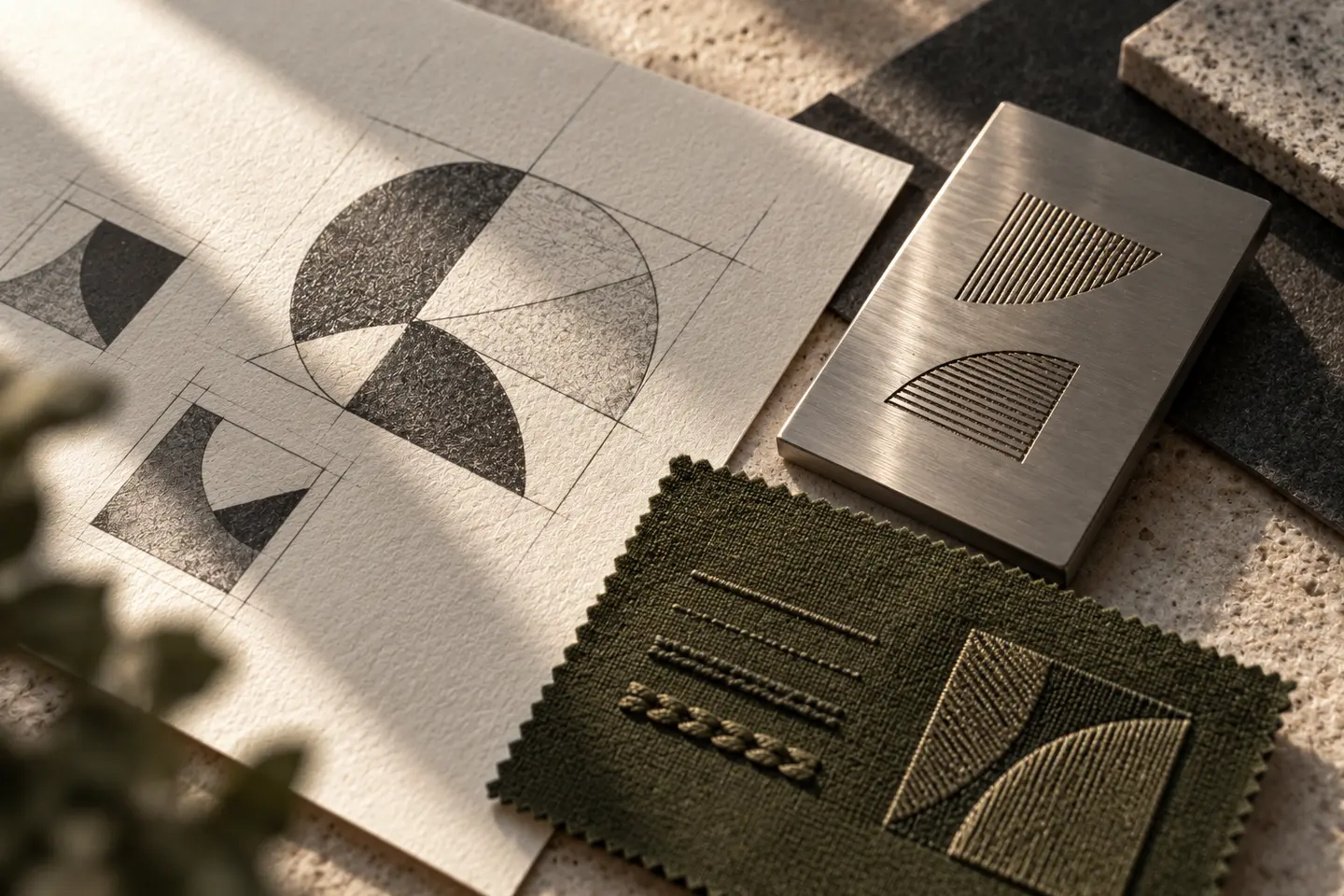
Two balanced surfaces, an open frame or a letter derived from the name can establish a corporate direction. Weapon silhouettes, target rings and aggressive motion are not essential elements. Surrounding a symbol with a ring of text can quickly move its appearance towards a seal. If that is not the desired character, compare an open horizontal arrangement. Seek individuality through the relationship between proportions, space and exterior contour, rather than increasing the number of elements until the identity becomes visually complicated.
Keep the initialism clear and balanced
When a short company name uses uppercase letters, similar stems must remain distinct. A continuous line joining all the characters may make the name harder to read. The complete legal name can appear at a supporting level below the main brand. Excessively wide lettering consumes space unnecessarily on a small exhibition card. Regular but natural spacing offers more flexibility. An angle from the symbol might be reflected in one selected character; every letter does not need the same sharp intervention to make the composition coherent.
Avoid turning colour into a claim of authority
Dark tones and metallic applications are available options rather than rules for the sector. Assess the palette alongside the approved corporate character and intended printed surfaces. Several shiny metal effects can hide small details. Prepare a flat-colour version of the principal identity as a separate reference. On materials appearing beside official marks, preserve a clear area for the company logo. The design should not imply public authority or a particular authorisation; any necessary statements belong in separately approved customer-supplied content.
Measure an exhibition card and report cover
The first proof is a printed exhibition card carrying a logo 30 millimetres wide. Identify the person and role details as fictional sample content. The second is a report cover with a 55-millimetre-wide identity. Inspect both in monochrome and reversed versions. Letterspacing should remain open, the descriptor should not reduce to an indistinct line, and the symbol should not be confused with an official seal. Printed measurements need direct assessment; a polished screen mockup alone does not show how small corporate materials will read.
A hypothetical corporate supplier brief
The hypothetical brief concerns the communication identity of a supplier working in the defence sector. An open frame derived from the company’s initial could provide a design route. Lead with the short name on the exhibition card and add the full name on the company report. Bring a presentation cover, information folder and card to the acceptance review. The candidate should identify the same organisation, accommodate different amounts of text and remain distinct from official insignia. Do not introduce claims about product capacity or technical performance through the identity.
Key takeaways
- Review the corporate mark separately from the appearance of official seals.
- Place the short name and complete company name at different information levels.
- Remove metallic effects to assess the strength of the underlying form.
Frequently asked questions
Does the identity need a shield?
No. A shield is an option but does not establish trustworthiness or authorisation. Open geometry and relationships between letters can also support a corporate identity.
Should it resemble official insignia?
A clearly separate company identity supports more understandable communication. If official naming or approval information is needed, the customer should provide it as distinct, verified content.
Why assess a monochrome version?
Reports, cards and other corporate materials may require one-colour applications. Preserving internal spaces and reading rhythm helps the identity work without relying on colour effects.